Case study
November 1, 2025
How we helped Augment raise $12M in the seed round

Written by
David Pokorny
5
min read
Turning complex fintech into a product investors trust.
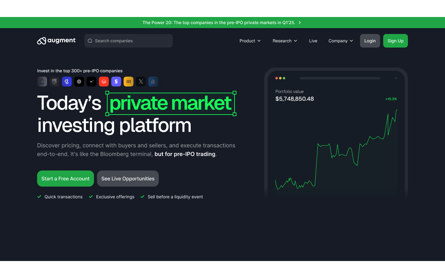
Augment is a fintech company redefining how private company shares are traded. Their platform enables investors, shareholders, and brokers to trade private equity with the speed and transparency of public markets -- solving one of the biggest bottlenecks in the financial world.
The opportunity was massive. But for us the challenge was just as big: intuitive flow & complex design.
The Problem
When Augment’s co-founders reached out, the product was already gaining traction -- but design wasn’t keeping up. Their development team was handling the visuals, which meant there was no structured design process, no dedicated ownership, and no system for consistency.
As a result, the product worked -- but it didn’t feel cohesive or intuitive. User journeys were fragmented, visual hierarchy was unclear, and the interface didn’t reflect the sophistication of a fintech company preparing to raise capital.
The mission was clear: Build a design foundation that could scale with the product -- one that communicates trust, speed, and expertise.
The Approach
We approached the project using our founder-first model: clarity, speed, and execution without the overhead. The goal wasn’t to make Augment look better. It was to make it work better -- for users, investors, and the internal team.
1. Headstart: Day 1 momentum
We started by understanding the business fundamentals: how private share transactions work, who the users are, and what makes Augment different.
Instead of long workshops, we focused on what matters -- what the product needs to communicate to build trust.
2. Understand: Simplifying complexity
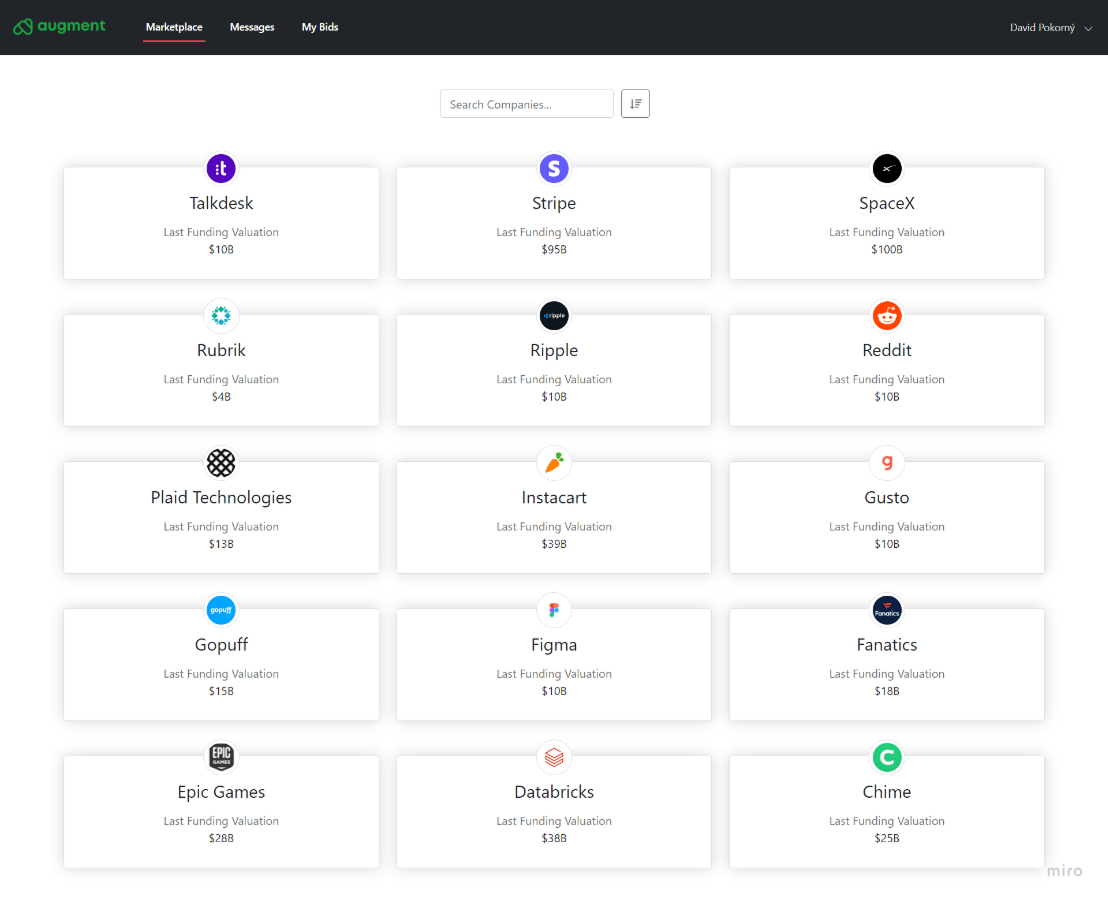
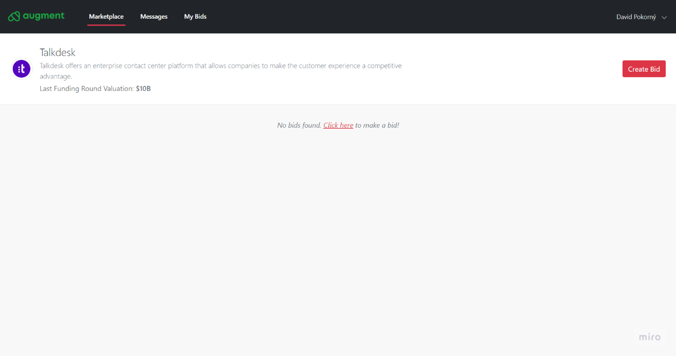
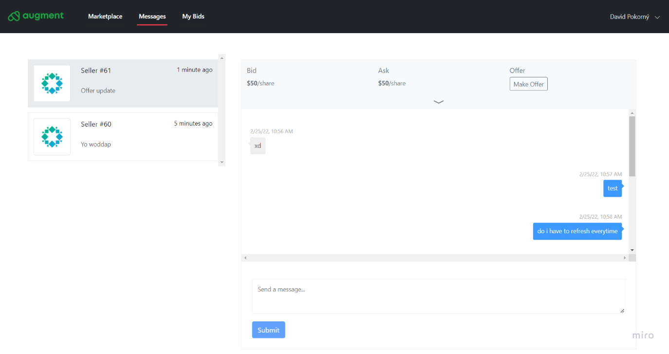
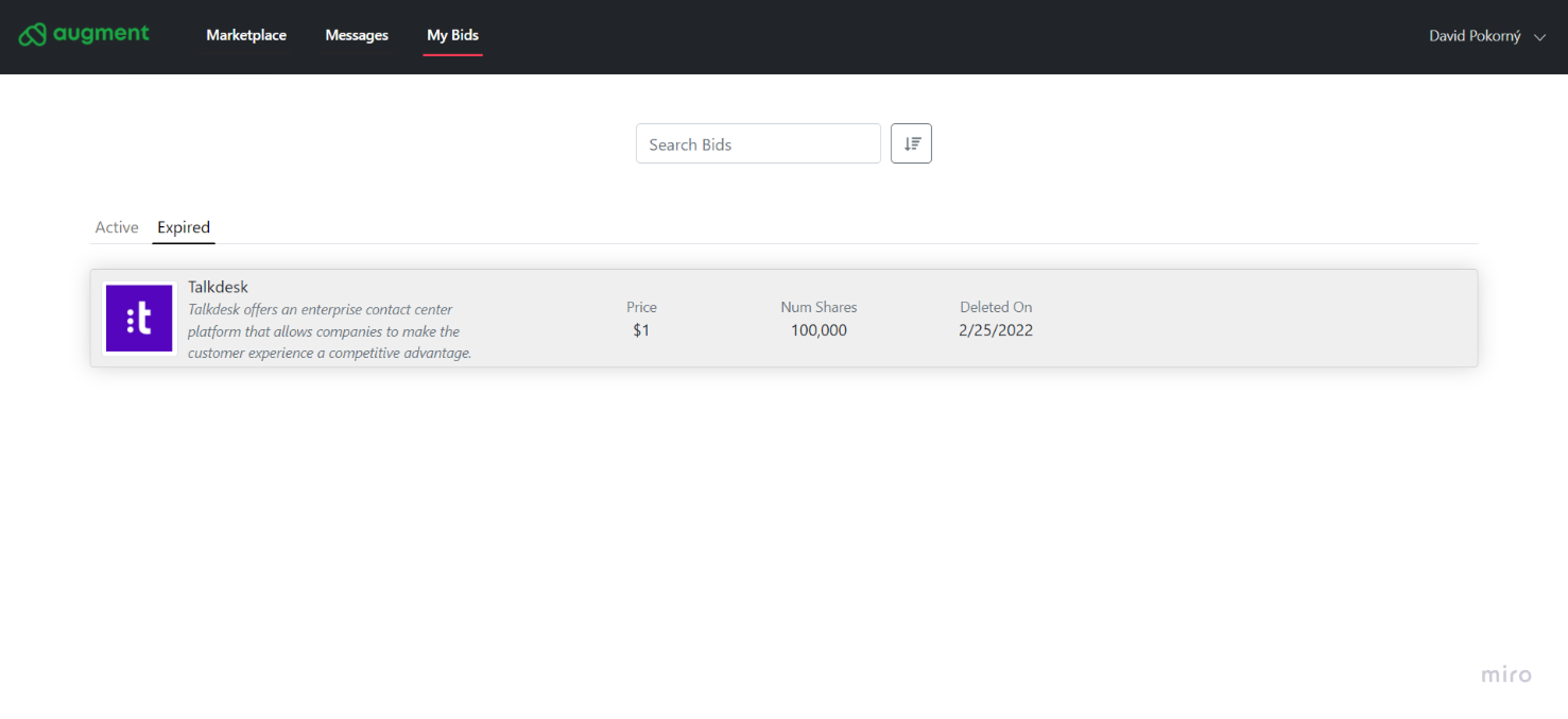
Fintech is dense. So we stripped away everything unnecessary. We analyzed the full user flow -- from logging in to executing a trade -- and identified where users hesitated or got lost. Our design philosophy was simple: complex product, simple experience.
3. Make: Designing trust into every pixel
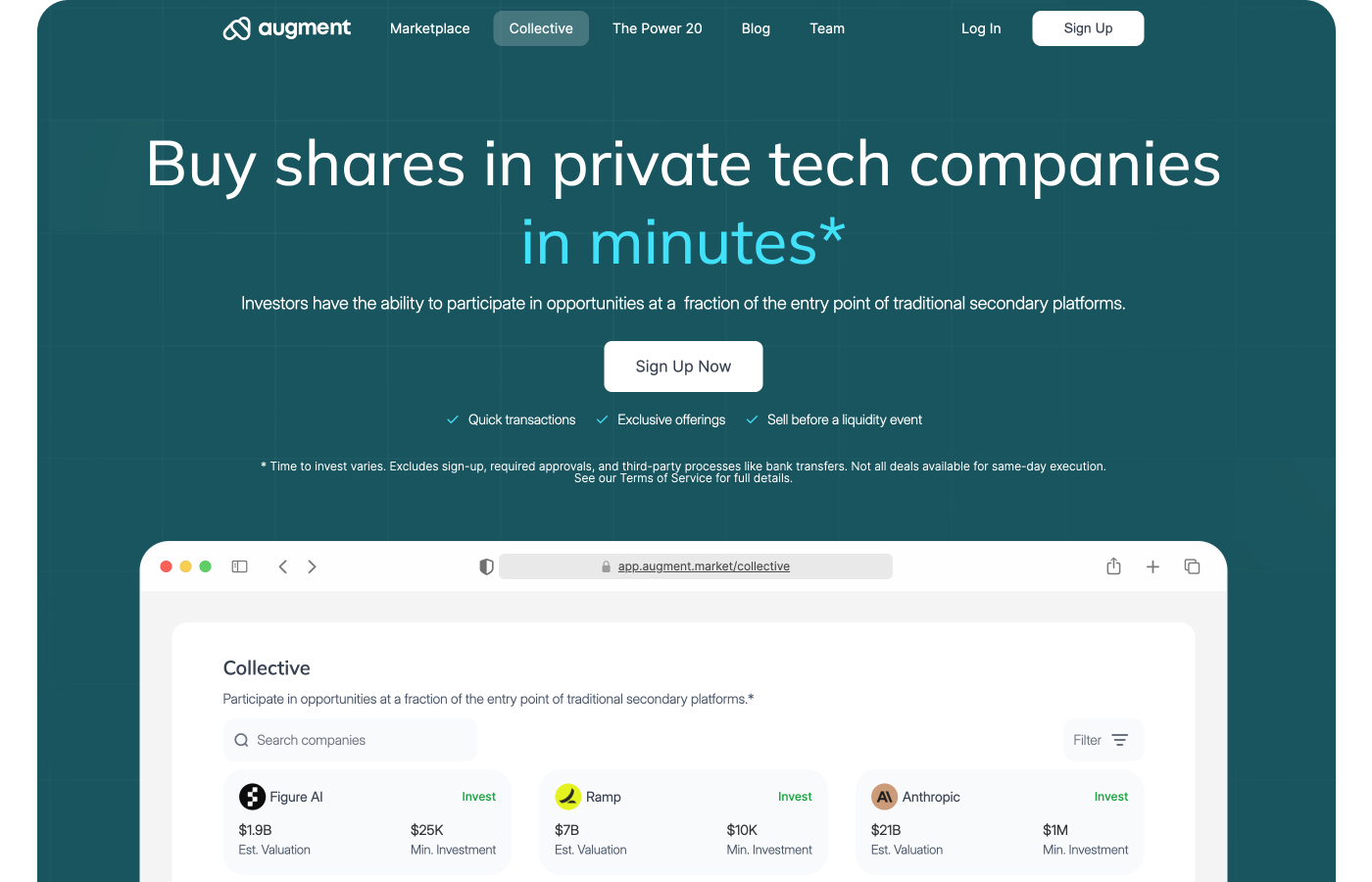
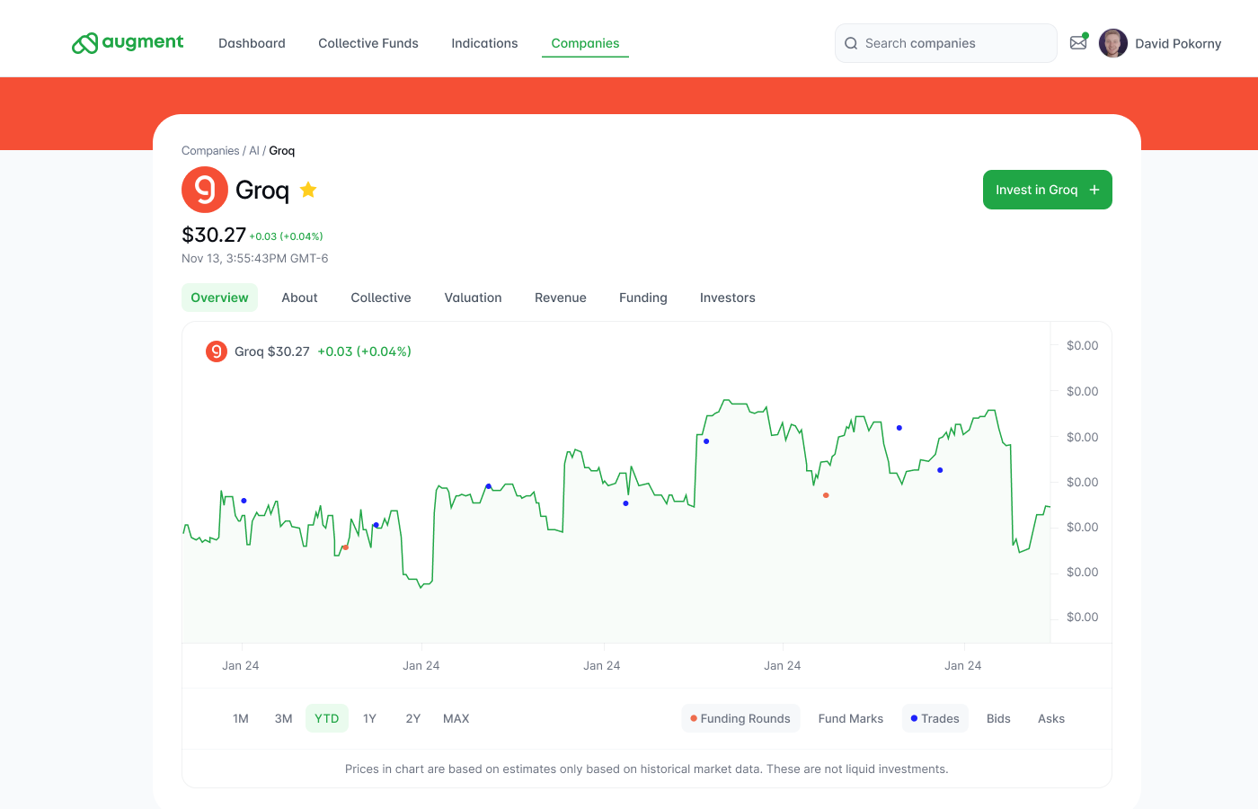
We built a visual system grounded in clarity and credibility. Neutral tones, confident typography, and structured layouts created a sense of control and precision.
Micro-interactions added momentum -- subtle motion that guides users without distracting them.
The interface needed to say: “You can trust this platform with your money.”
4. Build: Working like part of the team
We didn’t operate like an external agency. We integrated directly with Augment’s internal developers and product managers -- adapting tools and communication to match their workflow. No ticket systems. No bureaucracy. Just focus. Every day brought new iterations, updates, and refinement until the product looked and felt investor-ready.
5. Launch: Design that sells
Once the redesign went live, the difference was immediate. User confidence improved. Conversions increased. And most importantly -- the product was now presentation-ready for investors.
The Results
Within years of our collaboration, Augment successfully raised $12 million in funding. Their product became a key differentiator during investor conversations -- a tangible reflection of the company’s readiness and professionalism.
Internally, the design system we built allowed their team to move faster, stay consistent, and onboard new developers without losing quality. Externally, the refreshed UI elevated Augment’s credibility in a market where trust is everything.
What Made It Work
- Founder-first collaboration: We worked at the same speed and intensity as the founding team.
- No wasted cycles: Direct communication, no meetings that don’t move the needle.
- Clarity over decoration: Every design choice supported trust, usability, and scale.
- End-to-end thinking: We didn’t just hand over Figma files -- we helped build a product ecosystem that lasts.
Key Outcomes
✅ $12M raised in funding
✅ Clear, cohesive product design built for scale
✅ Improved investor and user trust
✅ Internal design process established from scratch
✅ A long-term foundation for growth
Why It Matters
Fintech users don’t buy features -- they buy confidence. And confidence starts with design.
The Augment project is proof that good design isn’t about adding more -- it’s about removing friction, building clarity, and inspiring trust at every level.
Before Humbl
Most founders struggle to get design that actually keeps up with their business.
They either go with freelancers who vanish when things get busy
or agencies that slow everything down with process, meetings, and ticket systems.
After Humbl
Sharing selected design work created by Humbl Design.
Some screens include early explorations, and all data shown is illustrative due to NDA restrictions.