
I wrote this for startup founders, product managers, developers, and fellow designers who need to ship fast. If you have a working design file, an active communication channel, and 15 minutes to focus, applying these steps will save you weeks of wasted revisions. I will show you how to structure your design feedback so the design team returns a fixed screen 24 hours later. You will stop guessing what looks good and start building a product that converts.
The trap of "make it pop"
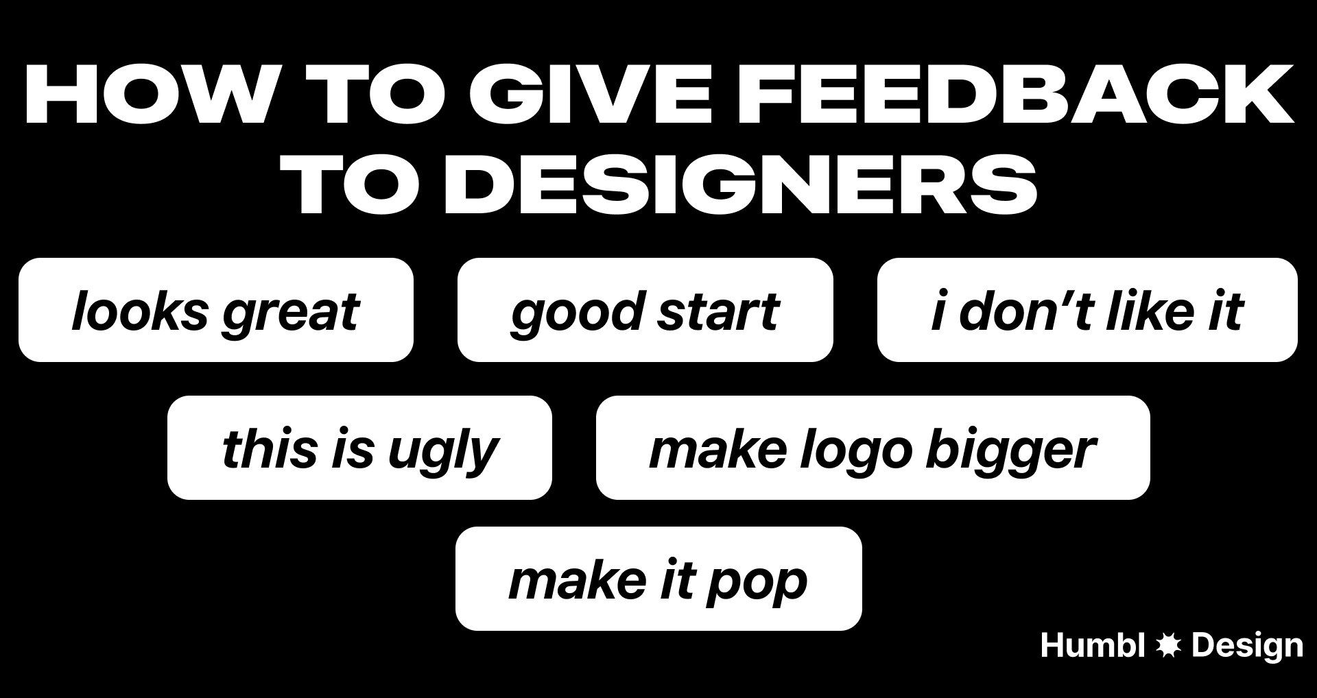
I see this often. A manager reviews a design, gives vague instructions, and disappears. When they look at the next iteration, they drop the worst comment in the industry: "Make it pop."
The project stalls. The designer guesses what the reviewer wants. The launch gets delayed.
"Make it pop" means nothing. It forces designers to blindly guess your visual preferences.
But positive feedback suffers from the exact same problem.
Saying "this looks great" is equally unhelpful. If you give a thumbs-up without explaining why, the designer doesn't know what to replicate for the next screen. You need to highlight the specific features you like so the designer understands your actual preferences.
Design debt slows down your product, and it starts with how you communicate. You need a system to translate your feelings into functional directions.
Three questions to ask before you leave a comment
Before you type anything in Figma or record a Loom, run your thoughts through a filter. People often look at a screen, decide they hate the overall view, and tell the designer to start over. This wastes time and destroys momentum.
Instead, break the design down and ask yourself these three questions:
1. What is the exact element failing here?
Identify the actual culprit. Is it the visual hierarchy? Are the colors distracting? Is the typography hard to read? Does the imagery miss the mark? Is the actual copy confusing? Pinpoint the exact thing that makes you dislike the design.
2. Does it make sense to tier this feedback?
Not all feedback carries the same weight. You need to separate massive conversion blockers from minor visual polish. Changing an entire user flow is an urgent, top-tier problem. Fixing a border radius from one pixel to two pixels is a low-tier task that can wait.
3. Does this hurt the user experience?
If a checkout screen looks cluttered, it hurts conversion. If you just dislike a specific color, that is a personal preference. Separate objective product goals from subjective visual tastes. If you cannot tie the change to a specific metric, tell your designer it is just a visual preference.
Choose the communication channel
It doesn't matter what specific tool you use, as long as both parties agree to keep the loop open. If there is a phase where you don't hear from each other for weeks, the process dies.
Here is how I structure communication channels to keep turnaround times under 24 hours:
Batch your feedback
Avoid the trap of "trickle feedback." Reviewing a design and sending comments one by one as they pop into your head is disruptive. Pinging a designer continuously forces them to context-switch, destroying their deep work focus. Instead:
- Review the entire flow first.
- Consolidate your notes into a single list.
- Send all your feedback at once.
This allows the designer to see the big picture and address conflicts between your requests before they start iterating.
Ask why first
Before you critique a specific design choice, ask the designer to explain their thought process. Design is rarely arbitrary. Starting with "Can you walk me through the logic here?" prevents you from demanding a change that breaks another part of the system. They might be working around:
- Rigid technical constraints.
- Strict adherence to accessibility standards.
- Recent user research that you haven't seen yet.
Anchor to the original brief
It is easy to let your personal preferences dictate a review, but you are not always the end user. You must evaluate the design strictly against the initial project goals and user personas. Ensure the design effectively serves your entire target audience—both men and women alike—rather than just reflecting your subjective tastes. If a design choice hits the metrics outlined in the brief, it should stay, even if it isn't your personal favorite.
The structure of a perfect critique
Generic feedback creates generic products. When you leave written feedback, tell the designer exactly what to fix.
Use this specific structure:
name the element + explain the functional problem + provide a visual reference
For example, do not say "fix the dashboard." Say,
"The primary action button blends in with the secondary data. Look at how [Competitor] highlights their main action using a dark background here: [Link]."
Common mistake: Softening the feedback to avoid difficult conversations. This leads to confusion. Be direct and constructive.
The formula for constructive feedback
Use this four-part structure to eliminate ambiguity and keep the focus on problem-solving:
- Context: Pinpoint the exact location. (e.g., "On the mobile checkout screen...")
- Observation: State what is happening factually, without emotion. (e.g., "...the 'Submit' button is hidden below the fold...")
- Impact: Explain why this hurts the business or user experience. (e.g., "...which will likely lower our conversion rate for users on smaller devices.")
- Next step: Suggest a direction or ask the designer for a solution. (e.g., "Can we explore a sticky footer for this button?")
Next steps
Open your current design file. Find the screen that is underperforming the most. Pick one specific element you dislike, find a real-world example of how you want it to look, and send a Loom video to your designer right now.
Any statistics cited in this post come from third‑party studies and industry reports conducted under their own methodologies. They are intended to be directional, not guarantees of performance. Real outcomes will depend on your specific market and execution.
Why is "this looks great" bad design feedback?
Saying "this looks great" lacks context. If you don't explain exactly which elements you like, the designer won't know what specific features to replicate on the next screen.
How do I give feedback if I hate the overall design?
Never say you hate the "overall view." Break it down into specific elements: identify if the problem is the hierarchy, weird colors, typography, or the actual copy.
When should I use Figma comments versus a Slack huddle?
Use Figma comments for minor tweaks like fixing a border from 1px to 2px. Use ad hoc Slack huddles or calls for urgent blockers or complex flow changes that require instant alignment.
How do I prevent design revisions from taking weeks?
Maintain active, daily communication. Relying solely on Figma comments causes notification lag. Use async tools like Loom videos or direct team chat messages to keep the momentum going.
What is the best way to explain what I want?
Always provide visual references. If you want a specific style or feature, find an example of another product doing it well and share that link directly with your designer.


