
I've worked through 50+ founder audits and the pattern is consistent: the design changes that produce real conversion lifts are almost never the visual ones.
- they're structural
- copy hierarchy
- CTA count
- where the social proof lives on the page
- form field count
Before the cases: a quick sense of what you're aiming at. SaaS sits at 3.8% median, the lowest of any tracked industry, according to Unbounce's analysis of 41,000 landing pages. Top performers in SaaS hit 10–15%. The gap between median and top decile is almost never closed by driving more traffic. It's closed by fixing the page.
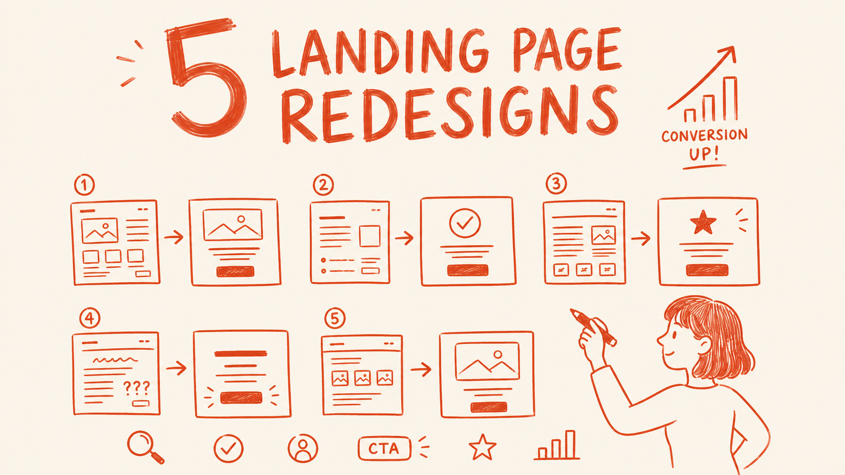
Here are 5 documented before-and-after cases where the redesign actually moved the number, and what each one teaches about the job.
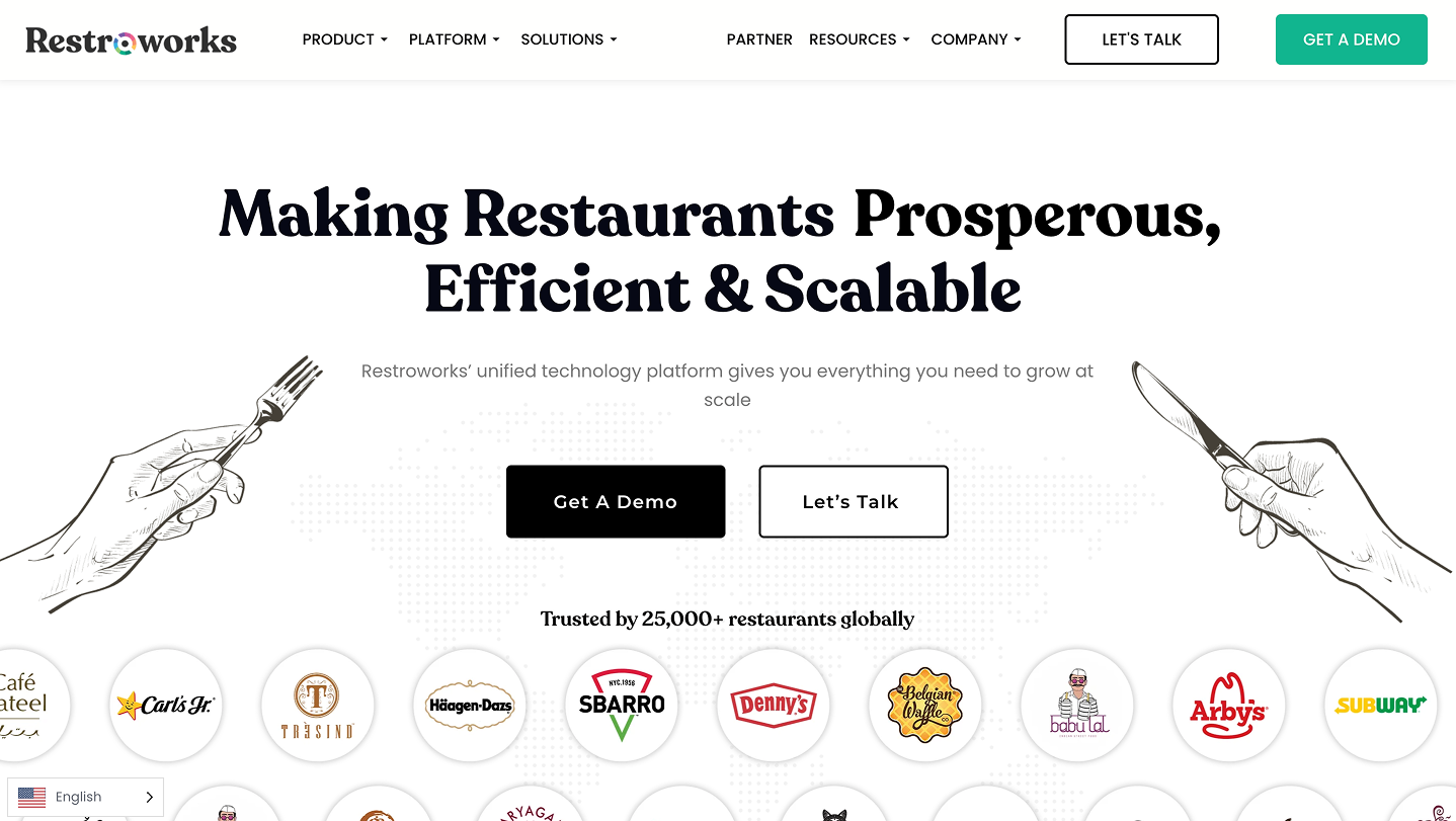
1. Restroworks: 52% more demo requests through sequential testing
Restroworks is a SaaS restaurant management platform serving 5,000+ customers across 100+ locations. They had a real problem: visitors were landing on the homepage and contact page and dropping off without requesting a demo. The pages looked fine. The conversion rate wasn't.
Instead of rebuilding everything, they ran 4 sequential A/B tests, each informed by what the previous one taught. The total result: 52% more leads in a single month and a 25% improvement in overall conversion rate.
What changed, in order:
- Test 1: Rewrote homepage headlines to focus on outcomes, highlighted the USP, clarified the CTA. Result: 16% more visitors continued to the contact page.
- Test 2: Second homepage iteration based on the first test's data. Result: 5% additional lift.
- Test 3: Narrowed the contact form and added copy explaining what happens on the demo call. Result: 20% more contact page conversions.
- Test 4: Further contact page refinement. Result: 7% more conversions on top.
No single change was dramatic. Stacked, they added up to 52% more demos per month.
The lesson most designers miss: conversion problems are almost never in one place. The homepage was leaking visitors before they even reached the form. Fixing the form without fixing the homepage would have produced a fraction of the result. You have to map the full journey first, then fix in sequence.
2. Form field reduction: 11 fields down to 4
The highest single-change conversion lift I've seen documented comes from form field reduction. Cutting from 11 fields to 4 produced a 120% increase in conversions in the most cited version of this test.
Across multiple studies, reducing form fields to 5 or fewer consistently doubles conversion. The principle holds across B2B SaaS, fintech, and professional services.
Every extra field is a micro-decision asking the visitor whether you're worth their time. By field 7, most people have already decided you're not. The fields you're cutting don't disappear. You get that data from the sales call, the CRM enrichment tool, or the onboarding flow. You just stop asking for it before you've earned the right.
When I audit landing pages, long forms are almost always on the list. Founders add fields because they want qualified leads. What they get is fewer leads. Fix the form and qualify in the follow-up.
3. TestGorilla's headline rewrite
TestGorilla is a skills-based hiring platform. Their original hero led with a product description: what the tool was and how it worked. Standard SaaS template, feature-first, company-out.
They rewrote the hero headline to "Skills-based hiring that works." Eight words. Outcome-first. No feature explanation required.
The result: an 80-day payback period on their paid acquisition spend, tied directly to the page change. That's the kind of number that turns a marketing expense into a growth engine.
The copy in the "before" column is accurate. It's not wrong. But it makes the visitor do the translation: "So this helps me hire better?" The new headline does that translation for them in under a second.
Across documented headline tests, writing for benefit over feature delivers 27 to 104% conversion lift. The range is wide because the starting quality varies. A badly written feature headline moving to a good benefit headline hits the top of that range. A mediocre headline moving to a slightly better one stays at the bottom.
The diagnostic question for any hero: can a stranger read the headline and immediately tell what they'll be able to do that they can't do now? If yes, move on. If no, that's the redesign.
4. Social proof moved to the point of decision
Most SaaS landing pages have a testimonials section. It's usually somewhere in the lower half of the page, after features, after pricing, well below the fold. Visitors who make it that far have already decided or already left.
Moving a testimonial adjacent to the primary CTA button produces a 68% conversion lift in documented tests. Same testimonial. Same copy. Placed next to the button instead of three scrolls below it.
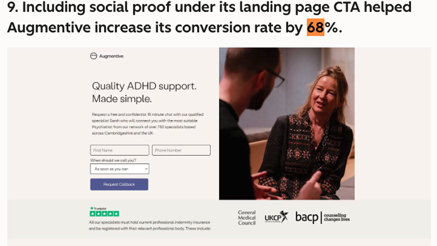
The psychology here is simple: anxiety peaks at the point of commitment. The visitor hovers over the signup button and that's when doubt kicks in. Social proof at that exact moment addresses the doubt when it's loudest.
Choose the testimonial carefully. The one that goes next to the CTA should directly address the most common objection for your buyer. For a $200/month tool, that objection is usually about whether it actually works. "We saw 40% more demos in the first month" beats "Great product, highly recommend" every time.
5. Cutting from 3 CTAs to 1
The most common mistake I see in SaaS hero sections is the triple CTA: "Start for free," "Book a demo," and "Watch a 2-minute video" sitting side by side above the fold. Founders add options because they're trying to cover every visitor type. What they get is decision paralysis for all of them.
Unbounce's analysis across 41,000 landing pages found single-CTA pages convert at 13.5% vs 10.5% for multi-CTA pages. That 3-point gap doesn't sound dramatic until you're sending $20,000 a month in paid traffic through the page.
Reducing to one CTA means choosing which action matters most and making everything else secondary. The video goes below the fold where it supports the decision. The demo request goes in the nav where buyers who know what they want can find it. The hero becomes a single clear ask.
I audit pages where the hero section has 5 or 6 clickable elements. Founder usually says "we want to give people options." The data says giving people too many options means fewer of them do anything.
What these 5 cases have in common
None of them was a full visual redesign. New brand colors and updated typography didn't feature in any of these results.
Every single one was structural. Where proof lives. How many decisions the visitor has to make. Whether the headline does the translation work for the reader. How much friction sits between landing and converting.
That's the real job of a landing page redesign. The visual layer matters. Ugly loses trust fast. But pretty doesn't close the gap between a 3% page and a 10% page. Structure does.
If you're a designer trying to charge more for landing page work, this is the gap to own. Every client has a before state. Most of them can be shown an after state with a real number attached to it. When you can point at a specific structural problem, name the likely conversion impact, and show what the fix looks like, the conversation about budget goes differently.
That's what CRO-trained designers can do that most designers can't. And most designers could learn it in a few months if they started asking conversion questions instead of aesthetics questions.
Any statistics cited in this post come from third‑party studies and industry reports conducted under their own methodologies. They are intended to be directional, not guarantees of performance. Real outcomes will depend on your specific market and execution.
What is a landing page redesign?
A landing page redesign is a structured revision of a page's content, layout, or both with the goal of improving a specific outcome, usually conversion rate, but sometimes scroll depth, time on page, or click-through to a secondary step. A redesign can mean changing the visual design, restructuring the information hierarchy, rewriting the copy, reducing form fields, or all of the above. The most effective redesigns start from a specific diagnosis of what's underperforming and why, then make targeted changes to address that problem. Full visual overhauls without a clear diagnosis of the conversion problem often produce a better-looking page with the same conversion rate.
How much can a landing page redesign improve conversion rates?
he range is wide. Headline rewrites alone produce 27 to 104% conversion lifts in documented tests. Form field reduction from 11 to 4 fields produced a 120% increase in one well-cited case. Social proof moved adjacent to the CTA produced a 68% lift. The CXL Truckers Report case showed a 79.3% overall improvement across 6 iterative tests. What determines where you land in that range is how broken the starting point is and how precisely you've diagnosed the problem. Pages with multiple obvious structural problems have more room to move than pages that are already well-structured.
What should a landing page redesign focus on first?
Start with the thing that's losing you the most visitors. Use your analytics to find where the drop-off happens in the conversion funnel. If bounce rate is high, the problem is usually above the fold: hero headline, value prop clarity, or page load speed. If visitors scroll but don't convert, the problem is usually CTA or social proof placement. If they reach the form but don't complete it, the problem is almost always form length. Fix in that order. Don't redesign the visual layer until you've validated that the structural problems are solved.
How long does a landing page redesign take?
A targeted structural redesign, one that addresses a specific diagnosed problem takes 2 to 4 weeks from audit to live page. A full visual and structural redesign takes 4 to 8 weeks depending on complexity and how quickly feedback cycles move. The audit is the most important phase and takes 2 to 5 days. The actual design work is fast once you know what you're solving for. What slows projects down almost every time is unclear feedback, slow approvals, or trying to solve multiple problems at once without prioritising.
Do you need to redesign the whole page to improve conversions?
Rarely. All 5 cases in this guide involved targeted changes to specific page elements, not full rebuilds. The Truckers Report result came from removing one step in the funnel and adding testimonials. The TestGorilla lift came from a headline rewrite. The form field case involved cutting fields. Nothing else changed. Full redesigns make sense when the brand needs to change, when the page was built without any conversion thinking at all, or when iterative fixes have hit a ceiling. For most underperforming landing pages, a structured audit followed by 3 to 5 targeted changes produces the fastest conversion improvement.


