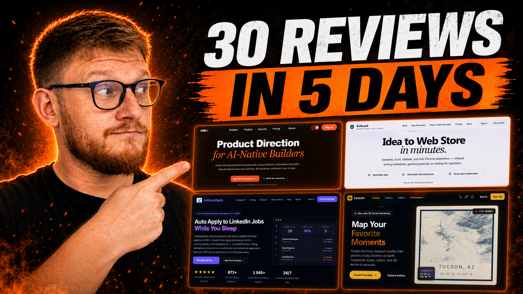
I did 30 video audits across 5 days. Each one a real product, a real founder, a real landing page. And every single one had problems in the same six places.
Important: Screenshots and URLs are from before the audit. You might already see different variants when you visit them.
Your headline doesn't say anything
Real headlines I reviewed this year:
"Product direction for AI native builders."
"Did your AI buiild what you meant?"
"Run your league without the chaos."
"Stop guessing. Build what people actually want."
None of these tell me what the product does. Give yours to a stranger, someone who hasn't heard the pitch, and ask what the product is after three seconds. Nine times out of ten, they can't tell you.
Read this H1 by rismon.ai, would you say it's easy to understand what the product does?
.png)
Your H1 has one job:
combine the problem and the outcome into one line. What changes for the visitor after they use your product? That's what the headline should say.
"Auto-apply to 600 LinkedIn jobs every month."
"Find doctors who accept your insurance."
"Transcribe your audio in 60 seconds."
Each one names a specific outcome. Compare any of those to "AI-powered productivity" or "the future of collaboration." One makes someone sit up. The other gets scrolled past.
The answer is usually already on your page, just buried. One founder I audited had "We scan thousands of daily posts to find the most painful problems across the internet" sitting in paragraph two. That's the H1!
If you're stuck, read your support tickets or Reddit DMs. The language people use to describe their own problem is almost always sharper than anything you'd write from scratch. I broke down the most common landing page headline mistakes separately if you want the full breakdown.
Mero has an awesome product but H1 doesn't say much:
.png)
Nobody can see your product
You built something. You know it works. But the person visiting your page for the first time is deciding whether to trust you, and you've given them a paragraph and an icon.
Show the product. The actual UI. A screenshot. A 30-second screen recording. Something that answers: what am I actually buying?
Across 30 audits I saw the same pattern: founders hiding the product behind a popup ("Watch demo"), a nav dropdown ("Sample report"), or section five after three paragraphs about the problem. One site had a three-minute product video buried under a button. Nobody clicks that.
Put it above the fold. Immediately under the headline. People want to see before they decide. If you haven't built a polished UI yet, a rough Loom still beats nothing. Visuals explain faster than copy. Every single time.
If your product looks messy or incomplete, a well-cropped screenshot of the most useful screen beats an abstract gradient. Show the thing you're most proud of. Annotate it if you need to. One callout arrow beats three paragraphs of explanation.
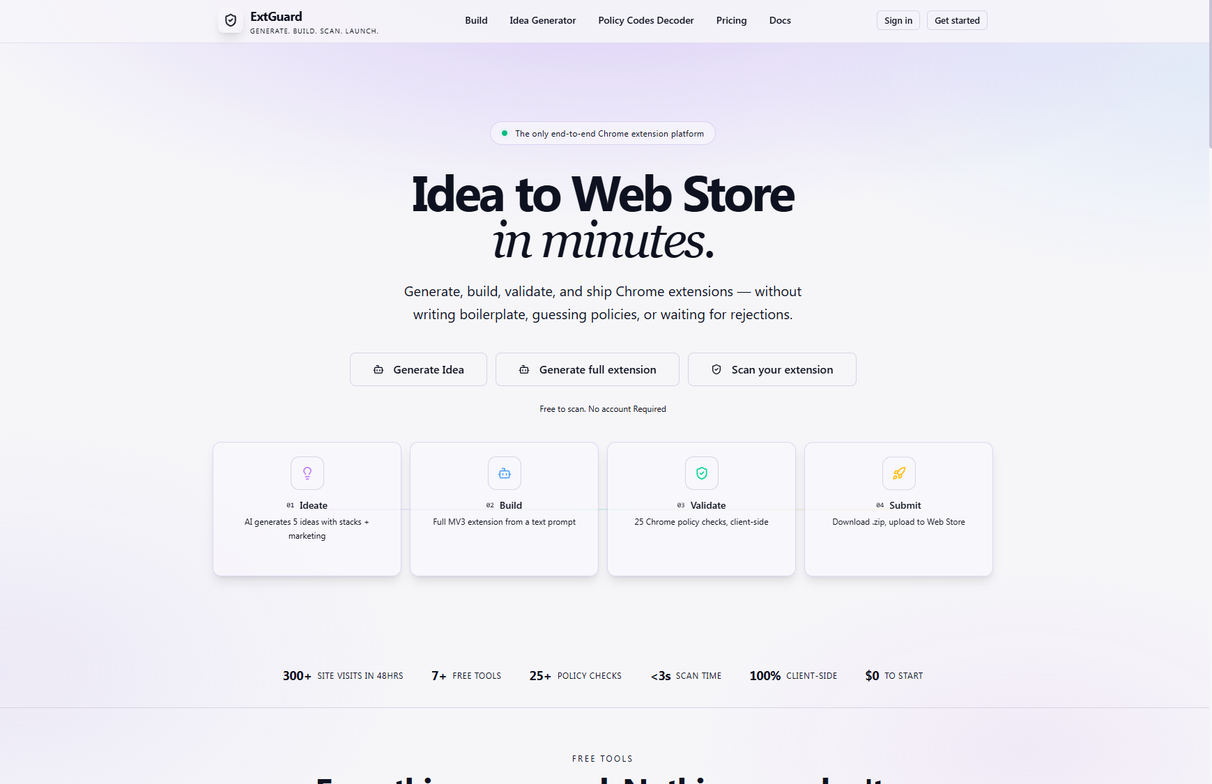
Look at this example by ExtGuard: Where is the product? What am I buying? It's so hard to tell what the product does.
You have too many CTAs
One site I audited had 7 elements that looked like buttons. "Sign in." "Get started." "Launch terminal." "See what's inside." "Start free trial." "Learn more." They all wanted different things, some went to the same page with different copy, and the visitor had no idea what to do first.
So they did nothing.
Your hero needs one primary button. Maybe a secondary. That's it. And the copy matters more than most founders realize.
"Learn more" and "Get started" are the weakest CTA on the internet. It says nothing about what happens after the click. Compare it to something specific:
Build it around a verb and an outcome.
"Find me a remote job."
"Check my content for AI."
"Transcribe this file now."
Something that makes the action obvious without requiring a decision. Two buttons going to the same destination is a bug. Pick one.
If you're running into this, there's a good chance the rest of your page has the same problem.
Try to count how many buttons can you click on:
.png)
You're listing features, not benefits
"Intelligent formatting."
"Universal export."
"Multi-channel delivery."
"300 DPI download."
Founders know their product well, so they describe the mechanism. Visitors care about what changes for them.
"Intelligent formatting" is a feature. "Filler words vanish automatically" is a benefit. "300 DPI download" is a feature. "Print giant wall art without losing detail" is a benefit. Same product. Completely different impact on the visitor reading it.
Go through every line of copy in your hero and ask: what does the visitor actually get from this? What does their work look like after? That answer is your copy. The feature is just the vehicle.
The fastest way to fix this: take each feature and finish the sentence "which means you can..." Whatever comes after that is the benefit. "Intelligent formatting —> which means you can stop editing out your own verbal tics." That's your copy, right there in the completion.
One exception: developer products. Dev tools sometimes need the spec. Even then, one benefit per section does a lot of work before you get into the technical details.
Your social proof is buried or missing
Numbers close deals. Testimonials close deals. Logos close deals. But not if they're sitting at the bottom of the page inside a carousel that three people will ever click through.
Put a number in the headline itself:
"Find 80+ competitions across Ireland."
"Used by 1,200 developers."
"Flagged 40,000 pieces of AI content."
A real testimonial belongs near the top, near your CTA, not in a slider below the fold.
Stop doing carousels for testimonials. You're hiding your best evidence in a slide deck that requires patience nobody has.
No customers yet? Use the founder story. Why you built it and for whom. A real paragraph about why this product exists earns more trust than a fake "10,000+ happy users" badge from a company that launched three weeks ago.
What matters most is placement. Someone who's almost ready to click, then sees "Trusted by 130+ seed-stage teams" that's often the signal that tips them over. Social proof placement is its own post, but the short version: put it as close to your CTA as possible.
Great social proof done by: https://jobeasyapply.com/
.png)
The hero is doing too much
I've audited pages with custom cursors, ambient sound, light/dark mode toggles, animated globes, floating cards, five competing CTAs, and a sticky nav trying to be both product nav and marketing nav at the same time. All of it fighting for attention at once.
The job of the hero is one thing: make the visitor understand what you do and want to keep scrolling. That's the entire job.
Strip it back. One headline. One subheading. One CTA. One product visual. If an element doesn't help the visitor decide, cut it. Custom cursors don't convert. Ambient sound doesn't convert. The dark mode toggle won't save you.
You can always add things back later. Right now, less is the fix.
.png)
What a fixed hero looks like
Here's the same product, before and after applying every fix above.
[IMAGE: Before/after comparison of a full SaaS hero section redesign. Before: generic feature headline, stock visual, two competing CTAs, no social proof above fold. After: specific outcome headline, real product screenshot, single CTA with benefit-led copy, social proof line directly above the CTA. Alt text: before and after comparison of a SaaS hero section showing the six fixes applied]
Same product. Same layout. Different first impression.
The "after" version answers all three questions in under 5 seconds: what is this (fixes status update overhead), who is it for (seed-stage engineering teams), why should I care (3 hours a day is a lot to lose). That's what you're going for.
Real example from a founder who requested landing page audit:
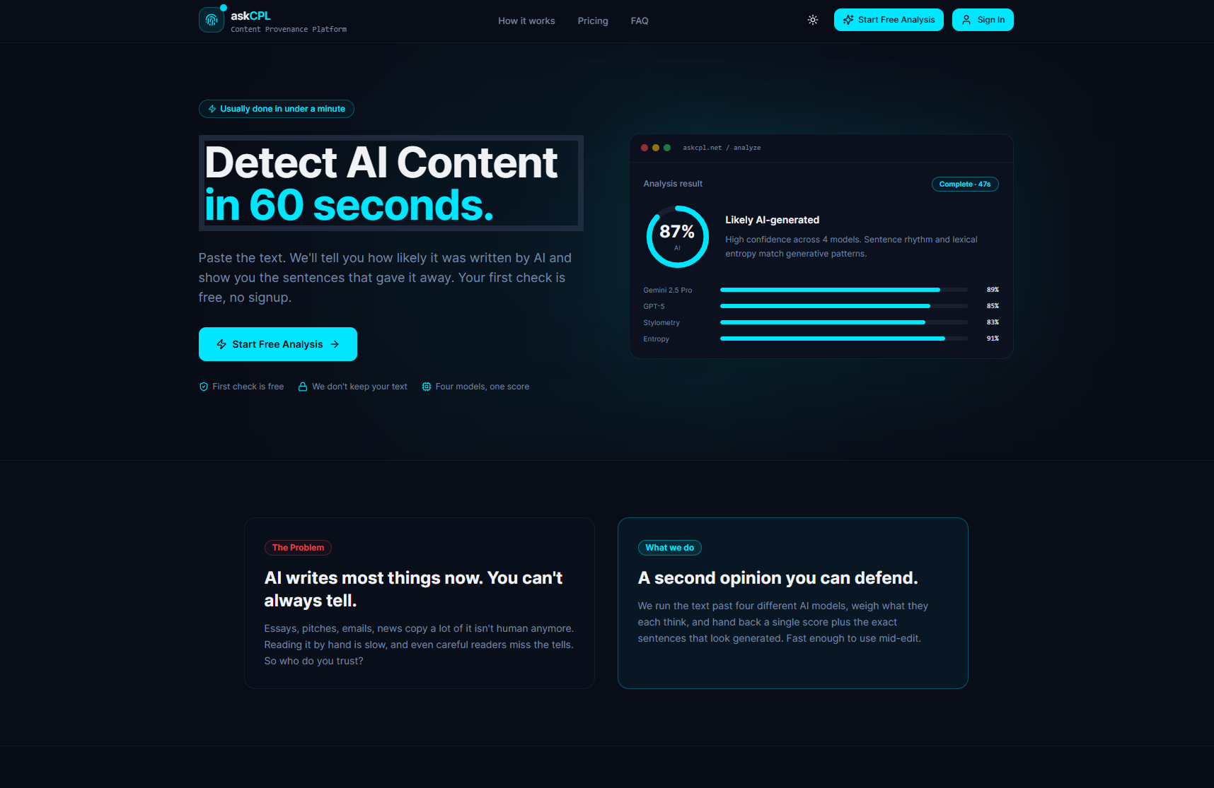
askCPL before
Text heavy with lot of buttons. It's hard to tell what should I focus on. All I see is a chunk of text.
askCPL after:
What an improvement! Visual clarity is fixed. Text is easy to red. Graphics support the core idea + before and after section strengthens the hero section. Well done!
The 5-minute audit you can run right now
Open your landing page. Cover the logo. Give it to someone who doesn't know your product and ask them to explain what it does in one sentence.
If they can't, your hero is broken.
If they can but they describe a feature instead of an outcome, your headline needs rewriting.
If they get it but they're not sure who it's for, your subheadline needs more specificity.
That's the audit. Five minutes. Most founders skip it. Do it today before you spend another dollar on ads.
Any statistics cited in this post come from third‑party studies and industry reports conducted under their own methodologies. They are intended to be directional, not guarantees of performance. Real outcomes will depend on your specific market and execution.
What's the most common hero section mistake founders make?
Leading with the feature, not the outcome. "AI-powered workflow automation" describes what the product is. "Your engineers lose 3 hours a day to status updates" describes what the visitor feels. Visitors don't care about the mechanism until they're convinced the outcome matters. Lead with the outcome every time.
How long should a SaaS hero section headline be?
Short enough to read in under 2 seconds. Six to twelve words is the working range. The goal is clarity. If it takes more than one read to understand, it's too long or too vague. A longer headline isn't automatically a problem — but in practice, most long headlines have padding that makes the real point harder to find.
Should I use a screenshot or a video in my hero section?
A screenshot is safer and faster. Most visitors won't hit play on a hero video. A static product screenshot, cropped to show the most useful screen, loads instantly and tells the story without asking anything from the visitor. If you do use a video, make it autoplay, muted, and under 30 seconds. A three-minute product demo buried under a button gets clicked by almost nobody.
How many CTAs should I have above the fold?
One primary CTA, one secondary at most. Two buttons competing for attention force a choice, and choices create friction at exactly the wrong moment on the page. Decide what your single most important conversion goal is right now (signups, demos, waitlist), commit to that CTA, and put the secondary option in the nav or below the fold.
How do I add social proof if I have no customers yet?
You don't need logos. Use any signal that reduces perceived risk: a waitlist number, a quote from a beta user, a press mention, the founder's background ("built by ex-Stripe and Notion alumni"), or the number of people who've signed up. Early-stage social proof is about trust, not volume. One specific, real proof point beats a vague "trusted by teams worldwide" badge from a company with zero public reviews.