

Product designers learn color by copying things that look good. That works for a long time.
Then a client asks you to explain a decision, or you hand a palette off and watch it fall apart across 50 screens, or a second designer joins and starts picking their own shades. Taste stops being enough the moment the work has to be consistent, explainable, or built by more than one person.
Start with HSL
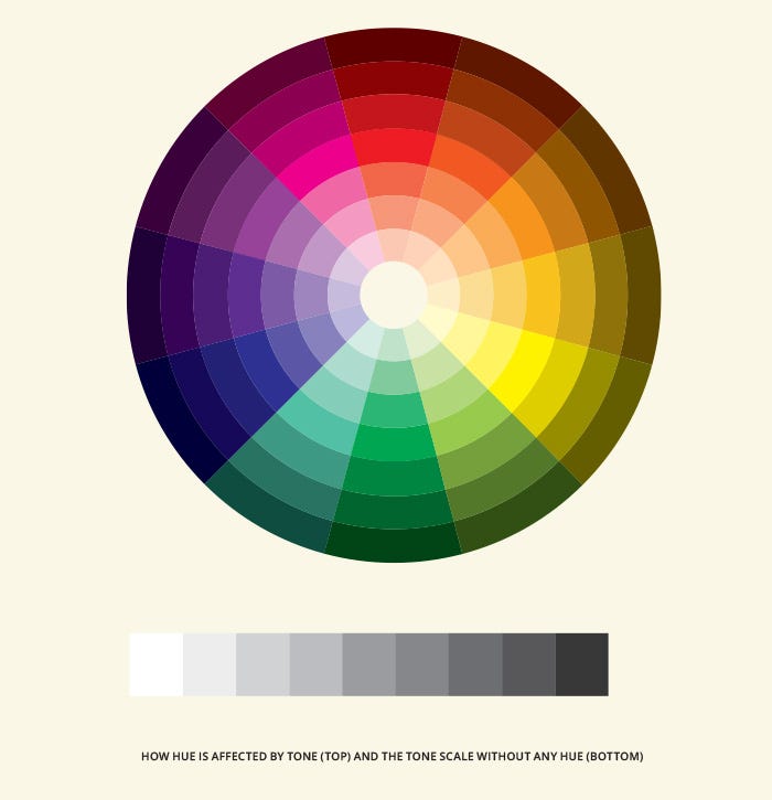
HSL is the human-readable format for color. Three numbers: hue, saturation, lightness.
Hue is the color itself, expressed as a degree on a 360-degree circle. Red is 0. Green is 120. Blue is 240.
Saturation is how vivid. 0% is grey. 100% is the most vivid possible version of that hue.
Lightness is how light or dark. 0% is black. 100% is white.
#3B82F6 tells you nothing useful. hsl(217, 91%, 60%) tells you: a vivid, medium-light blue at 217 degrees. Now you can reason about it. Want a lighter version? Increase lightness. Want it more muted? Drop saturation. Want it warmer? Shift the hue toward red by 10-20 degrees.
Figma shows both formats. Start looking at the HSL values on every color you pick. Within a week it changes how you work.

That said, HSL has a real weakness worth knowing about. Its lightness values don’t correspond to perceived brightness. Yellow at L50% and blue at L50% don’t look equally bright to the human eye. Yellow reads significantly brighter. When you’re building semantic colors (error, warning, success, info) that should feel visually equal, this creates a consistency problem HSL can’t solve on its own.
OKLCH matters for serious color work
OKLCH (Lightness, Chroma, Hue) was created in 2020 by Björn Ottosson to model how humans actually perceive color. Its lightness axis is perceptually uniform: equal numeric steps produce equal perceived differences. Same intuitive axes as HSL, with the perceptual accuracy HSL lacks.
Chroma in OKLCH is similar to saturation but behaves more predictably across the full lightness range. The key difference is the L: when you set all your semantic colors to the same lightness value in OKLCH, they actually look the same visual weight in the UI.
Tailwind CSS v4, released in January 2025, switched its entire default palette from RGB to OKLCH for exactly this reason. The new Tailwind colors are built around perceptual uniformity. The visual step between each shade looks consistent across every color family.

Figma doesn’t support OKLCH natively yet. You need a plugin or an external tool like oklch.com to convert values and build scales. Worth knowing if your engineers are working in Tailwind v4 or writing CSS with OKLCH values and you’re still handing off HSL. The colors can look different than intended once the conversion happens.

Tonality
Tonality is the temperature of a color: warm or cool. It’s the thing that separates a palette that feels coherent from one that feels slightly off without you being able to say why.
When the dominant tone in an interface is warm but a few elements use cool neutrals (cool grey body copy on a warm off-white background, for example), the result is subtly unsettling. Each choice looks fine on its own. Together they conflict.
The rule: pick a temperature and apply it everywhere. If the product runs warm, every neutral should run warm. Tailwind’s stone palette is warm-leaning. slate is cool-leaning. zinc sits closer to pure neutral. Pick one family and don't mix.
A practical trick for subtle fills and hover states: instead of declaring a new color, use your primary neutral at around 10% opacity. At that opacity it picks up the temperature of whatever’s behind it automatically. One less color to maintain, and tonal consistency handles itself.
How to build a product color palette
A product palette has 3 parts: a brand color scale, a grey scale, and semantic assignments. In that order.
Brand color scale. Pick one primary hue. Build 9 shades, named 50 through 950 (following Tailwind’s convention). The lightest shades are backgrounds and tints. The middle shades are interactive elements and primary actions. The darkest shades are for text or deep decorative use.

To build the scale: fix your hue, then vary lightness and chroma across 9 steps. Chroma peaks in the middle and tapers toward both ends. The 500 shade should be the most vivid version. The 50 shade is nearly white. The 950 shade is nearly black.
Shade-building trick: when you simply decrease lightness to make darker shades, the result often feels muted and flat. A better approach: shift the hue slightly and increase chroma as the color gets darker. The darker shades end up feeling rich rather than dead. When you look at a color palette and think “that just looks expensive,” this is almost always what’s happening under the hood.
Semantic colors. For error, warning, success, and info states, use the same lightness and chroma pattern from your brand scale. Just change the hue. Error might be H: 25 (orange-red). Warning might be H: 85 (yellow). Success might be H: 145 (green). Info might be H: 210 (blue). Because they share the same lightness structure, they feel visually equal. No single state looks more urgent than another by accident.
This approach works most cleanly in OKLCH, where lightness is perceptually uniform. In HSL, you’d need to manually compensate for the fact that yellow at L60 and red at L60 don’t look the same brightness.
Grey scale. Build it the same way: 9 shades, same naming. Slightly warm greys (hue shifted 20–40 degrees toward orange or yellow) feel more human. Slightly cool greys (shifted toward blue) feel more technical. Pick one direction and commit.

Semantic assignments. Decide which shade of each color does each job and write it down. blue-600 is the primary button. blue-100 is the selected state background. gray-700 is body text. gray-400 is placeholder text. Without this, every designer picks a different shade for every interaction state.
Dark mode color decisions
If you’re building a dark mode, the common mistake is inverting the light mode palette. That produces values that feel harsh or overly saturated on a dark background.
Colors appear more saturated in dark mode than in light mode at the same chroma value. The fix: narrow the lightness range and lower chroma overall for your dark mode scale. The colors look less vivid in Figma but more calibrated in the actual product. Design the dark mode scale separately rather than flipping the light mode one.
What color means in a product
Color in a product is a communication layer. Every color is saying something to the user. When those messages conflict, users have to think. That’s a problem.
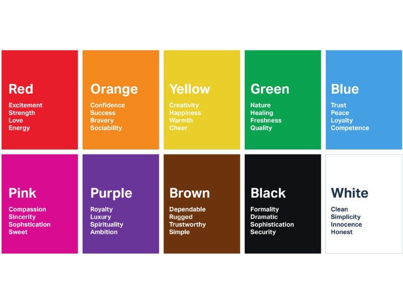
The conventions most users carry from every other product they’ve used:
- Blue: interactive, actionable, links
- Green: success, confirmation, positive state
- Red: error, danger, destructive action
- Yellow or orange: warning, in-progress, caution
- Grey: neutral, disabled, secondary information
Violating these without a reason adds friction. A red “Submit” button next to a red “Delete account” button forces users to read more carefully to figure out which action is destructive. A green badge in a place where green means nothing specific makes users pause to interpret it.
The practical decision: your brand color might not be the right color for your primary CTA. If your brand is red, you need to decide what red means in the UI. Action, or danger? It can’t mean both on the same screen. Some products solve this by making the primary button a neutral dark color and saving the brand color for decorative use. The only indefensible choice is letting the same color carry two meanings at once.
The 60–30–10 rule in product UI
This comes from interior design but maps directly to screens.
60% of the visual space is neutral: backgrounds, surfaces, containers. Your grey scale handles this. The user barely registers it, which is the point.
30% is secondary: borders, dividers, secondary text. Still grey territory but with more visual presence.
10% is accent: brand color, primary action states, status indicators. The things that draw the eye.
10% sounds small. It’s the right amount. When a product feels visually noisy, it’s almost always because the 10% has crept to 25% or more. Every card has a colored border. Every section has a tinted background. Every label runs in the brand color. The signal disappears because everything is signal.
Open Linear and look at how much of the UI is grey. The color (purple for tags, green for status, blue for selections) lands with weight precisely because most of the interface doesn’t use any.

Gradients and blending modes
Two things most designers skip that make a real difference at the detail level.
Gradients. CSS gradients by default travel through linear color space. When the two end colors sit far apart in hue, the path between them goes through muddy browns and greys. A simple fix: add in oklch to your CSS gradient syntax. This routes the gradient through perceptual color space, producing richer and more dynamic transitions. For overlay gradients (a dark fade over an image, for example), equal-step gradients leave a visible horizon line where the fade stops. The fix is easing the gradient using a smoothstep curve so the stops aren't equally spaced. Andreas Larsen's easing-gradients tool generates the stops for you without writing the function from scratch.
Blending modes. Plus-Lighter is worth knowing for foreground elements on colored backgrounds. White at 50% opacity with Plus-Lighter reads significantly more vivid and saturated. The blending mode interacts with the background color to produce the result rather than just overlaying flat opacity. Plus-Darker is the inverse: useful for dark elements on colored backgrounds. When you see a UI with unusually rich, vibrant coloring at low opacity values, blending modes are almost always involved.
Contrast ratios
WCAG contrast ratios are the one part of color work with a hard pass/fail. Worth knowing cold.
The middle shades of most color scales (roughly the 400 range) are the hardest to hit contrast requirements with. They’re neither light enough to use as backgrounds nor dark enough to use as text. Most designers find uses for them anyway. That’s usually where failures show up.
Tools: Figma’s built-in accessibility check, the Stark plugin, or WebAIM’s contrast checker. Run every text-on-background pairing before handoff. Finding a failure after engineering has implemented the design wastes everyone’s time.
The mistakes that give you away
Using brand color as text on a colored background. Shows up most in hero sections. Almost never passes contrast.
Hardcoded hex values on individual components. Build the scale once. Reference tokens everywhere. The moment you set a hex directly on a component, you’ve created a maintenance problem every future designer will inherit.
Too many semantic meanings for the same color. If blue means “primary action,” blue cannot also mean “informational badge,” “link,” “selected state,” and “brand highlight” all at once. Pick one semantic role per color. Use shade variants for the rest.
Missing disabled state colors. Designers define active, hover, and focus. They forget disabled. Engineers invent it. It looks different on every component.
Tonal mismatch between sections. Warm hero background, cool grey body text, neutral button fill. Each element fine on its own. Together they feel unsettled. Pick a temperature and apply it everywhere.
Building the palette on a Mac retina display and never checking on Windows. Colors look more vivid on retina. A rich warm blue on your MacBook Pro can look washed out on a standard monitor. Check on a non-retina screen if you can.
Any statistics cited in this post come from third‑party studies and industry reports conducted under their own methodologies. They are intended to be directional, not guarantees of performance. Real outcomes will depend on your specific market and execution.
Do I need to know formal color theory to be a good product designer?
No, but you need a framework for making consistent, explainable decisions. Formal color theory (pigment mixing, simultaneous contrast, the Munsell system) is interesting background knowledge that rarely comes up in product work. What does come up: understanding HSL and OKLCH, building systematic palettes, knowing what contrast ratios to hit, and understanding what each color communicates in a UI context. You can learn all of that without taking a single art class.
How many colors should a product use?
As few as possible. For most early-stage products: 1 brand color scale (9 shades), 1 grey scale (9 shades), and semantic tokens for error, warning, success, and info. That's around 40 color values covering every real scenario. Extra colors are almost never justified by extra complexity. Each additional color needs a clear semantic role. If you can't name the role, cut the color.
What's the difference between a color palette and a color system?
A palette is a set of colors. A system is what those colors mean and where they're used. Most early-stage products have a palette and no system. The palette looks fine in Figma, but inconsistency shows up in the product because nobody decided what blue means in relation to purple, or which grey is for disabled versus placeholder text. The system is the decision layer on top of the palette. It's what makes the palette usable across a team and across time.
Should I use HSL or OKLCH when building my color palette?
Both serve different purposes. HSL is great for reasoning about individual colors. It's more intuitive than hex, and Figma supports it natively. OKLCH is better for building systematic palettes where multiple colors need to feel visually equal (like semantic states). Tailwind v4 uses OKLCH for its palette. If you're working on a design system with semantic colors and dark mode support, building your scale in OKLCH using a tool like oklch.com gives you a more perceptually consistent result than building in HSL and guessing at the adjustments. For everyday single-color work, HSL is fine.
How do I know if my color palette is accessible?
Test every text-on-background pairing against WCAG contrast ratios. The minimums are 4.5:1 for normal text and 3:1 for large text and UI components. Figma has a built-in check under the Inspect panel. The Stark plugin goes further and can audit an entire frame at once. WebAIM's contrast checker is free and takes 10 seconds per pairing. Run these before any design goes to handoff. OKLCH's perceptually uniform lightness makes it easier to predict which pairings will pass before you test, but you still need to verify the actual numbers.