
A form is the highest-intent moment in your product.
The user has already decided to try. They clicked the CTA, they navigated to signup, they're ready. Your job now is to not get in the way. Yet most forms manage to lose people anyway. Not because of broken validation or missing fields, but because of a dozen small decisions that nobody ever wrote down.
This is every one of those decisions.
Labels
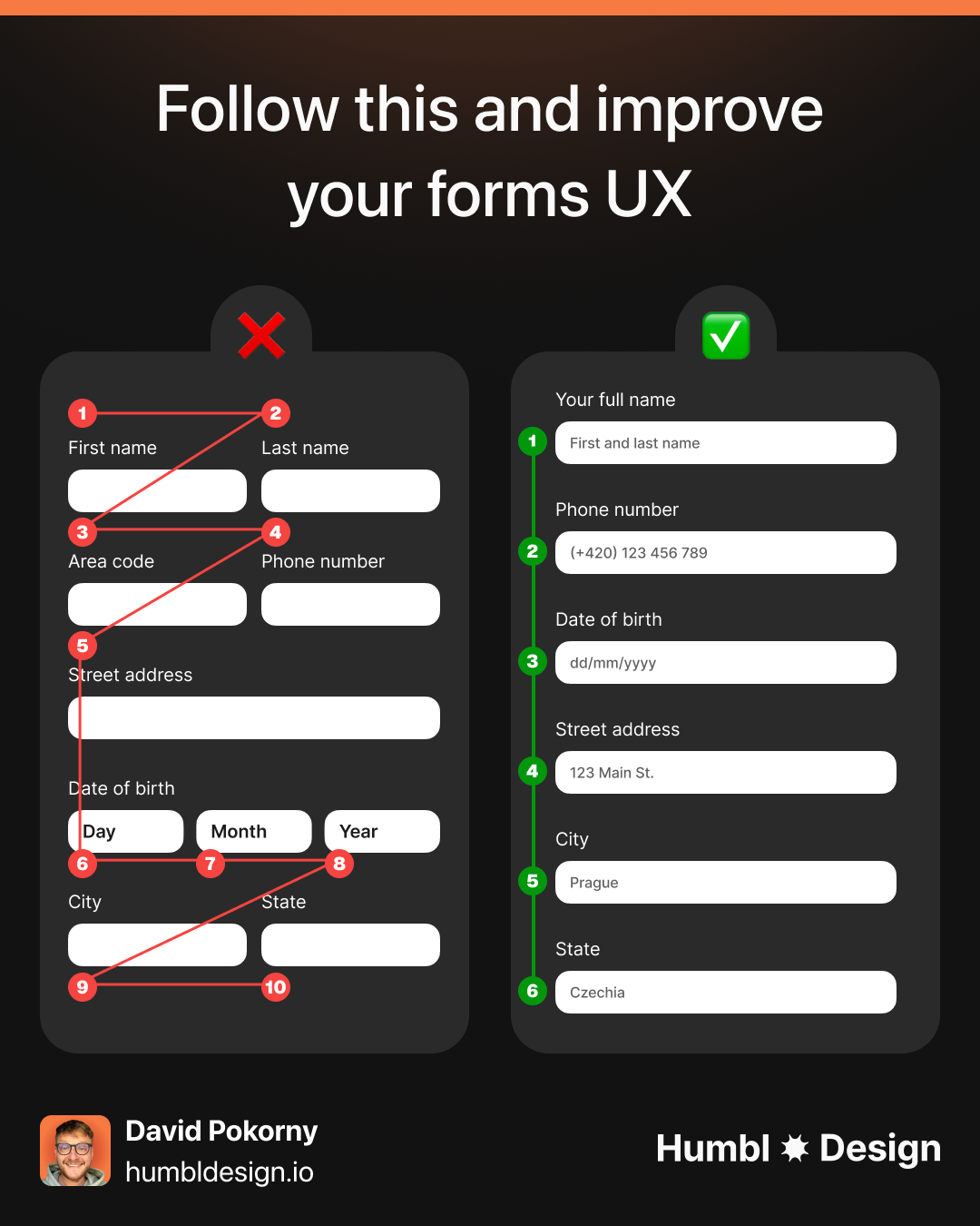
Top-aligned labels. Always. The label sits above the field, left-aligned, persistent. It never moves, never disappears, never gets confused with placeholder text.
Left-aligned labels (label on the left, field on the right) were popular a decade ago because they reduced vertical height. Eye-tracking studies from Nielsen Norman Group showed they create a broken scan path: users have to zigzag between label and field instead of reading straight down. Use them only when horizontal space is specifically the constraint.
The label is not optional just because you've added placeholder text. Placeholder text disappears the moment someone starts typing. The user now has to clear the field to remember what you asked. On mobile this is worse because the keyboard covers half the screen. Password managers skip fields with no proper label. Screen readers depend on a <label> element with a matching for attribute. Labels are not decorative. They're infrastructure.
Placeholders
Placeholder text has one job: to show an example of valid input.
"john@company.com" in the email field. "+1 (555) 000-0000" in the phone field. "e.g. 10,000" in the monthly revenue field. These help users understand the expected format without reading instructions.
What placeholder text is not for: labeling the field. "Enter your email" as placeholder text means the user has no idea what's in the field the second they start typing. Every usability test on this pattern shows confusion. Drop it.
Placeholder text should also be visually lighter than user-entered text. Low contrast (usually around 40-50% opacity on the base text color) signals "this goes away." If your placeholder text looks too much like filled-in data, users skip the field thinking it's already answered.
Inputs
A zip code is 5 characters. A field for it shouldn't stretch 400px across the screen.
Input width signals expected input length. A narrow field says "short answer." A wide field says "there's room for more." When the field width doesn't match the answer length, users second-guess themselves. Is my ZIP code supposed to be longer? Did I misunderstand the question?
Common widths by field type:
- Full name, email, company: full-width or 2/3 width
- Phone number: medium width (roughly half the form)
- Zip/postal code, CVV, expiry: narrow (3-5 characters)
- City: medium. State/province: short dropdown.
On mobile, full-width is fine for almost everything. The screen is the constraint.
Required vs optional
Most forms asterisk every required field. If 9 out of 10 fields are required, you've added asterisks to 9 fields for no reason. The 1 optional field is the one that needs to be called out.
The rule: mark whichever group is smaller. If the form is mostly required, add "(optional)" to the exceptions. If the form is mostly optional (like a profile enrichment form), asterisk the required ones.
Never leave it unmarked. A field with no indicator forces the user to guess. They'll either fill in everything to be safe or skip things and get hit with a validation error. Both outcomes are worse than just labeling it clearly.
Field order and grouping
The order of your fields should follow the order of natural conversation, not the order that was easiest to build in your database.
First name before last name. Name before email. Email before password. Billing address after payment details, not before (people want to know if their card works before they type out their full address).
Group related fields together with visual separation: whitespace, a divider, or a subtle section label. Shipping details in one block. Payment details in another. Personal info in a third. Users process grouped fields faster because they can chunk the work: "I've done the address part. Now I'm on payment."
Fields that belong together should sit together in the DOM too, not just visually. Screen readers announce fields in source order. Visual grouping that contradicts source order creates an inconsistent experience for keyboard and screen reader users.
Validation timing
When does your error message appear? The answer changes how the form feels to use.
On blur is the default for almost every field. The exception: password strength indicators can update as the user types because that's feedback they're actively looking for, not an error. Confirmation fields (password confirmation, email confirmation) should validate on blur against the previous field, not on keystroke.
On submit validation should still happen as a final check. But don't make it the only validation. It's the net, not the wall.
Error messages
Error messages tell users what happened. Good error messages tell users what to do next.
"Invalid input" is not an error message. It's an error code wearing a human face. The user knows something is wrong. They don't know what or how to fix it.
Here's what good error messages look like:
Error messages belong directly under the field that triggered them, not at the top of the form. When a user sees an error at the top, they have to map it back to the field. That's work. Put the message where the fix needs to happen.
Mark the field visually too: a red border is the convention, and conventions are your friend here. Users have seen this pattern. Don't break it to be different.
Focus states
WCAG 2.4.11 (Level AA since WCAG 2.2) requires a visible focus indicator. The minimum: an area equal to the perimeter of the component, with at least 3:1 contrast ratio against adjacent colors.
In practice, a 2px solid brand-colored outline with 2px offset passes in most contexts. Test it on the actual background colors your form sits on. Light brand colors on white backgrounds can fail the contrast check. When in doubt, use a dark outer ring plus a white inner ring. That combination passes against almost anything.
Never set outline: none without replacing it with something custom. Keyboard users navigating your form with Tab need to see where they are. Removing the browser default focus ring without a substitute is an accessibility failure and a WCAG violation.
Submit button
Three things about submit buttons that most forms get wrong.
Copy. "Submit" is not copy, it's a default. What does submitting actually do? "Create your account" is better than "Submit." "Get my free audit" is better than "Submit." "Book a call" is better than "Submit." Write the outcome, not the action.
States. The button needs a loading state. When a user clicks submit, the form is processing. The button should disable immediately (to prevent double-submission) and show a loading indicator. Lock the button width first: swap the text for a spinner without the button resizing. Layout shift on a form submit feels like something broke. After success, either redirect or show a success state in the button itself before redirecting.
Position. Left-aligned on single-column forms. Centered on two-column checkout flows. Full-width on mobile. Never right-aligned: it breaks the natural reading path and users miss it more often than you'd expect.
Pro tips
Two attributes that most forms get wrong because they're invisible in design tools but very visible in production.
Input type. type="email" brings up the @ keyboard on mobile. type="tel" brings up the number pad. type="number" for numeric input. type="password" for password masking with show/hide. type="date" for date pickers (though custom components often look better). These aren't just semantic. They change the keyboard a mobile user sees. Getting them wrong means typing a phone number on a QWERTY keyboard.
Autocomplete. autocomplete="email", autocomplete="given-name", autocomplete="cc-number". When autocomplete attributes are set correctly, browsers and password managers can fill the form automatically. When they're missing or wrong, users type everything manually. Checkout forms with incorrect autocomplete values have measurably higher abandonment rates. Ship the attributes.
Any statistics cited in this post come from third‑party studies and industry reports conducted under their own methodologies. They are intended to be directional, not guarantees of performance. Real outcomes will depend on your specific market and execution.
How many fields should a form have?
As few as required to complete the action. Every field you add is friction. The test: could you move this field to later in the onboarding flow, after the user is already activated? If yes, remove it from the initial form. Typeform's data shows that form completion rates drop by roughly 11% for every additional field above 3. The exception is checkout: users expect to fill in payment and shipping details. The bar for necessity is lower there, but "do we need fax number?" is still a question worth asking.
When should I use multi-step forms?
When a single-screen form would require more than 6-8 fields and the fields fall into distinct logical groups. Multi-step forms reduce perceived complexity by showing one group at a time. They also allow you to progress-bar the experience, which increases completion rates on longer forms. The tradeoff: more steps mean more opportunities to abandon. Keep steps clearly labeled and always show progress. If the form is 3 fields and you're considering multi-step for aesthetic reasons, don't.
Should inline validation show green for valid fields?
Yes, but only after the user has left the field. Showing a green checkmark as the user finishes typing a valid email signals "this is done, move on." It reduces the cognitive load of tracking what's complete. The mistake is showing green too eagerly. A green checkmark on a half-typed email address is wrong. Validate on blur, then show green if valid, red with a specific message if not.
What's the right approach for long forms like loan applications?
Progress indicators and section headers are critical. Users need to know how much is left, not just what's next. Save progress automatically if the form might take more than a few minutes. Losing a half-completed loan application is one of the most abandonment-inducing experiences in financial products. For very long flows, consider breaking into sessions: let users save and return with a link. This pattern works well in applications where users need to gather documents or information they don't have on hand.
Should the password show/hide toggle always be included?
Yes. The argument against it is usually concerns about shoulder-surfing. But the real security risk is users creating weak passwords because they can't verify what they typed, or resetting their password repeatedly because they can't remember a password they guessed on while typing blind. Show the toggle, visible by default as an icon inside the input, accessible via keyboard. Let the user decide when to show it.