
1. Answer "what is this" before you answer "why it's great"
The first question every visitor asks is: "what am I looking at?"
Most landing pages rush straight past this. They open with a tagline like "The future of work, built for teams" and assume visitors will stick around long enough to piece together what the product actually does.
The hero section has one job on an unknown product: explain what the thing is. One sentence. Plain English. Before you say anything else.
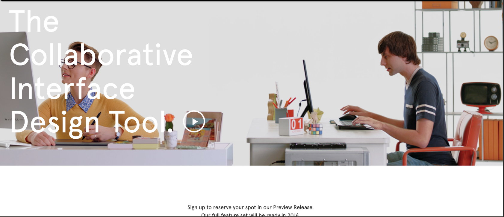
Figma's early landing page did this well. "The collaborative interface design tool." Seven accurate words. A designer landing on that page knew exactly what they were evaluating before they scrolled.
The test I use: read the hero copy and ask "could I explain this product to a non-technical friend in 5 seconds?" If the answer is no, the copy needs a rewrite before anything else gets designed.
On the design side, this means the hero layout has to support the explanation. A clean typographic hierarchy with the product description in a clear H1, a supporting sentence below it, and a CTA after that. In that order. No abstract illustration eating up the visual weight before the visitor even knows what they're looking at.
2. Borrow familiarity with an analogy
Humans understand new things by comparing them to things they already know. When Slack launched, the pitch was essentially "email for teams, but real-time." When Notion launched, it was "a doc that's also a database." Neither description is technically complete. Both are useful.
An analogy has one job: get the visitor to a working mental model fast. The structure is simple: "[Known thing] for [specific use case]" or "[Known thing], but [the key difference]."
A few things to watch:
- The known thing has to be genuinely well-known, not just well-known inside your industry
- The difference has to be the actual value, not a feature detail
- One analogy is enough. Two creates confusion.
I see a lot of early-stage AI product pages get this wrong. They write "AI-powered [category]" as if "AI-powered" is the explanation. It's not. Every product is AI-powered right now. The analogy still needs to tell the visitor what the product actually does.
If you're using an analogy in the hero section, the supporting visual should reinforce it. If your product is "Loom for onboarding," show it being used for an onboarding walkthrough, not a generic screen recording.
3. Show the product working in the hero
A description of your product is worth less than 5 seconds of your product working.
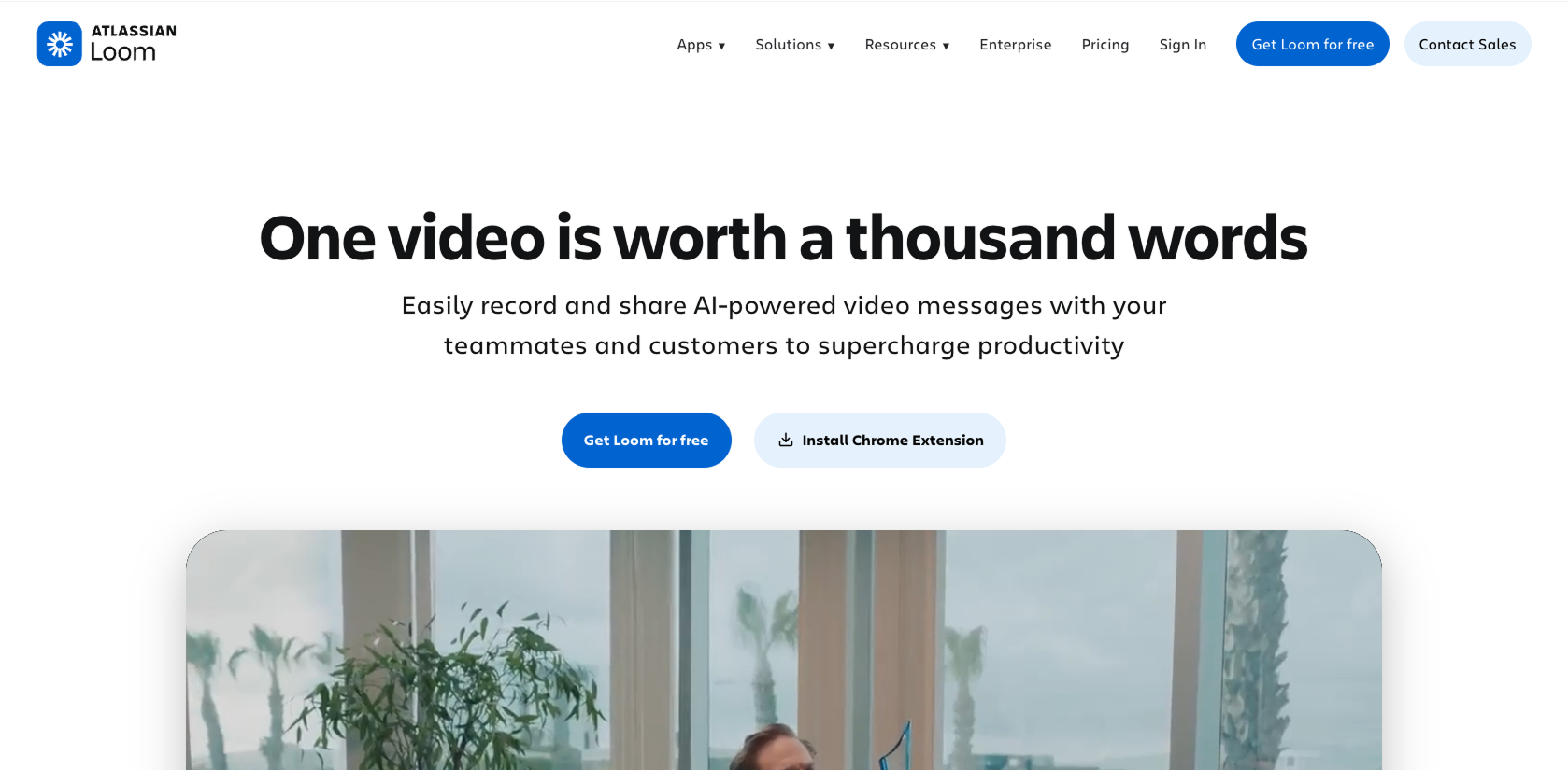
Loom figured this out early. Their landing page embeds a short video showing exactly what recording and sharing looks like. You watch it and think "I could use that." The feature list comes after. The demo closes the gap between "what is this" and "I want to try this" faster than any paragraph of copy can.
For unknown products, the UI in the hero isn't decoration. It's the argument.
The design goal is to make the visitor feel like they've already tried the product once before they click the CTA.
One practical note: if your product has a complex UI, don't show all of it. Pick the single screen or action that best represents the core value. A full dashboard screenshot overwhelms. A specific, annotated view of the thing that matters converts.
4. Design for the skeptic, not the superfan
When you're excited about something you built, it's natural to write copy for people who already want it. The real audience is people who've never heard of you and are skeptical by default.
A skeptic's first question is "why do I need this?" Their second is "is this real?"
Most landing pages for unknown products answer the first question in the hero, then jump to features. They skip the second question entirely.
The second question gets answered by:
- Naming the problem clearly and specifically. "Teams struggle with communication" means nothing. "Your engineers are spending 3 hours a week in status meetings that could be a 2-minute async update" is a claim that makes someone sit up.
- Showing the company knows the problem from the inside. Founder background, domain experience, real numbers from real scenarios.
- Proof that others have tried it. Even a single real quote from a beta user beats six paragraphs of feature copy.
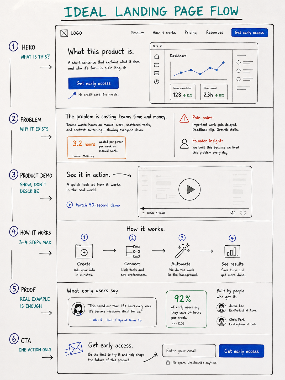
The structure I use for unknown product pages:
- hero (what it is?)
- problem & solution section (why it exists?)
- product demo (what it does?)
- proof (who else use it?)
- call to action (what should I do, if I want to use it?)
In that order. Every section answers the next question a skeptic would ask.
5. Replace customer proof with problem proof
Early-stage unknown products rarely have 50 testimonials. Most have 3 beta users and one investor who believes in the founder.
Substitute customer proof with problem proof.
Problem proof means showing you understand the problem better than anyone else. This can look like:
- A specific stat about the problem's cost or frequency with a named source
- A clear "before state" description that makes your target user think "yes, that's exactly what my team does"
- A founder's background that signals they've lived the problem firsthand
Superhuman launched with a waitlist and almost no public testimonials. The proof on their early page was the claim itself: "The fastest email experience ever made." Specific, audacious, verifiable. It creates curiosity. And curiosity converts better than a carousel of headshots from people nobody's heard of.
On the design side: build the social proof section with flexibility in mind. Start with the founder story and a problem statement. Design placeholders that work at zero social proof and get stronger as testimonials come in.
6. Give visitors one specific next step
Unknown products often have identity crises in their CTAs. "Get early access." "Join the waitlist." "Request a demo." "Start for free." "Learn more." All on the same page, sometimes in the same section.
This is a conversion killer. Pages with a single clear CTA convert 22% better than those with multiple competing actions, and that gap is even wider when visitors don't know what the product is yet.
When a visitor doesn't know your product, they need one clear invitation. The CTA has to match where they are in their awareness. "Start your free trial" is too far down the funnel for someone who just landed and still isn't sure what they're looking at.
Lower-commitment CTAs that work for unknown products:
- "See how it works" (links to a demo)
- "Watch the 2-minute overview"
- "Get early access" with a one-sentence explainer of what that means
Notion's early waitlist page had one field and one button. No nav. No footer. No feature list. Just the single action they wanted visitors to take. It worked because it matched the awareness level: you don't know enough to commit yet, but you're curious. Leave your email and we'll show you more.
Design principle: the less someone knows about your product, the lower the commitment the CTA should ask for.
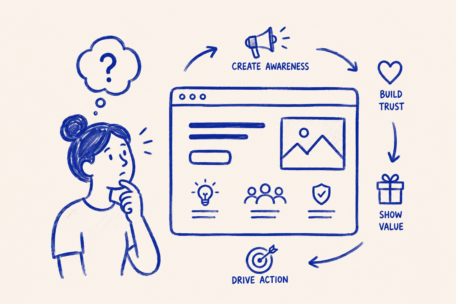
7. Structure the scroll to build understanding
A typical landing page tries to generate desire. An unknown product landing page has to generate understanding first.
The scroll order matters more than any individual section. If a testimonial appears before the visitor understands what the product does, it means nothing. "This changed my workflow" is useless context when the visitor still doesn't know what the workflow is.
This is the sequence I use:
- Hero: what it is, in plain English
- Problem section: why it exists, specifically named
- Product demo: what it does (show, don't describe)
- How it works: 3 to 4 steps, no more
- Proof: even one real example beats none
- CTA: one action, matched to awareness level
The scroll should feel like a conversation: here's the problem. Here's the tool we built to fix it. Here's how it works. Here's someone who tried it. Want to try?
Most unknown product pages fail because they skip from "here's the tool" to "here's why the tool is great" and never explain how it actually works. The "how it works" section is the most underrated section on a new product page. It's where the mental model clicks. Design it with care.
Three to four steps max. Each step names one action, not three. Visuals for each step, even simple ones. This is where you turn a confused visitor into a curious one.
The one thing to get right
Every design decision on an unknown product landing page lives or dies by one question: does the visitor know what they're looking at?
Get that right first. Not the visual polish, not the micro-animations, not the testimonial layout. The explanation. A well-designed page that doesn't explain the product will convert worse than an ugly page that does.
Your first job is to be understood. Everything else builds on that.
Any statistics cited in this post come from third‑party studies and industry reports conducted under their own methodologies. They are intended to be directional, not guarantees of performance. Real outcomes will depend on your specific market and execution.
How long should a landing page be for a product nobody's heard of?
Longer than average. When a visitor has no prior context, they need more information before they'll commit to any action. A 5-section page works for known products. Unknown products typically need 7 to 9 sections: hero, problem, demo, how it works, proof, FAQ, and CTA. Shorter pages assume context that isn't there yet.
Should I use a video or static screenshots in the hero for an unknown product?
A short looping video of the product working beats a static screenshot almost every time for unknown products. The motion creates curiosity and conveys function in a way a screenshot can't. Keep it under 60 seconds, show the core action only, and make sure it plays without sound. If video production isn't feasible yet, an annotated screenshot beats a generic illustration.
How do I write a hero headline for a product with no established category?
Start with function, not aspiration. "The fastest way to [specific outcome]" or "[What it is] for [who it's for]" are both stronger than emotional taglines when the visitor has no frame of reference. Figma's early headline was "The collaborative interface design tool." Not exciting — but clear. Clarity converts when aspiration can't carry the weight alone.
What do I put in the social proof section if I don't have any customers yet?
Problem proof. Show you understand the problem better than anyone. A specific stat about the pain (with a named source), a clear before-state description, or a founder's domain background all work. One real beta user quote, even from a friend in the target industry, is worth more than a polished section of generic claims. Design the section to grow: start lean, add real proof as it comes.
How do I know if my landing page is explaining the product clearly enough?
Run the 5-second test: show someone in your target audience the page for 5 seconds, then ask them to explain what the product does. If they can't, the hero failed. The second test: count how many FAQs you feel you need to add. Every FAQ that answers "but what does it actually do?" is a signal that the page above it isn't doing its job. Fix the page. Don't patch it with FAQs.


