Buttons are the most common component in product design. They're also the most consistently under-specified.
Most teams get the primary button right. The problems show up in the details: the disabled state that looks almost identical to the default, the icon button with horizontal padding tuned for text, the focus ring that fails WCAG contrast, the loading state that causes layout shift.
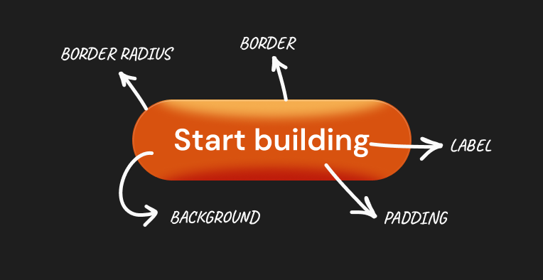
Anatomy
Every button has the same 4 structural elements: the container (background + border + border radius), the label (text), the icon (optional), and the interactive states layer (hover, focus, active, disabled).
The container controls the button's visual weight and size through 3 properties: background color, border, and border-radius. The label controls legibility through font size, weight, and color. The icon, when present, changes the padding rules. And the states layer controls how the button communicates to users. More on that below.
Get the anatomy right and the rest of the specification follows from it. Skip it and you're making individual decisions for every variant with no system underneath.
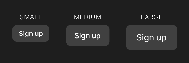
Size variants
Most products need 3 sizes: small, medium, and large. Medium is the default. Small is for compact UIs: table rows, toolbars, inline actions. Large is for hero sections and primary landing page actions.
Heights should be fixed. Padding adjusts the height, but after enough testing on enough products, fixed heights give you more consistent alignment across components.
- Small (32px): 13px font, weight 500, 8px vertical / 12px horizontal padding, 6px border radius. Use for compact contexts: table rows, toolbars, inline actions.
- Medium (40px): 14px font, weight 500, 10px vertical / 16px horizontal padding, 8px border radius. The default for most situations.
- Large (48px): 16px font, weight 500, 12px vertical / 20px horizontal padding, 8px border radius. Use for hero sections and primary landing page CTAs.
Letter spacing: add 0.01em to 0.02em on button labels. It helps them read clearly at smaller sizes and gives labels a slightly more intentional feel than body text. Line height: 1. Buttons are single line, so no extra line height needed.
Touch targets: WCAG 2.5.8 (Level AA in WCAG 2.2) sets a minimum interactive target of 24x24 CSS pixels. WCAG 2.5.5 (AAA) and Apple's Human Interface Guidelines recommend 44x44px. A 32px small button on mobile needs extra spacing around it to reach the 44px touch target. In practice, add 6px of invisible padding around small buttons on touch surfaces, or enforce a minimum clickable area via CSS without changing the visual size.
Color types
Every design system needs 5 button types. They're not visual preferences. Each one has a specific function in the hierarchy of actions on a screen.
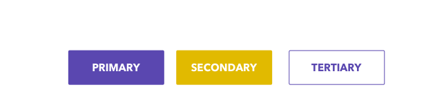
- Primary: filled, brand color background, white label. The one action you most want the user to take. One per screen, maximum. Two primary buttons means no hierarchy. They cancel each other out.
- Secondary: outlined (1-2px brand color border), transparent or very light fill. Important but not the primary action. Often paired with Primary. Can appear multiple times but should never outweigh Primary visually.
- Ghost / Tertiary: no border, no fill, brand color or neutral label only. For low-emphasis actions: back, dismiss, cancel. Use when the action matters but shouldn't compete for attention.
- Danger / Destructive: filled red for primary danger, red outline for secondary danger. For irreversible actions: delete, remove, revoke. Match the visual weight to the consequence: Primary Danger for high-impact actions, Secondary Danger for lower-stakes but still destructive ones.
- Link: looks like a hyperlink, no box, underline on hover. Use inside body text or when you need an action without a visible container.
One common mistake: using Primary Danger for every destructive action. "Archive" is not the same risk level as "Delete account." Archive should be secondary or ghost. Delete account should be primary danger with a confirmation modal. The visual weight of the button should match the consequence of the action.
Another mistake: designing ghost buttons that look like disabled buttons. Ghost buttons are an active state. They're low emphasis, not inactive. Make sure ghost button labels have enough contrast against the page background (minimum 4.5:1 for WCAG AA) and respond visibly to hover.
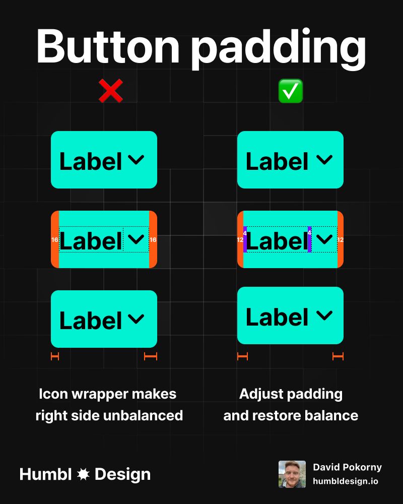
With icon vs without icon: the padding rule
This is the detail that breaks the most buttons in production.
A button with only a text label needs generous horizontal padding. The label is the only visual anchor. Without enough breathing room, it looks cramped. A button with an icon next to the label has an extra visual element on one side that reduces the need for as much padding. Use the same padding for both and one of them will look off-balance.
At medium size (40px height), the four configurations break down like this.
- Label only: 10px vertical, 16px horizontal. The label needs the full horizontal padding to breathe.
- Left icon + label: 10px vertical, 12px horizontal, 8px gap between icon and text.
- Label + right icon: 10px vertical, 12px horizontal, 8px gap between text and icon.
- Icon only: 10px on all sides. Equal padding keeps the button perfectly square.
Why does horizontal padding drop by 4px when an icon is present? The icon adds visual mass on that side. The eye reads 12px of padding next to an icon as equivalent to 16px of padding next to nothing. The total perceived whitespace is similar. Test it yourself: put both side-by-side at the same 16px horizontal padding and the icon version will look like it has too much room on the icon side.
Icon-only buttons must be perfectly square. Equal padding on all sides. At medium size: 10px all around gives you a 40x40 button. This is intentional. It reads as a square action, not like a text button that lost its label.
Left icon vs right icon: these aren't interchangeable.
- Left icon: icon that describes what the button does. "Add" with a plus icon, "Search" with a magnifier, "Filter" with a funnel. The icon and label reinforce the same meaning.
- Right icon: icon that describes how the button behaves. A dropdown chevron (the button opens a menu), an external link arrow (the button leaves the current page), a forward arrow (continue, next step). The label says what, the icon says how.
Don't mix the convention. A "Download" button with a download icon on the right reads as though the button navigates somewhere. Put the download icon on the left, where it describes the action.
Icon sizing: match the cap height of the label text, not the full em square. For a 14px button label (cap height roughly 10px), use a 16px icon. For a 16px label, use a 20px icon. Icons set to the full line height look too large and unbalanced next to text.
States
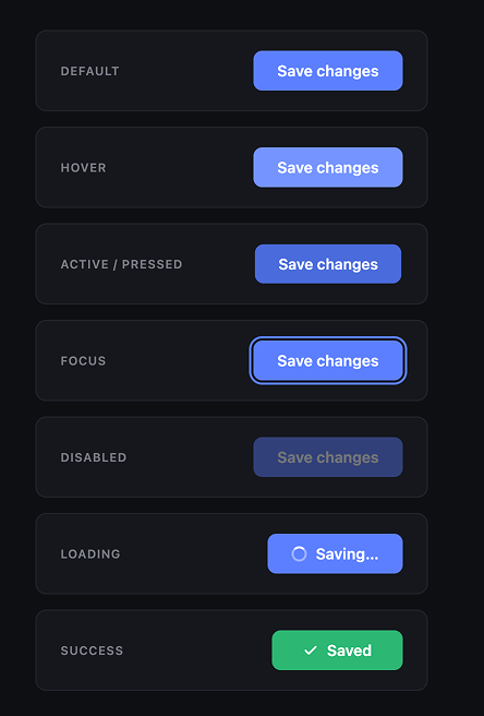
7 states. All of them need to be specified. "Nice to have" is not a category here. Missing states ship as bugs.
Default
Base styles. All the size and color specifications above apply. Nothing interactive has happened yet.
Hover
Triggered when the cursor moves over the button on desktop. Signals that the element is interactive.
Change: reduce the background lightness by 8 to 10% for filled buttons. For outlined buttons, add a very light fill (the brand color at 8 to 10% opacity). For ghost buttons, add a light background (neutral at 8% opacity).
What not to do: change the label color, add an underline, or change the border radius. The hover state communicates interactivity. It doesn't redesign the button. Keep the change subtle enough that the button still looks like itself.
Hover doesn't exist on touch devices. Never put essential information only in a hover state.
Active / pressed
Triggered the moment the user clicks or taps. Brief, usually 100 to 150ms. Provides tactile feedback that the click registered.
Change: reduce background lightness by 15 to 20% (darker than hover), and apply transform: scale(0.98). The slight scale-down simulates physical depression. It's a subtle effect but users notice when it's missing. The button feels unresponsive without it.
Focus
Triggered by keyboard navigation (Tab key) and assistive technology. This state is non-negotiable for accessibility and the most commonly skipped in production.
Requirements: a visible focus ring with at least 3:1 contrast against the surrounding background. The WCAG 2.4.11 (AA) success criterion (introduced in WCAG 2.2) requires focus indicators to have a minimum area of the perimeter of the unfocused component and minimum 3:1 contrast ratio against adjacent colors.
Implementation: outline: 2px solid [brand-color]; outline-offset: 2px; at minimum. A 2px offset ring in your brand color on most backgrounds will pass. Test it. Use the browser's native focus behavior as a fallback. Never apply outline: none without providing a custom alternative.
One more thing: focus and hover look different. Focus should look deliberate and distinct from hover. A focus ring should be obvious to someone navigating by keyboard, not a subtle color shift.
Disabled
The button exists but cannot be activated. Used when preconditions aren't met: required fields are empty, permissions are missing, the action isn't available in the current context.
Change: apply opacity: 0.4 to the entire button. Don't change the color. Don't use a grey button. Maintaining the button's color at reduced opacity tells the user "this is the same action, currently unavailable" rather than "this is a different kind of button."
Add cursor: not-allowed and pointer-events: none. Remove hover and active states. The button should be completely inert.
One hard decision: should you show a tooltip on disabled hover explaining why the button is disabled? Yes, if the reason isn't obvious from the page. A disabled "Submit" button on an incomplete form doesn't need a tooltip. The empty fields explain it. A disabled "Export" button in a dashboard might need "Upgrade to Pro to export data" as a tooltip. Disabled buttons without explanations frustrate users who don't know what they're waiting for.
Loading
The user clicked the button and something is happening. The system is working on it.
Change: replace the label with a spinner, or add a spinner alongside a modified label ("Saving..."). Lock the button's dimensions before swapping the content. If you don't, the button width collapses to fit the spinner and the layout shifts. This is one of the most visible production bugs in form UIs.
How to lock dimensions: measure the button width in its default state, set a min-width equal to that value before the state changes. Or set a fixed width on the container. Either approach prevents the jump.
Disable the button during loading. A user who double-clicks a loading button should not trigger two requests.
Success
The action completed. Confirmation that the system responded.
Change: replace the spinner with a checkmark and a short success message ("Saved", "Done", "Sent"). Return to the default state after 2 to 3 seconds, or leave as success if the action was terminal (form submitted, payment sent).
This state is optional for quick actions but important for anything that takes visible time or has consequences the user can't undo. Submitting a support ticket needs a success state. Toggling a setting probably doesn't.
Common mistakes
Two primary buttons on one screen. This collapses hierarchy. The user sees two things claiming to be the most important action. One of them needs to be secondary, ghost, or moved to a different context.
Disabled state that's indistinguishable from active. If your primary button at 40% opacity still looks like a primary button, users will click it and get nothing. Test your disabled state by looking at the button without context. Can you immediately tell it's disabled?
Focus ring set to none. Keyboard users and screen reader users rely on visible focus. outline: none without a custom replacement is an accessibility failure. WCAG 2.4.11 (AA since WCAG 2.2) requires focus to be visible.
Icon-only button with no accessible label. Screen readers announce button content. An icon with no text and no aria-label announces as an unlabeled button. Add aria-label="[action]" to every icon-only button, and a tooltip on hover for sighted users who don't recognize the icon.
Same horizontal padding for icon buttons and text buttons. Covered in the icon section above. The icon version will look unbalanced with the same horizontal padding. Reduce by 4px when an icon is present.
Loading state with no locked width. If you don't fix the button width before swapping label for spinner, the button jumps in size. Users notice this, especially on forms where the button is near other elements.
Danger button for every irreversible action. Archive, unsubscribe, and disable are not the same risk level as delete account or clear all data. Match the visual weight to the consequence. Reserve Primary Danger for actions that are irreversible and high-impact. Use Secondary Danger or ghost for lower-stakes destructive actions.
Any statistics cited in this post come from third‑party studies and industry reports conducted under their own methodologies. They are intended to be directional, not guarantees of performance. Real outcomes will depend on your specific market and execution.
How many button types does a design system actually need?
5 is the right number for most products: Primary, Secondary, Ghost, Danger, and Link. More than 5 and you're creating visual noise without adding hierarchy. Fewer than 5 and you'll start overloading Ghost with actions it can't carry. Some enterprise products add a 6th type (Neutral/Dark) for specific contexts, but most startups never need it.
Should disabled buttons have tooltips?
When the reason isn't obvious from context, yes. An empty required field explains the disabled Submit button. A permissions restriction doesn't explain itself. Add a tooltip when the user needs to know what to do to enable the action. Skip it when the page already provides the answer.
What's the right icon size relative to button label size?
Match the icon to the cap height of the text, not the full line height. For 14px button text (cap height roughly 10px), a 16px icon is correct. For 16px text, use a 20px icon. Setting icons to match full line height makes them look oversized and heavy next to the label.
When should I use a full-width button?
Inside constrained containers: mobile screens, narrow modals, form footers in sidebars, card actions. On desktop with a wide viewport, full-width buttons read as either lazy layout or an error. The exception is landing page hero CTAs where the button is inside a centered text block and the button width matches the text block width, not the full page width.
Should my hover state use a color change or an opacity change?
Color change is better. Opacity-based hover mixes the button color with whatever is behind it, which means the final rendered color depends on what's underneath. You lose control of the exact hover shade. Adjust HSL lightness directly: darken by 8 to 10% for hover, 15 to 20% for active. You know exactly what color you get.