
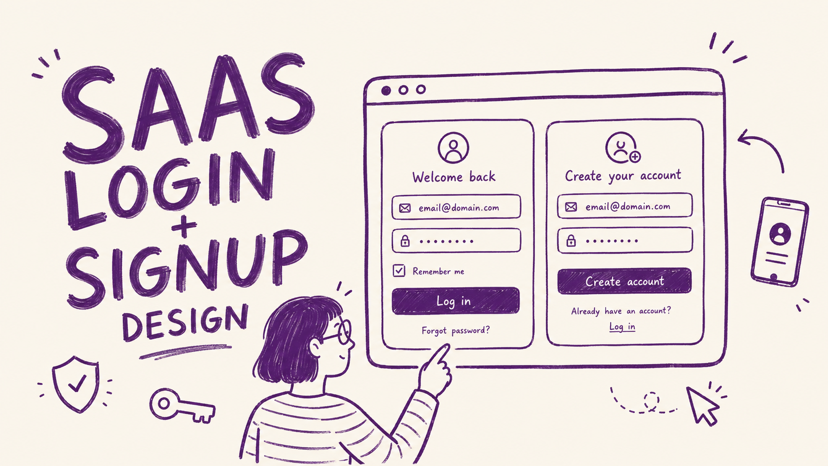
The login page gets designed last. Every SaaS product I've audited, it's the same story: the hero section gets three rounds of revisions, the pricing page gets a week of debate, and the login page gets an hour and a half on a Tuesday afternoon.
Did you know that 64% of users drop off during a typical SaaS signup flow, according to Authgear's 2025 UX guide. Because 7 specific design details created enough friction that they left before they got to see it.
None of these are visual problems. The login page needs to be frictionless. Here's where most SaaS teams get that wrong.
1. The error message says nothing useful
"Invalid credentials." That's the message. The user typed something wrong and the page is telling them in the least helpful way possible.
They don't know if it's the email or the password. They try the same combination again, get the same error, try a variation, get the same error, give up and go to a competitor that lets them sign in with Google.
The fix costs nothing. Tell the user exactly what went wrong.
Separate the email error from the password error. Link directly to the fix from the error message. A user who can't get in and has a clear path to solving it will try again. A user staring at "Invalid credentials" for the third time will close the tab.
2. The "Confirm Password" field is still there
Almost every SaaS signup form still has it. You type your password, then you type it again. If they don't match exactly, you get an error and you don't know which entry is wrong.
Authgear's research flags this as one of the top contributors to form abandonment: redundant fields that add friction without adding value. The "Confirm Password" field exists to prevent typos in password creation. The better solution is a password visibility toggle, which solves the same problem with less friction.
Remove the confirm field. Add an eye icon to toggle visibility on the password field. The user can see exactly what they typed. No second entry required.
If you're genuinely worried about password typos, send a simple "did you set the right password?" email after signup with a one-click reset link. That addresses the rare error case without adding friction to the majority of signups.
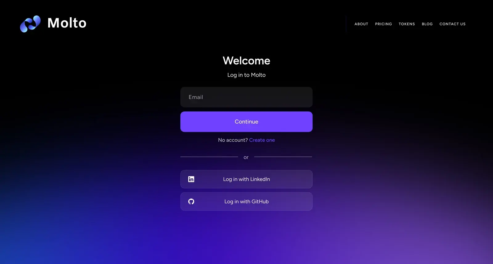
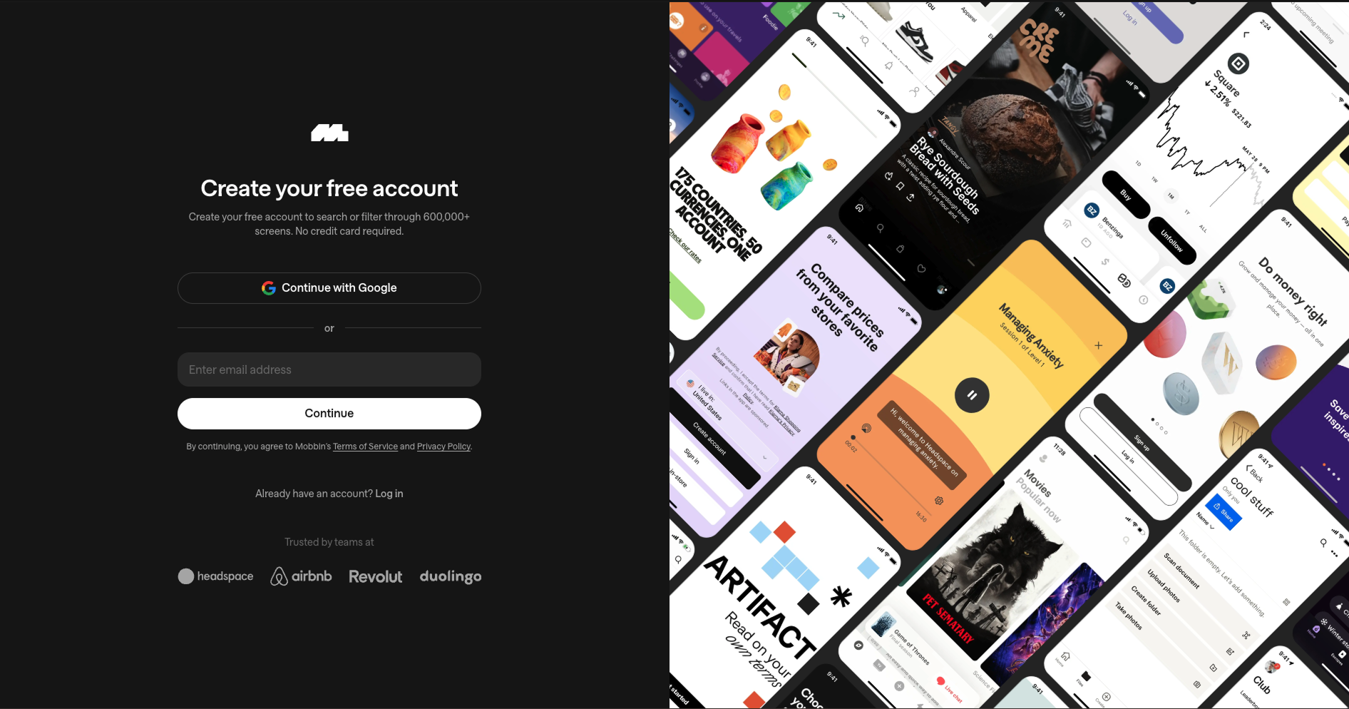
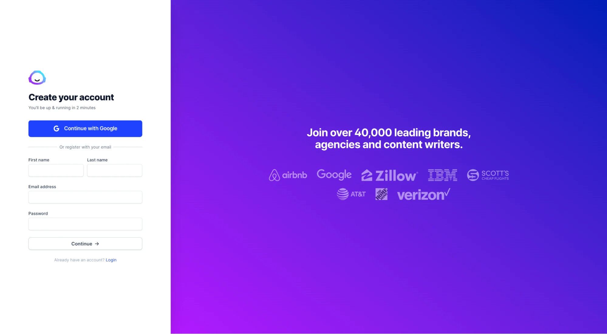
3. No social login option
For most SaaS tools, the fastest path to activation is one click. "Continue with Google" takes 3 seconds. Creating a new email and password takes 90 seconds and introduces four separate opportunities to make a mistake or get interrupted.
Google and GitHub authentication dramatically reduce friction for the primary audiences of most SaaS products: founders, developers, and startup teams who are already signed into Google all day. UXPin's 2024 login design guide specifically calls SSO out as the highest-impact change for B2B products targeting teams.
For B2B SaaS selling to companies, the case is even stronger. Enterprise buyers expect SSO. It removes the password management problem entirely. A login page without SSO reads as a product that hasn't thought about team adoption.
You don't need to offer five social options. One is usually enough. Pick the one your users already rely on. For most SaaS products that's Google. For developer tools it's GitHub.
4. Email verification blocks access to the product
The user signs up. They hit "Create Account." The page says "Check your email to verify your account." They close the tab, check their email ten minutes later, click the link, land on an empty dashboard, and wonder what the product does.
The activation window for a new SaaS signup is about three minutes. That's the window where the user is most willing to explore, most curious, most likely to have the "aha moment" that converts them to a paying customer. Putting an email verification wall between signup and the product kills that window.
Let users into the product immediately after signup. Run email verification in the background. Show a banner or notification that asks them to verify their email when it's convenient, not as a gate before they can see anything.
The products that do this well treat email verification as a trust signal, not an access requirement. "Your account is active. Verify your email when you get a chance to enable team invites and account recovery." That framing keeps the user in the product while still getting the verification done.
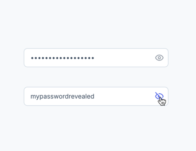
5. No password visibility toggle on mobile
On mobile, users can't see what they're typing at all by default, and autocomplete on phones regularly inserts the wrong character or capitalizes the first letter of a password.
The user types their password, submits the form, gets an error. They type it again carefully, submit, get the same error. They tap "Forgot Password," reset it, get back in. That flow took 4 minutes and created the impression that the login is broken.
The fix is one icon. An eye icon next to the password field that toggles visibility. Standard on iOS and Android native apps since 2015.
Authgear's UX guide lists this alongside social login as a high-impact, low-effort change. The implementation takes a developer about 20 minutes. The conversion impact shows up immediately in mobile signup rates.
6. The login page has zero trust signals
The landing page has testimonials, logos, security badges, a "100,000 teams trust us" stat. The login page has a logo and two input fields on a white background.
The login page is where a user is about to hand over their email address and create a credential. It's the highest-anxiety moment in the signup flow. And it's usually the page with the least reassurance.
One well-placed trust signal reduces that anxiety. It doesn't need to be a wall of logos. One sentence near the submit button is enough.
Stripe puts a minimal security statement near their login form. Notion shows the logo and a clean welcome state. Neither is a heavy intervention. Both reduce the friction of handing over personal information to something that feels like a blank form.
7. The page doesn't match where the user came from
The user clicked "Start your free trial" on a landing page for a specific use case. Maybe it was an ad for the project management feature, or a Google result for the integration they needed. The landing page spoke directly to that problem. They clicked through, convinced.
The login page says "Create your account." Generic. No reference to what they just read. No reminder of what they're signing up for. The connection between the promise and the product breaks.
Message match on the login page matters for the same reason it matters on the landing page: the user's attention is already on a specific problem. If the next page doesn't continue that conversation, trust drops and so does completion rate.
The fix doesn't require a unique login page for every traffic source. One sentence is often enough. "Start your 14-day trial" instead of "Create your account." "Get your first audit in 5 minutes" instead of "Sign up." The CTA on the login page should echo the CTA on the page that sent the user there.
The pattern across all 7
None of these details are visual. The login page doesn't need a redesign. It needs friction removed from the places it accumulates: error states, redundant fields, walls between the user and the product, missing authentication options, and a disconnect from the message that got the user there in the first place.
Login pages get built fast and never revisited. But they sit at the highest-intent moment in the funnel: a user who has already decided to try the product. Every point of friction at that moment costs a signup that was already won.
The designers and founders who treat login page UX with the same care as landing page UX recover signups without spending another dollar on acquisition. That's the math most SaaS teams are leaving on the table.
Any statistics cited in this post come from third‑party studies and industry reports conducted under their own methodologies. They are intended to be directional, not guarantees of performance. Real outcomes will depend on your specific market and execution.
What makes a SaaS login page convert well?
A high-converting SaaS login page removes friction from every step between landing on the page and getting into the product. The most impactful changes are: specific error messages that tell the user exactly what went wrong, social login options that reduce the steps required to authenticate, no email verification wall blocking access to the product, and at least one trust signal near the submit button. Visual design matters far less than these structural decisions. A clean but structurally broken login page will lose signups that a less polished but frictionless one would keep.
Should I remove the Confirm Password field from my signup form?
Yes, for most SaaS products. The Confirm Password field exists to prevent typos during password creation, but it introduces more friction than it solves. A password visibility toggle achieves the same goal with less abandonment. If you're concerned about users creating passwords they can't remember, a background reset link sent after signup handles the edge case without creating friction for every user. The exception is products where a forgotten password has serious consequences and recovery is difficult-in that case, the trade-off may be worth it, but you should test both versions.
How important is social login for SaaS?
Very important, particularly if your users are already signed into Google or GitHub throughout their workday. Offering "Continue with Google" reduces the signup path from roughly 90 seconds to 3 seconds and eliminates the most common failure points: forgotten passwords, typos in email addresses, and password creation friction. For B2B SaaS targeting teams, SSO is often expected at the enterprise level. For developer tools, GitHub authentication signals that the product understands its audience. Adding one social login option is one of the highest-ROI changes a SaaS login page can make.
Why do users abandon SaaS signup forms?
The most common reasons are forms that ask for too much information upfront, unclear error messages that don't explain what went wrong, friction between signup completion and getting into the product (such as email verification walls), and a mismatch between the promise on the landing page and what the signup page actually says. According to Authgear's 2025 UX research, 27% of users abandon forms specifically because they're too long. The fix in almost every case is reducing the number of required fields, improving error states, and letting users into the product before asking them to complete additional steps.
What trust signals work best on a login page?
The most effective trust signals on login pages are short and directly address the anxiety of handing over personal information. A one-line security note near the submit button ("SSL encrypted. Your data is safe.") reduces hesitation for products handling sensitive data. A social proof line showing user or company count works well when the number is meaningful and credible. A "no credit card required" note eliminates a major objection for products with free trials. The placement matters as much as the content — the trust signal should sit directly adjacent to the submit button, at the exact moment the user is deciding whether to proceed.


