
The illusion of pretty versus the reality of useful
Decoration adds mental work. Clarity removes it.
Good design serves your entire audience by removing obstacles. A visually plain but perfectly clear interface beats a beautiful but confusing one.
Look at a cluttered dashboard. It uses five colors, nested menus, heavy drop shadows on every card, and floating widgets. Now look at Linear's issue tracker. It uses high-contrast text, flat buttons, and a single-column layout. The simple layout wins because the user finds the "Create Issue" button instantly.
When users log into your software, they want to solve a problem. Every extra shadow or unnecessary color variation forces their brain to process information that does not help them achieve their goal. You steal their attention away from what they need to do.
"Design is not just what it looks like and feels like. Design is how it works." — Steve Jobs
Why clarity starts in the UX, not the UI
A clear product works without explanation. The interface makes the next steps obvious before you apply a single drop of color. This clarity starts in the basic user experience.
Designing for the empty room
A clear product handles brand new users well. When an account has no data, the empty states must do the heavy lifting. Instead of showing a dead-end blank screen, these areas need short tutorials and obvious buttons that guide the user to their first win.
The power of onboarding and tutorials
Onboarding is the core of your UX. If a user needs a manual to understand your software, the design failed. The product needs to teach the user how to use it through simple tooltips, step-by-step reveals, and plain text.
Building for every user
Clear design supports your entire audience. It also supports users with visual impairments, older demographics, and people reading screens in bright sunlight. High contrast, large text, and obvious buttons make the product accessible to everyone.
Avoiding the boring trap
Founders worry that clear design looks generic. If your product looks like Stripe, you might fear losing your brand identity. You keep your brand identity through sharp copywriting, a distinct primary color, custom icons, and real photography. You do not build a brand through complex UI patterns.
The visual anatomy of a clear interface
Once the UX works, the visual design should support it. You do this by removing the noise. Using a clean color palette points to core features naturally.
Typography and spacing as navigation tools
Instead of relying on a dozen different shades to separate content, lean on typography and white space. Spacing tells the user what elements are related. Typography shows what matters most.
If you have tech background, you can try it yourself:
/* Clarity over decoration */
.button-primary {
background-color: #0F172A;
color: #FFFFFF;
padding: 12px 24px;
border-radius: 6px;
font-weight: 600;
}
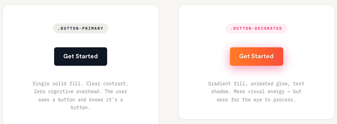
/* Avoid adding unnecessary mental work */
.button-decorated {
background: linear-gradient(90deg, #FF8A00, #E52E71);
box-shadow: 0 4px 15px rgba(229, 46, 113, 0.4);
text-shadow: 1px 1px 2px rgba(0,0,0,0.2);
}If you don't have, look at this:
Technical choices for speed
A simple layout requires less CSS. When you write custom CSS for every new feature, your codebase grows infinitely. Developers invent new class names. They duplicate styles. The stylesheet becomes a massive file that slows down the site and confuses the team.
You write code faster when you use a utility-first tool like Tailwind CSS. Utility classes force strict constraints. You stop guessing which exact hex code to use for a background. You apply a standard class directly to your markup and move on. You never leave your primary file to hunt down a broken style in a separate document.
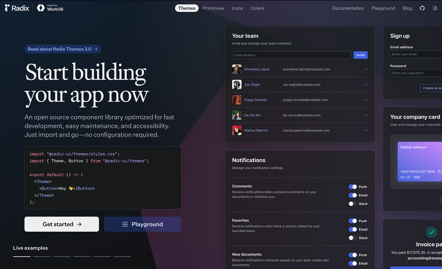
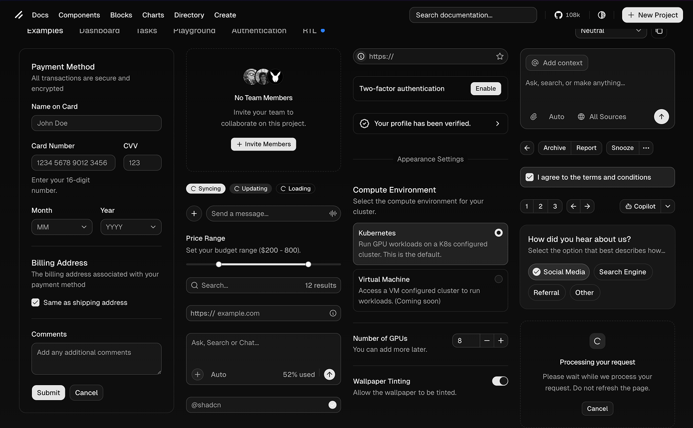
Stop building basic elements from scratch. A pre-built component library gives you the foundation instantly. You pull in accessible, unstyled parts from libraries like Radix or Shadcn. You attach your utility classes to match your brand. You ship the feature the same afternoon.
These tools stop you from writing custom styles for every single button. They keep your design consistent automatically. When a new developer joins the team, they do not need to study your custom CSS rules. They read the standard utility classes and start shipping code on their first day.
Balancing user research with speed
User research still has a place. The depth of that research depends on the state of your project.
If you are an experienced designer or founder, you can rely on proven UX rules. For bootstrapped startups with just a few users, trust your gut and talk directly to people. Work fast. Have open conversations between the designer, the product team, and your early users to ask if specific features actually make sense.
Why the traditional agency model breaks early-stage startups
The traditional design agency model works well for large corporate projects. For bootstrapped companies and newly funded startups, it is a death sentence.
Early-stage companies die during long discovery phases and endless waiting periods. Weekly reveals and massive presentation decks create an artificial barrier between the people building the product and the people designing it.
I built the Humbl Design framework to fix this exact problem. I watched too many startups burn through their funding while waiting for design approvals. The design was rarely the problem. The communication gap caused the failure.
In a traditional agency setting, an account manager stands between you and the person doing the work. You experience these common delays:
- Sending an email and waiting three days for a reply.
- Paying for 40-page discovery documents no one reads.
- Scheduling a follow-up call just to clarify a basic text comment.
- Reviewing a single button change in a weekly hour-long meeting.
These delays kill momentum. At Humbl design, I operate on a simple rule: speed of communication dictates the success of your product.
Speed does not mean rushing the pixels. Speed means shortening the time between a founder having an idea and the designer executing it.
When founders talk directly to their designers every single day, the software improves instantly. You fix errors in minutes instead of weeks. You do not need a formal slide deck to review a checkout screen. You need an open chat and a shared design file. The Humbl Design approach proves that when you remove the gatekeepers, you ship better products faster.
Speed to market does not mean lower quality
People think designing fast means settling for sloppy work. Speed to market forces hard choices.
Designing fast means getting faster feedback. You ship a rapid prototype and review it immediately. You skip the extra steps and focus on shipping a functional interface that users can interact with today.
Building a communication loop that works
To work this fast, you must replace the weekly agency reveal with direct, daily contact between designers and founders. It comes down to how your team talks.
Whether you rely on Slack, Figma, Loom, or Linear, the tools matter less than the rhythm. You need a culture where founders talk directly with the design team.
Setting your daily rhythm
Set up daily stand-ups and short async huddles. Jump on an immediate call if there is a blocker. Keep the feedback loop open. Talk directly.
The clarity audit
Check your current product against these four rules right now:
- Does every page have exactly one primary call to action?
- Can a user explain what this screen does in five seconds?
- Are you using more than two font families? (If yes, delete one).
- Do your primary buttons pass a color contrast check?
Any statistics cited in this post come from third‑party studies and industry reports conducted under their own methodologies. They are intended to be directional, not guarantees of performance. Real outcomes will depend on your specific market and execution.
Why do startups fail at product design?
They build confusing products. Founders add complex animations and bright colors instead of fixing the basic user experience. Users leave when they cannot figure out the exact next step.
Does clear design mean my brand will look boring?
Clear design does not erase your brand identity. You build your brand through sharp copywriting, specific primary colors, and custom photography. Complex UI patterns only confuse people.
How do I test if my product design is clear?
Run a clarity audit. Check if every page has exactly one primary call to action. Ask a new user to explain what the screen does in five seconds. If they hesitate, the design fails.
Why is the traditional agency model bad for startups?
Agencies rely on long discovery phases and weekly presentations. Startups run out of money waiting for these slow feedback loops. Founders need direct, daily contact with designers to build and ship fast.
How can I design fast without lowering quality?
Speed forces you to make hard choices. You skip the extra steps and ship a functional prototype. You review it immediately and fix the errors. Faster feedback creates better quality.


