

A SaaS signup asks for your email. A fintech signup asks for your bank account, your SSN, or your routing number.
That's a different ask entirely. Your landing page has to earn that trust before the user clicks anything.
The trust section gets dropped near the footer: a row of compliance logos, a line about encryption, maybe a padlock icon. Then founders wonder why their conversion rate is low even though the product works.
Where should I put trust section?
Trust signals on a fintech landing page belong above the fold and near the primary CTA. The default position (bottom of page, near the footer) puts trust content after the user's decision moment. By the time they scroll that far, most have already bounced.
The default is wrong anyway. Users don't scroll to the bottom to decide whether to trust you. They decide in the first 5 seconds. If your hero asks someone to connect their bank and your trust signals are 2,000 pixels below the fold, you're asking for commitment before you've earned it.
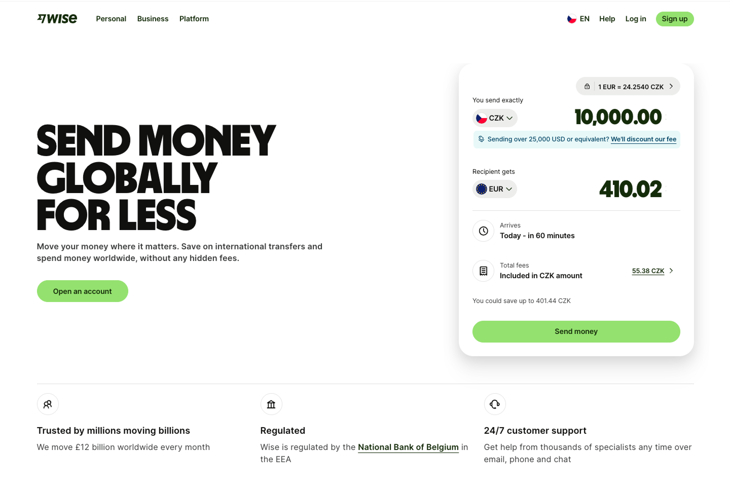
Wise gets this right. Their trust elements appear immediately below the main CTA. Before you scroll anywhere, you see the regulated link, a 24/7 customer support, and their customer numbers. You haven't moved your finger yet and you already know this is a real company.
Writing content
Fintech security copy runs on a small vocabulary. "Bank-grade security." "Military-grade encryption." "Secure by design." "Your data is protected." Pick any fintech page and you'll find at least one of them.
These phrases feel safe to write because they sound reassuring. The problem is they don't commit to anything verifiable. Users have read them enough times that they stopped registering. A phrase that can mean anything ends up meaning nothing.
The fix is specificity. "256-bit AES encryption" tells me something. "SOC 2 Type II certified" tells me something. "Your funds are held at JP Morgan Chase, FDIC insured up to $250K" tells me a lot. Each one is a claim someone could actually check.
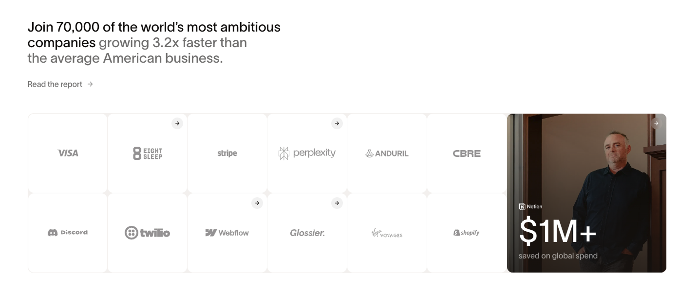
Ramp does something more interesting. Below the "70,000 companies" stat, they show a grid of customer logos: Visa, Stripe, Perplexity, Webflow, Shopify, Discord, Twilio. Click the logo and it opens a case stdudy page. Because each one links to a real result, they make the claim checkable.
The 4 things a fintech trust section needs:
1. Regulatory status
FCA regulated. SEC registered. FINRA member. State money transmitter license. Whatever applies to your product: state it explicitly and early.
This is the baseline. If your company holds, moves, or processes money, users want to know you're legally authorised to do it. Leaving this out, or burying it in the footer, signals either you don't have it or you don't think it matters. Both read badly.
2. Institutional proof
Who backs you? Investors, banking partners, custodians. A16Z or Y Combinator in your investor list tells a fintech user more than 10 glowing testimonials. So does "banking partner: JP Morgan" or "custody: Apex Clearing."
3. Volume that implies safety
"$2.4 billion processed" or "4 million users" or "10 million transactions monthly" do real trust work. Volume signals that other people have already taken the risk you're asking the user to take.
These numbers land differently in fintech than in SaaS. When you're asking someone to connect their bank account, knowing that 4 million other people already have is a meaningful signal.
4. Named security specifics
SOC 2 Type II. PCI DSS Level 1. 256-bit encryption. Multi-factor authentication required at signup. Named specifics carry more weight than categorical claims.
If you have the certifications, show them. If you don't yet, be honest about your security architecture without the buzzwords. "Funds held at Goldman Sachs" is more useful than "bank-grade security" even if you haven't gone through formal audits yet.
What doesn't work
User testimonials alone aren't enough in fintech. A review from "Sarah,, 5 stars" doesn't address what users are worried about. What's Sarah's money doing? Is it safe? Can she get it out?
Testimonials work in fintech when they address the trust question directly. "I transferred $50K through Wise for the first time and it landed in 2 hours" is useful. "Love this app, so easy to use!" is not.
Generic security icons (padlocks, shields, checkmarks) are visual noise. Users have seen them on phishing sites. A padlock icon does nothing. A named certification does something. A named banking partner does more.
If you're going to include security badges, make them mean something. SOC 2 logo from a real auditor. FCA badge. PCI DSS seal. If you can't link to a verification page, it's decoration.
Where to put it
A trust section works hardest when it's closest to the ask. If your primary CTA is "Connect your bank account," the trust signals belong directly above or below that button.
The second most effective position is immediately below the hero. You've told them what you do. Before they scroll to learn more, answer the implied question: is this safe?
The footer is the third option. Park legal disclaimers and regulatory boilerplate there. Your primary trust work belongs further up.
Coinbase structures their security content mid-page, well before the footer. Named specifics about cold storage, insurance coverage, and regulatory licenses. The instinct is right. The mistake most founders make is treating trust as something that lives at the bottom because they ran out of space.
Before and after
Most seed-stage fintech pages I audit look something like this:
The fix is treating trust as a first-class design concern. Most founders still treat it like a compliance checkbox.
Fintech pages that convert have almost always figured this out. The ones that don't are still designing the trust section like something the lawyers made them include.
Any statistics cited in this post come from third‑party studies and industry reports conducted under their own methodologies. They are intended to be directional, not guarantees of performance. Real outcomes will depend on your specific market and execution.
Where exactly should I put the trust section on my fintech landing page?
Closest to your primary CTA. If someone has to scroll past your trust signals to reach the "Connect your bank" button, the page is ordered wrong. The second best position is directly below the hero. The footer is for legal boilerplate, not primary trust work.
Do I need to be SOC 2 certified before I can have a strong trust section?
No. SOC 2 takes time and costs money. Most seed-stage fintechs don't have it yet. What you can do right now: name your banking partners, state your encryption standard, call out your regulatory status (even a state money transmitter license is worth naming), and show investor backing. Specificity does more work than a certification badge from an auditor nobody's heard of.
Why don't testimonials work as well in fintech as in SaaS?
The user's core fear is simpler: is my money safe? It's not "will I like this product?" A generic 5-star review doesn't answer that. Testimonials in fintech need to address the trust question directly: did the money move? Was it fast? Did anything go wrong? "I transferred $80K and it landed in 2 hours" is a trust signal. "Great UX, love the dashboard" isn't.
How do I write trust copy if I'm pre-SOC 2 and don't have famous investors?
Be specific about what you do have. Name your banking partner. Name the encryption standard. State your regulatory status. If you hold funds at Evolve Bank or JP Morgan, say so. If you're FDIC insured through a partner bank, say so with the insured amount. Founders often undersell the specifics they do have because they're focused on what they don't have yet.
What's the biggest conversion mistake fintech landing pages make with their trust section?
Placement. The content is often fine: certifications, logos, a Trustpilot score. But it's at the bottom of the page, after the feature breakdown, the pricing table, and the FAQ. By the time users see it, most have already bounced. Move the trust signals up. Put at least one near your primary CTA. The decision to connect a bank account happens in the first scroll, not after 2,000 words of copy.


