In early 2026, this isn't a competitive advantage, it's survival. This guide maps out the workflows and benchmarks required to keep startups moving fast without the typical "AI mess" that kills products. It’s for founders and product leads who need to know which tools actually work and how to set the boundaries that keep design quality high.
BTW: If you scroll all the way down - there's a short case study.
The 2026 AI tools
The design space is fragmented. Trying to use one tool for everything is a mistake that leads to generic, broken UI. You need a pipeline where every tool has one specific job based on what it actually outputs.
Structural and wireframing tools
These are for layout logic. Use them to nail the information architecture before you even think about pixels.
- Uizard: Best for rapid MVPs. If you have a hand-drawn sketch or a screenshot from a reference app, its Autodesigner turns it into a digital mockup in seconds.
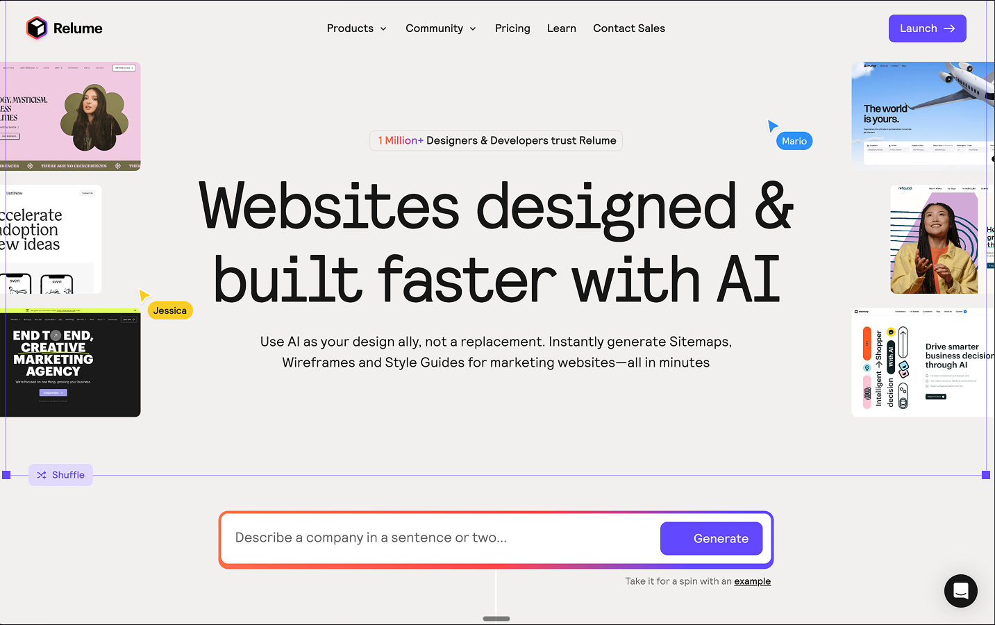
- Relume: The standard for web projects. It builds sitemaps and wireframes from text, which is the fastest way to kill the "blank canvas" phase.
High-fidelity and UI generators
Once the structure is locked, these tools handle the visual layer.
- Moonchild AI: This is context-aware. It doesn't just swap components; it builds custom design systems from your prompts. Use this when visual consistency is the priority.
- Galileo AI: A Figma-first platform. It’s excellent for complex SaaS dashboards and mobile apps where you need high-fidelity screens that feel real.
Validation and logic engines
Before you build, you need to validate. These tools ensure your structure actually works.
- UX Pilot: Use this for predictive heatmaps. It tells you where a user will look in the first 3 seconds, so you can fix your hierarchy before testing.
- Flowstep: This helps analyze user behavior and generates concepts based on actual design thinking, not just "vibes."
Native ecosystem tools
- Figma AI & Figma Make: Figma’s native suite now handles everything from auto-renaming layers and generating placeholder text to turning your designs into fully functional, interactive web applications directly within the canvas.
The vibecoding approach
Vibecoding is the shorthand for building products by fully “giving in to the vibes”. Describing the feel, mood, and outcome you want, then letting AI generate the visuals, flows, and even code while you stay in creative director mode. Instead of specifying every component upfront, you describe the atmosphere and intent, and the stack of tools handles implementation.
In practice, that design stack can looks like this:
- Nano Banana: Handles the visual layer. You use it to generate moodboards, hero imagery, and UI reference shots that nail the brand feeling before you commit to a design system.
- Claude Sonnet / Claude Opus: Handle the product logic layer. You feed them the visuals and brief, and they turn the vibe into user stories, screen lists, JSON specs, and edge cases for the actual product.
- Claude Code: Handles the implementation layer. It takes those structured specs plus your existing components and tokens, and scaffolds real UI code (for example, React/Next) that matches the intent.
- Gemini 3.0: Sits across visual and logic layers, pairing with Nano Banana for richer image generation and with your LLM prompts for context-aware suggestions, especially when you need tightly aligned visuals and text.
You should treat vibecoding as a separate lane in your workflow: use structural tools (Relume, Uizard) when you care about information architecture and flows, and use vibecoding stacks (Gemini + Claude) when you care about tone, brand, and “does this feel right?” before you lock constraints.
How to use AI in practice
Dumping tools on a team does not work without standard operating procedures.
Here is how you actually prompt and utilize these specific platforms in your day-to-day workflow.
Wireframing with Relume
When you need to get an idea out of your head and into a testable format immediately, skip Figma entirely and start in Uizard.
Once Uizard generates the layouts, then you export the best variant to Figma, delete any decorative noise, and re-map it to your grid and spacing system. Uizard handles surface speed; you handle the underlying product logic and system fit.
Workflow:
- Start from a plain-text brief, not a visual in your head.
- Generate two to three variant wireframes and compare flows, not colors.
- Only move into Figma once the structure is logically sound
Here's a prompt you can try:
Generate a mobile app wireframe for a plant care tracker.
Requirements:
- A dashboard showing upcoming watering schedules for 3 plants.
- A floating action button (FAB) to add a new plant.
- A detail screen for a specific plant showing soil moisture history.
Style: Keep it low-fidelity and strictly structural.
UI generation with Moonchild AI
When moving from wireframes to high-fidelity, use Moonchild AI to establish your visual direction and generate a foundational design system. The goal here is not just “pretty screens,” but a coherent visual language that can be reused across future flows.
After generation, you pull the screens into Figma and translate Moonchild’s decisions into tokens and variables: primary/secondary colors, spacing scale, typography roles, and reusable components. The tool proposes the look; your system decides what becomes real.
Workflow:
- Feed Moonchild your structural wireframes plus a short brand/context description.
- Ask it to propose a base theme (colors, type scale, elevation, radius).
- Lock in one direction, then have it generate multiple key screens using those same rules.
Prompt example:
Design a high-fidelity checkout flow for a luxury watch brand.
Context: The target audience expects minimalism and high contrast.
Visuals: Use a dark mode theme with #0A0A0A backgrounds and gold (#FFD700) primary actions.
Output: Include a cart review screen, a payment input screen, and a success confirmation state. Ensure the padding is dense but highly legible.
Usability validation with UX Pilot
Before handing off a high-fidelity screen to developers or paying for human user testing, run it through UX Pilot’s predictive engine to catch obvious flaws. Think of it as your pre-flight visual check: no one should see a user before UX Pilot has seen the file.
Use the feedback to adjust layout, contrast, and copy hierarchy. Only after your primary CTA wins the first glance and accessibility issues are resolved do you schedule human testing to explore deeper behavior and comprehension.
- Export your key screen (or Figma link) into UX Pilot.
- Run an attention heatmap and scan the first 3 seconds of predicted focus.
- Ask for accessibility and hierarchy critiques, then iterate in Figma until you pass your thresholds.
Try this prompt:
Analyze the attached dashboard layout.
1. Run an attention heatmap simulation.
2. Tell me if the primary "Export Report" button captures at least 70% of initial visual focus.
3. Identify any accessibility issues regarding color contrast on the secondary navigation.
Multi-agent workflows for product design
Advanced teams have moved from single AIs to clusters of small, specialized agents. By splitting responsibilities, one agent analyzes product analytics, another proposes flows, another checks accessibility, and another lints your layout against your design system. Designers act as orchestration leads who define roles, set constraints, and override agents when they drift from the product strategy.
Claude Code sits at the implementation layer of this stack. You can treat it as the lead engineering agent that coordinates multiple sub‑agents, each with different responsibilities (for example, UI implementation, accessibility fixes, test generation) while you stay focused on product outcomes instead of individual commits.
Workflow:
- Define explicit agent roles in your process (Data, UX, UI, QA, Code).
- Make sure each agent outputs in a structured format (JSON, checklists, diffs, pull requests).
- Keep a human in the loop at each handoff, especially where business risk is high.
Prompt example (Claude + Claude Code stack):
Act as a Lead UX Agent. Your job is to orchestrate the design and implementation of a new user onboarding flow.
Step 1 (Data Agent): Request and summarize funnel analytics to identify the top two drop-off points.
Step 2 (UX Agent): Generate a JSON outline of the required screens and key states to reduce those drop-offs.
Step 3 (UI Agent): Propose a component map for each screen, constrained to our approved Figma design tokens.
Step 4 (Claude Code): Implement the UI changes in our React codebase using only existing components and tokens, and open a pull request with a summary of the diff.
Wireframing and structural logic
Use AI to generate the first draft of the structure, whether it comes from Uizard, Relume, a vibecoding stack, or a multi‑agent workflow, then use your human product knowledge to align it with business priorities.
Your primary value as a designer is editing the product logic, not drawing gray rectangles. Starting from scratch wastes hours of billable time and slows down validation cycles.
AI can generate structural layouts in seconds based on text prompts, giving you a baseline to edit, rearrange, and refine. Use AI to generate the first draft of the structure, then use your human product knowledge to align it with business priorities.
Prompting for design constraints
AI lacks context. If given too much freedom, it will guess hex codes and paddings, fracturing your system and creating massive design debt for engineers.
To prevent this, force AI to use your exact semantic tokens. Strictly define the context, the exact token variable names, and the structural auto-layout rules.
Example prompt:
Generate a pricing card component.
Rules:
- Do not use raw hex codes or arbitrary pixel values.
- Use `color-surface-base` for the card background.
- Use `color-text-primary` for the $49/mo heading.
- Use `space-md` (16px) for all internal padding.
- The container must use vertical auto-layout with a gap of `space-sm` (8px).
Simulated usability validation
Human testing is too expensive and slow to waste on basic visual failures. Running an attention simulation before user testing is essential to catch avoidable errors. Tools that predict user interactions with heatmaps can flag potential accessibility issues before launch, showing exactly where users look in the first crucial seconds.
Once visibility is verified by AI and your primary CTA meets your internal attention benchmark (for example, ~70%), use humans to test meaning, trust, and complex comprehension.
Designing the UX of AI latency
AI takes time to think, with complex API calls taking several seconds to return a response. Always design a specific loading state so users are never left staring at a static screen, which quickly erodes trust in the feature's reliability.
- 0–1 seconds: Show an immediate state change on the button (e.g., label changes to "Analyzing...").
- 1–3 seconds: Display a skeleton loader mimicking the expected structural output.
- 3+ seconds: Implement streaming text or partial results so users can begin reading immediately.
Defensive UI for AI outputs
AI output is non-deterministic. You cannot anticipate exactly what it will say or how long the response will be. Build defensive containers for all AI-generated content to handle worst-case scenarios like single words, massive paragraphs, or complex Markdown tables. Set strict max-heights, apply internal scrolling, and explicitly define typography rules for all potential formatting outputs so long responses do not break your page layout.
AI governance and guardrails
Treat AI like a junior designer with access restrictions. Define which models can see specific data and how their changes are reviewed. You must limit AI tools to anonymized or synthetic data when working on sensitive flows like medical records or billing. Log which agent suggested which change so that your team can easily audit and revert decisions when necessary.
Metrics and KPIs for AI-assisted design
AI-assisted design needs clear KPIs to be sustainable, otherwise teams will quietly regress to old manual habits. Measure the ROI of your AI tools by tracking specific efficiency and quality metrics:
- Time to first testable mockup: Measure time from the initial brief to an interactive prototype.
- Attention quality: Percentage of key screens where primary CTAs pass the 70% attention threshold on the first simulation.
- Design debt incidents: Number of issues per sprint related to spacing or detached tokens caught in QA.
Team training and process rollout
Roll out these workflows formally. Define the pipeline for each design phase, run a pilot squad to compare cycle times against a control group, and turn successful patterns into a team-wide playbook. The ultimate goal is to make AI usage a predictable part of your standard operating procedure.
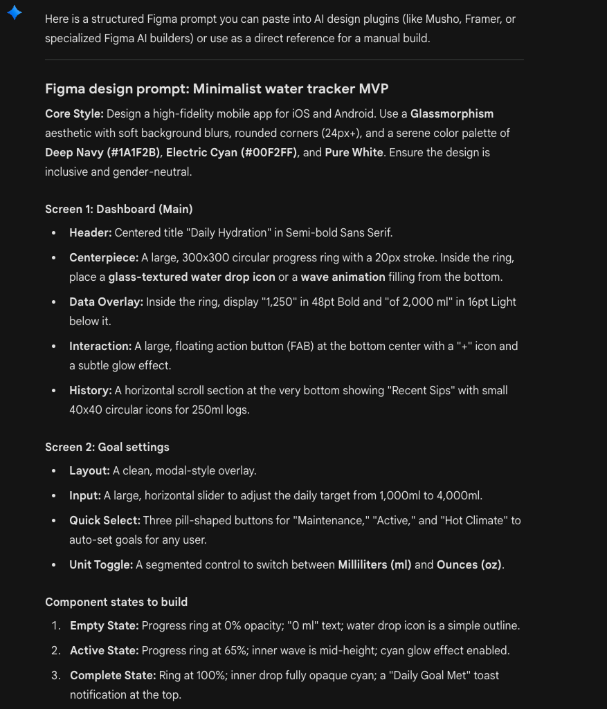
Case study: Using AI in client work
Imagine this:
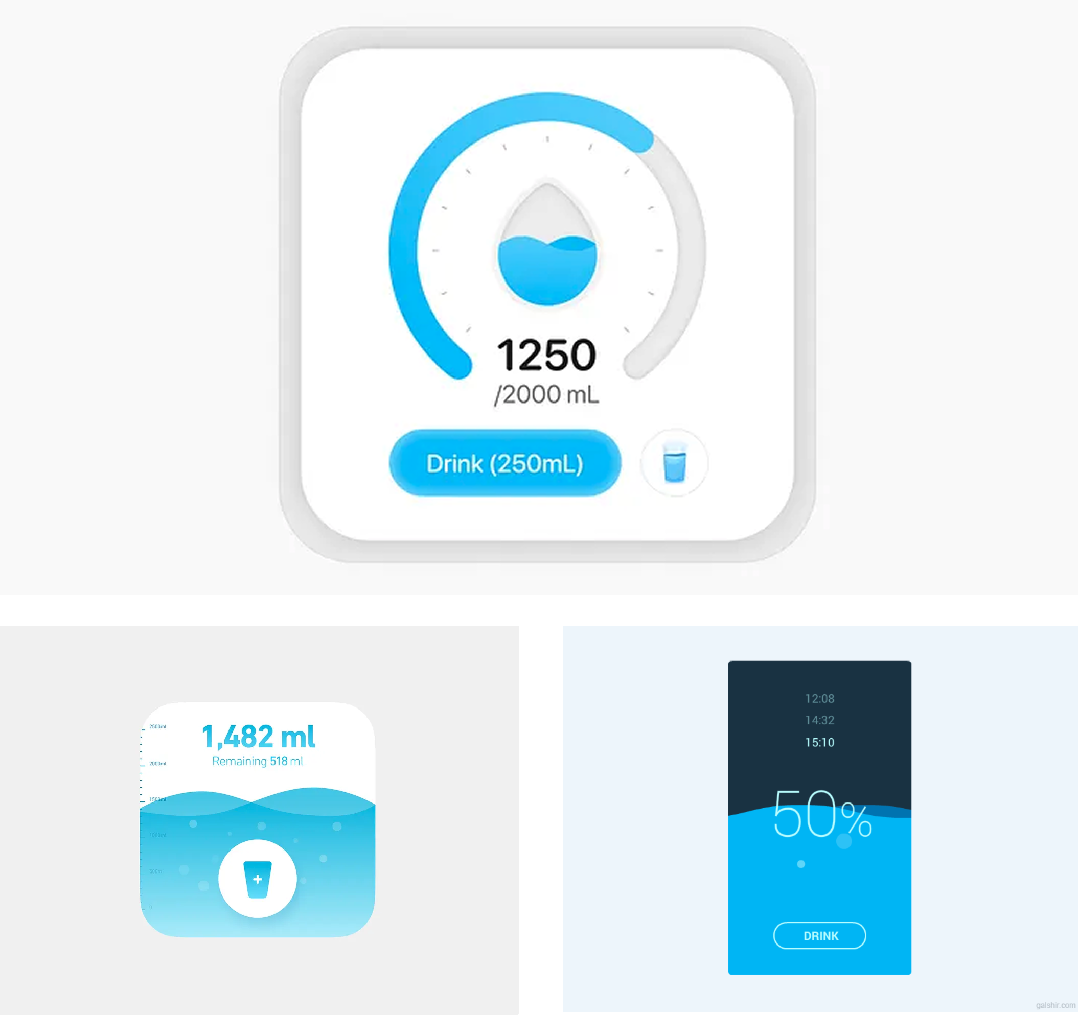
A client lands in your inbox: they want a daily water tracker app. Users tap to log each glass of water, and a fill-up ring shows their progress toward a daily goal. Simple concept. Before you open Figma and start designing from scratch, you can use AI to generate a set of inspiration mockups in minutes, this gives you and your client something tangible to react to before the real design work begins.
Here is how to implement AI into your workflow at a very basic level.
Step 1: Visual research and ideation with Gemini
Start on Dribbble. Find two or three screenshots of water trackers, health apps, or fitness dashboards that feel close to what you want, apps with circular progress rings, clean log buttons, minimal layouts. You are not copying these; you are setting a visual direction.
Screenshots I liked:
Now open Gemini and drop those screenshots in alongside a plain-text brief. Tell Gemini you are designing in Figma Make, this ensures the output is structured in a way Figma Make can work with:
I'm designing a simple mobile water tracker app. Users tap
a button to log each glass of water, and a circular progress
ring fills toward their daily goal.

Here are some visual references for the look and feel I'm
going for [attach screenshots].

Based on these references and the app concept, write me a
detailed app description I can paste into Figma Make to
generate screens. Include:
- What each screen shows and its purpose
- The key components on each screen
- The visual style and mood based on the references
- Any important states (empty, in progress, goal complete)

Keep it to an MVP — no login, no social, no monetization.
Just the core tracking experience.
Gemini gave me this (Fast model):
Gemini reads both the images and your brief, then returns a rich description that blends your visual taste with the product logic. This is your design brief, informed by real references, not abstract guesswork.
Keep in mind you can tweak the specs until you're 100% happy with the outcome.
For the simplicity of this guy, I will use the very first output Gemini gave me.
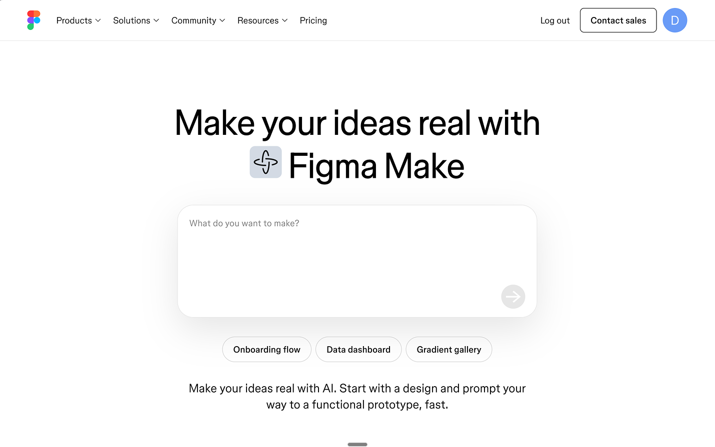
Step 2: Design and publish with Figma Make
Open Figma Make and feed it everything: paste Gemini's app description and attach the same Dribbble screenshots as visual references. Figma Make now has both the functional spec and the aesthetic direction in one prompt.
The first variant did not include all the required pages and did not look like a mobile app. But it was a good starting point:
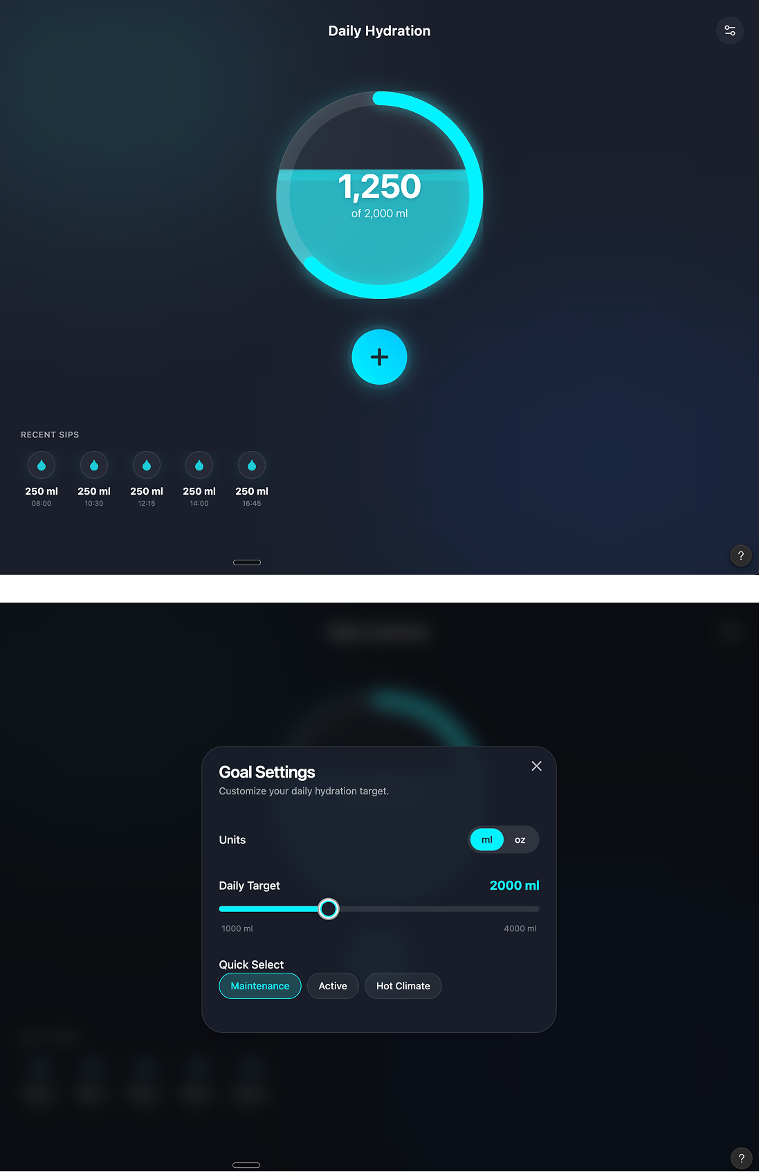
After a second round of prompting, it looked much better. Keep in mind that this is not your final design.
These are inspiration mockups you can put in front of your client or use as a springboard for your real design work.
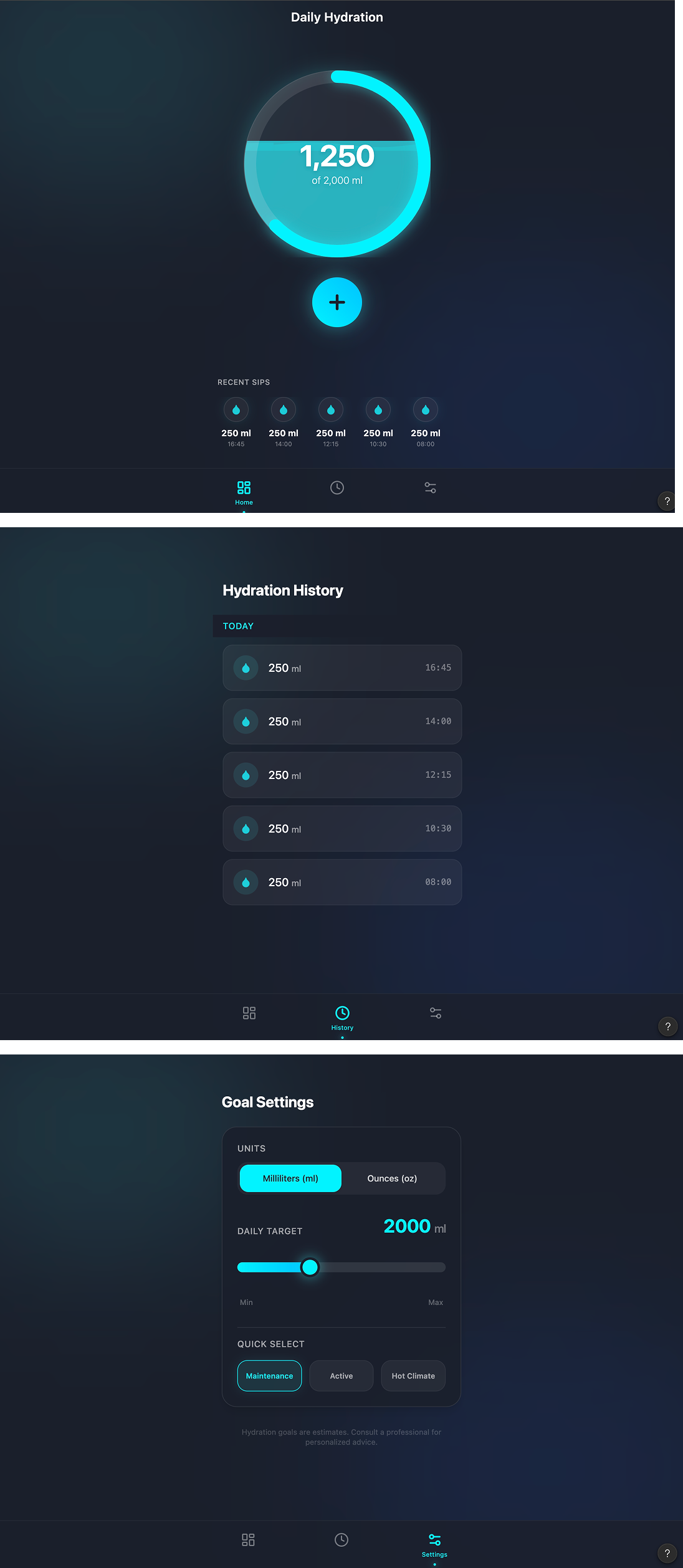
Treat Figma Make as an inspiration tool, not a finished-UI tool. From here, you do what you already know how to do:
- Adjust the layout to match your grid
- Fix spacing and create proper design tokens
- Tweak the visual hierarchy
- Add missing screens and edge-case states
- Apply your client's brand
Two steps.
You went from a client brief and a few Dribbble references to a set of tangible mockups you can react to, present, and build on, before spending hours on design work.
The AI did not design the product for you.
It gave you a head start so your actual design time is spent on decisions that matter, not on dragging rectangles from a blank canvas.
Any statistics cited in this post come from third‑party studies and industry reports conducted under their own methodologies. They are intended to be directional, not guarantees of performance. Real outcomes will depend on your specific market and execution.
Will AI replace designers in 2026?
No. AI is replacing specific tasks (like first-pass wireframes & research tagging), not the role of a designer. AI tools still fail on product strategy, UX tradeoffs, and inclusive design decisions
Which AI tools should a designer actually start with?
Start with the tools already in your stack: AI features in Figma or your main design tool. You can play around with Claude, Gemini, Perplexity to see their advantages.
How much of my day should be “AI work”?
You don’t need a dedicated “AI block”. A healthy target is that AI touches 20–40% of your tasks: summarising specs, clustering feedback, generating first layouts, and drafting copy. If you spend more time prompting than designing, you’ve gone too far.
Is it safe to use AI for sensitive flows like pricing, consent, or health data?
You can use AI to generate ideas and edge-case checklists, but final UX and copy for anything involving money, legal consent, health, or security should always be reviewed and signed off by humans (design, product, legal). AI supports here, it doesn’t decide.
How do I stop AI from making my work look and sound generic?
Feed AI your real inputs: existing product screens, brand guidelines, voice examples, and clear constraints. Use it to generate options, then apply your taste and research to choose and refine. If you accept default outputs, you’ll get default design.