

I. Technical foundations: Color models & use cases
Choosing the right color model isn't just about preference; it's about matching the tool to the task. In 2026, a robust system likely uses a mix of models depending on the context. You cannot use a single format for the entire design-to-code pipeline because different stages require different types of manipulation.
1. HEX (Hexadecimal): The universal constant
Hexadecimal codes (e.g., #FF5733) remain the bedrock of web development for one reason: compatibility. While they are unintuitive to read they are universally supported by every browser, design tool, and legacy codebase.
Rule: Use HEX for static definition.
When you are defining your brand tokens in a design system or handing off final specs, use HEX. It is immutable and copy-paste friendly. It prevents errors that occur when developers accidentally swap R and B values in other formats.
2. RGB (Red, Green, Blue): The hardware native
RGB matches exactly how screens emit light. It is a "additive" model, meaning you start with black and add light. Its primary utility in modern web design is for handling transparency via RGBA (Red, Green, Blue, Alpha).
Rule: Use RGBA for opacity.
If you need a background to be 50% transparent, do not use a HEX code with appended alpha values (like #00000080) unless your team's tooling strictly supports it. RGBA (rgba(0, 0, 0, 0.5)) is often safer for cross-browser consistency in older stacks.
3. HSL (Hue, Saturation, Lightness): The coder's tool
HSL is the most "human-readable" format for writing CSS. It separates the color (Hue) from its intensity (Saturation) and brightness (Lightness). This makes it mathematically manipulatable. If you want to create a hover state that is "10% darker," you simply subtract 10 from the Lightness value. You cannot do this with HEX.
Rule: Use HSL for logic and states.
When building button states or theming engines, define your colors in HSL variables. This allows you to write algorithmic changes (e.g., calc(--base-lightness - 10%)) directly in your stylesheet.
4. HSB / HSV (Hue, Saturation, Brightness): The artist's tool
There is a critical distinction between HSL and HSB that trips up many designers. In HSL, 100% Lightness is always pure white, regardless of the hue. In HSB (used by Photoshop, Figma, and artists), 100% Brightness is simply the "purest" version of that color.
Rule: Use HSB for selection, never for code.
Use HSB to pick your colors in your design tool because it aligns with how painters mix paint. But convert it to HEX or HSL before it touches the code.

II. The "Brand-to-UI" translation protocol
One of the most common points of failure in digital product design is the blind application of print guidelines to digital screens. Marketing teams often hand over a print-based brand guideline (Pantone/CMYK) and expect it to work 1:1 on a website.
It won't.
Print colors rely on reflected light (subtractive), while screens use projected light (additive). A "Royal Blue" that looks deep and authoritative on a printed business card often looks muddy, dull, or washed out on a backlit retina display.
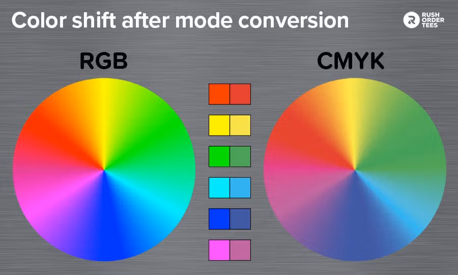
The fix: The "Digital Twin" method
Do not use the exact brand HEX code provided by the print team. Instead, create a "Digital Twin" that honors the spirit of the color while adhering to the physics of the screen.
Protocol:
- Import: Drop the print-safe HEX into your design tool.
- Boost: Switch to HSB. Increase saturation by 5-10% and lightness by 3-5%.
- Test: Place your new "Digital Twin" next to the physical business card or print collateral. Compare them under standard room lighting.
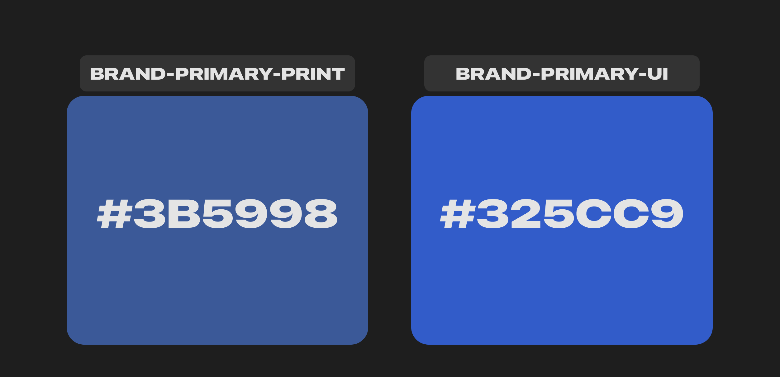
- Codify: Name the boosted color
Brand-Primary-UIand the originalBrand-Primary-Print. Explicitly forbid the use of the print color in the web codebase.
Note: If you skip this step, your interface will look "heavy" and dated compared to digital-native competitors who utilize the full brightness of modern screens.
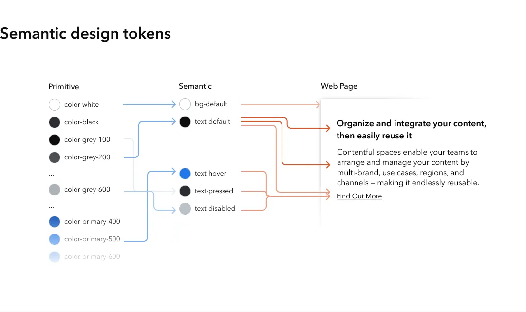
III. Semantic architecture: The token system
A robust color system separates what a color is (primitive) from what a color does (semantic). If you hard-code raw values like #3B82F6 directly into your button components, you are creating massive technical debt. If the brand changes from blue to purple next year, you will have to find-and-replace thousands of lines of code.
Layer 1: Primitives (The raw ingredients)
These are your absolute color values. They have no inherent meaning; they just exist. They should be named descriptively based on their hue and lightness level.
- Naming Convention:
{Hue}-{Level}(e.g.,Blue-500,Neutral-100). - Scale Density: Create a minimum of 10-12 steps per hue. You need this granularity to handle subtle borders, hover states, and background tints.

Layer 2: Semantics (The context)
These tokens describe the intent of the color. They point to the Primitives.
- Naming convention:
{Category}-{Property}-{State}(e.g.,action-bg-hover,surface-primary,text-critical). - The Golden Rule: UI components must only reference semantic tokens. They should never reference primitives directly. Why? Because context changes, but intent does not.
IV. Composition: The 60-30-10 Rule
Visual hierarchy relies on inequality. If all colors compete for attention with equal saturation and area, the user’s eye cannot find a place to rest. The interface becomes "noisy."
Rule: Adhere strictly to the 60-30-10 distribution for layout composition.
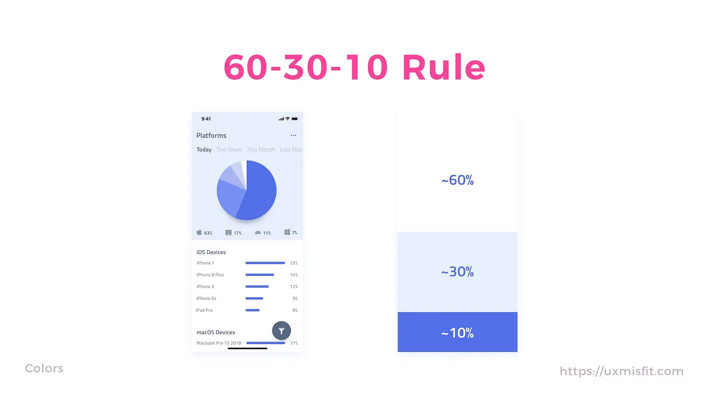
- 60% neutral: Backgrounds, surface colors, negative space. This is usually white, cream, or a very light grey (or dark charcoal in dark mode).
- 30% secondary: Cards, sidebars, headers, and non-critical accents. These are often brand tints or desaturated hues that define the structure without screaming for attention.
- 10% accent: Primary buttons, active states, links, and notification dots. This is where your primary brand color lives.
Exceptions:
- Dashboards: Shift to 70-25-5. Data-heavy interfaces have high "cognitive load" from the numbers themselves, so the color palette must recede further to avoid overwhelming the user.
- Marketing pages: You may invert this to 10-30-60 for specific "Hero" sections to create immersion, but must revert to the standard ratio for informational content areas below the fold.
V. Psychology & decision science
Color is not just decoration; it is a behavioral guidance system. Your choices directly influence how fast a user makes a decision and how they feel about the product.
1. Functional psychology (The user)
Users come to your site with "pre-installed" expectations based on years of internet usage. Breaking these expectations increases cognitive load.

- Red: 🛑 Stop, ⛔ Danger, ❗ Error, 🗑️ Delete.
- Green: ✅ Success, 🛡️ Safe, 💸 Money, 🚦 Go.
- Yellow: ⚠️ Warning, ✋ Pause, 🔍 Review.
- Blue: ℹ️ Information, 🤝 Trust, 🔗 Link/Neutral Action.
Never use Red for a "Success" message, even if it’s your brand color.
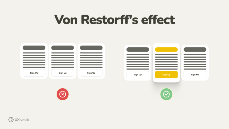
The Von Restorff Effect (Isolation Effect):
This psychological principle states that an item that stands out from its peers is more likely to be remembered.
- Application: If your brand palette is blue, do not make your "Buy Now" button blue. It will blend into the "safe" background. Make it orange (complementary) or pink (triadic). The clash triggers the isolation effect, drawing the eye and increasing conversion rates.
2. Client psychology
Design approval is often blocked by subjective bias ("I just don't like purple"). You must move the conversation from "Art" to "Science."
- The Competitor Anchor: When a client dislikes a strategic color, show a matrix of 5 competitors. If 4 use blue and 1 uses red, frame your choice as a "Blue Ocean Strategy" to own a distinct market position.
- The Legality Frame: If a client requests low-contrast colors (e.g., light grey text on white), do not argue aesthetics. Argue liability. "This fails WCAG 2.1 AA standards, which exposes the company to accessibility lawsuits."
- The Conversion Catalyst: When a client wants to change a high-performing but "ugly" CTA color to a brand color, do not argue aesthetics; argue revenue. "The orange button is a 'pattern interrupt' that converts 20% higher specifically because it clashes. Do we want a button that matches the brand, or a button that makes money?"
- The Persona Shield: When a stakeholder rejects a color based on personal taste ("I hate teal"), remove them from the equation entirely. "We aren't designing for you; we are designing for [target persona]. For them, teal signals safety and hygiene. Let's test if it instills trust in them, even if it feels cold to us."
- The System Integrity Defense: When a client requests a "one-off" random color for a specific feature, frame it as technical debt. "Every unique color added outside the token system increases codebase size and QA maintenance costs forever. Is this single banner worth increasing our long-term engineering debt?"
- The Environmental Anchor: When a client dismisses contrast accessibility because "our users have good screens," shift the argument from disability to environment. "Sunlight reduces screen contrast by 50%. If we use this low-contrast grey, your app becomes invisible to anyone walking outside. We need this ratio to survive the sun, not just the law."
VI. Accessibility & inclusion (WCAG)
Compliance is non-negotiable. Accessibility is not a "nice to have"; it is a requirement for modern web development. If your interface breaks when a user zooms in 200%, or if your buttons are invisible in direct sunlight, your code is not clean.
The legal floor vs. the user experience
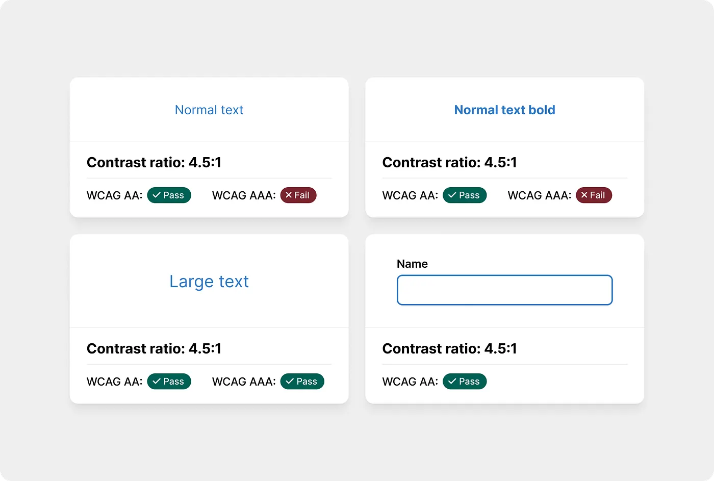
We target WCAG 2.2 AA as our strict legal floor. This standard requires a contrast ratio of 4.5:1 for normal text (under 18pt) and 3:1 for large text (18pt+) or bold text (14pt+). Crucially, this 3:1 ratio also applies to non-text elements like input borders and icons. If a user cannot see the edge of your input field, they cannot use it.
However, passing the legal math doesn't always guarantee readability. For a truly robust experience, we aim for APCA Silver. This future-proofing standard adjusts contrast requirements based on font weight, acknowledging that a thin font is harder to read than a bold one, even at the same color.
Color independence
Color must never be the sole conveyor of information. Approximately 8% of men (1 in 12) and 0.5% of women have some form of Color Vision Deficiency (CVD). If your interface relies exclusively on red to signal an error, that error state is invisible to a significant portion of your users.
The "triple indicator" method
Instead of just turning a form field red on error (which fails), use the Triple Indicator method:
- Color: Turn the border red.
- Shape: Thicken the border or add an alert icon.
- Text: Display a clear eror message.
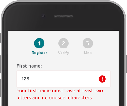
This ensures that even in grayscale, the state change is obvious. The same logic applies to data visualization: a line chart should never rely on blue vs. green lines alone. Always differentiate data sets with patterns (dashed vs. dotted) or direct labels to ensure clarity for every user.
VII. Interaction states & system behavior
Static colors are for print. Digital interfaces are living systems that must react to input. A button is not just a colored rectangle; it is a promise of interaction. A common failure in design handoff is providing only the "idle" state, forcing developers to guess how the element should behave when touched. This leads to inconsistent, "janky" experiences where some buttons darken, some fade, and others do nothing at all.
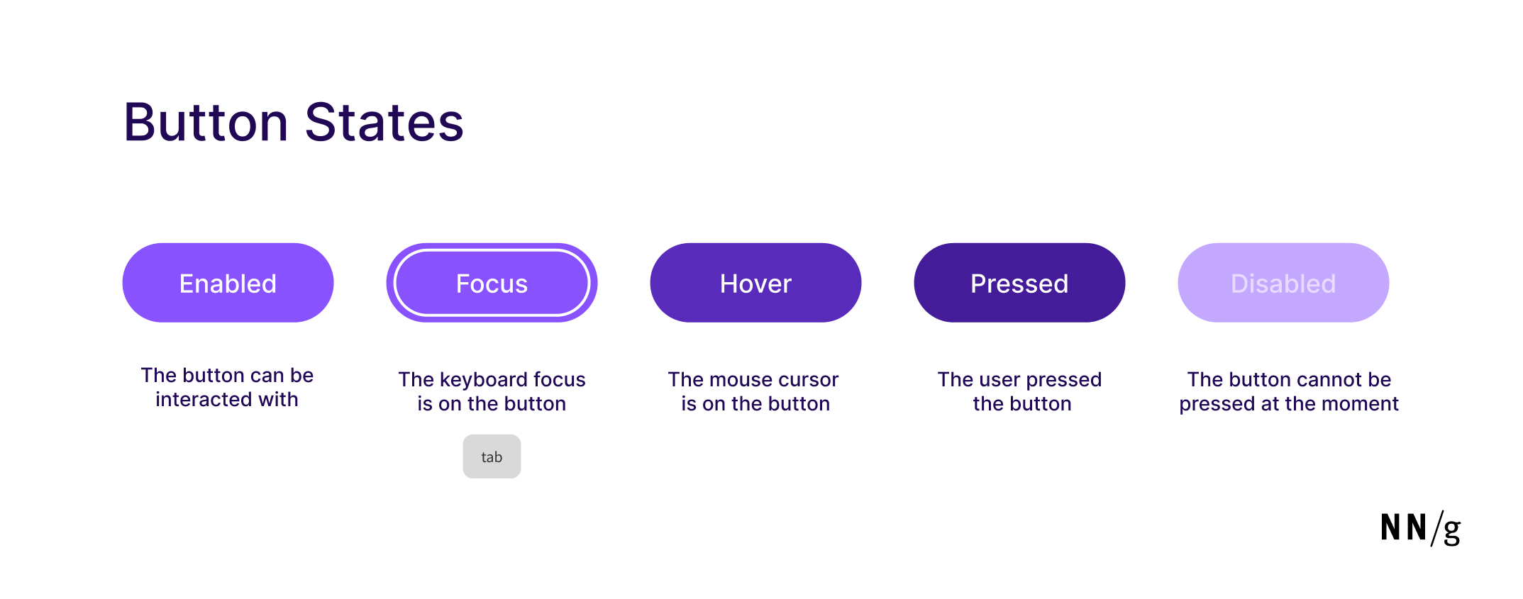
The five universal states
Every interactive component—whether a button, a link, or a card—must have five distinct, engineered states.
1. Default
This is the default appearance of the component when it is waiting for interaction. It represents the "resting" heart rate of the interface.
2. Hover
When a mouse cursor floats over an element, the interface must acknowledge the user's intent.
- The logic: In light mode, we darken the color by 8-12% lightness. In dark mode, we lighten it by 8-12%. This creates a "lifting" effect in dark mode (moving closer to the light source) and a "weight" effect in light mode.
- The hard constraint: Never use opacity for hover (e.g.,
opacity: 0.8). While easy to code, opacity is lazy design. It allows background patterns or images to bleed through the button, creating muddy, unpredictable colors. Always calculate a solid hex or HSL value for the hover state.
3. Active / pressed
This state triggers the millisecond the user clicks or taps. It provides immediate, tactile feedback that the input was registered.
- The math: Double the hover shift (16-24%). If hover was
-10%lightness, active is-20%. This dramatic shift mimics a physical button being depressed into the chassis, giving the user confidence that the system is working.
4. Focus
This state is invisible to mouse users but critical for keyboard and screen reader users. It answers the question, "Where am I on the page?"
- The engineering trap: The default browser focus ring is often ugly, so designers remove it (
outline: none). This is an accessibility violation that renders the app unusable for motor-impaired users. - The visible standard: We use the "double ring" technique. A single colored ring often disappears if the background matches the ring color (e.g., a blue ring on a blue header).
- The execution: Create a 2px white gap (or background color) followed by a 2px brand-color ring. This ensures the focus indicator is visible against any background.
- The trigger: Use
:focus-visiblein CSS, not just:focus. This ensures the ring appears only when a user is navigating via keyboard, keeping the interface clean for mouse users while robust for accessibility.
5. Disabled
A disabled element must communicate that it exists but is currently unreachable.
- The execution: Desaturate the color to near-zero (grayscale) and reduce the opacity to 30-50%.
- The contrast paradox: This is the only time you should deliberately fail accessibility contrast checks. A disabled button should be hard to read. If it passes high-contrast checks, a user might mistake it for a working button and become frustrated when it doesn't click. The low contrast is the signal: "Stop. This is not for you right now."
VIII. Dark mode implementation
Dark mode is not a filter; it is a separate semantic map requiring different optical physics. A common failure is simply "inverting" the colors (White → Black), which leads to eye strain and broken hierarchy.
In light mode, we use shadows to show depth.
In dark mode, shadows are invisible against the dark background, so we must use lightness to emulate proximity to the light source.
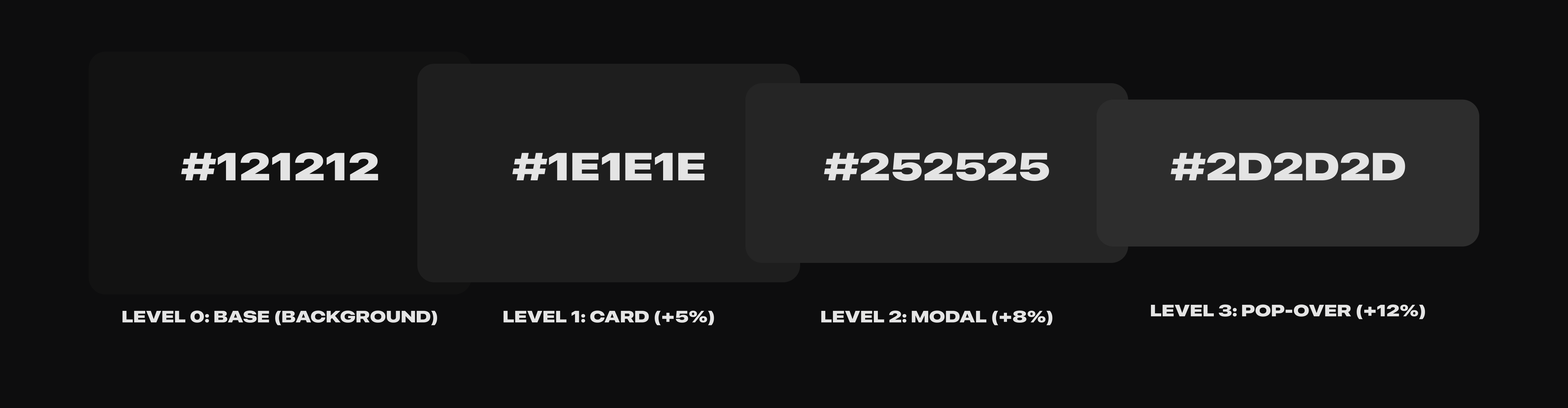
1. Elevation via lightness
In a physical world, objects closer to a light source appear brighter. In dark mode, we replicate this physics engine: the "higher" an element sits on the z-index (closer to the user), the lighter its background surface becomes.
- Level 0 (The basement):
#121212. This is your app background.- Constraint: Avoid pure black (
#000000). On OLED screens, turning pixels completely off causes "smearing" (black trails) when scrolling. A dark gray anchor stabilizes the display.
- Constraint: Avoid pure black (
- Level 1 (Card surface): Lighten by +5% (
#1E1E1E). Use this for the main content containers. - Level 2 (Modal / dialog): Lighten by another +3% (
#252525). This separates the modal from the card below it. - Level 3 (Pop-up / dropdown): Lighten by another +3% (
#2D2D2D). This is the highest surface, closest to the "light."
2. Saturation correction (the "halation" fix)
Fully saturated colors vibrate against dark backgrounds. This optical illusion, known as halation, causes text to blur and creates a painful "glowing" effect that fatigues the eye.
Rule: Desaturate all accent colors by 15-20% for Dark Mode.
- Light mode primary:
Blue-600(Saturation 100%). Deep, authoritative, high contrast against white. - Dark mode primary:
Blue-300(Saturation 75%). Soft, pastel, high legibility against dark gray. - The shift: You aren't just changing the code; you are changing the mood. Dark mode accents should feel like "emitters" of light (soft neon), not "reflectors" of light (glossy paint).
3. Text hierarchy (opacity vs. color)
In light Mode, we often use different shades of gray for secondary text (e.g., #666666). In Dark Mode, using specific gray hex codes is risky because they might clash with the background elevation.
Rule: Use white with opacity for text hierarchy.
- High emphasis (Headings):
White @ 87% Opacity. (Avoid 100% white; it is too harsh against dark backgrounds). - Medium emphasis (Body):
White @ 60% Opacity. - Disabled text:
White @ 38% Opacity.
This technique allows the background color of the card or modal to "bleed through" the text slightly, ensuring that the text always feels harmonious with its surface, regardless of the elevation level.
IX. Data visualization
Data colors must be distinct from brand colors. They serve a mathematical purpose, not a branding one. You need specific palettes for specific data types.
Rule: Create three specific palettes for data:
- Categorical (qualitative): 6-10 distinct hues for comparing different things (e.g., Apple vs. Google vs. Amazon). These must pass the "Squint Test"—if you squint, can you still tell the colors apart?
- Sequential: 1 Hue with 5-8 lightness steps. Used for intensity (e.g., Heatmaps, Sales Volume).
- Diverging: 2 Opposing Hues (e.g., Red vs. Blue) meeting at a neutral center. Used for deviations (e.g., Profit vs. Loss, Voting results).
X. Tools & Resources Checklist
Stop guessing. Use validators to ensure your system is robust.
Generation Tools:
- Huemint: An AI-based generator that applies colors to actual UI examples, so you see the context immediately.
- Coolors: The standard for quick iteration. Great for exploring trending palettes.
- Atmos: Excellent for creating detailed, accessible palettes with conflict detection.
Validation Tools:
- Stark: The essential plugin for Figma, Sketch, and Chrome. It checks contrast ratios and simulates various forms of color blindness.
- WebAIM Contrast Checker: The legal standard validator. If it passes here, it passes compliance.
- UseAllFive: A tool that helps you find accessible combinations within a restricted brand palette.
XI. Common mistakes & anti-patterns
XII. The Unspoken Truth: process vs. people
We have just spent 3,000 words outlining the mathematical perfection of colors, the rigors of WCAG compliance, and the strictness of token architecture. This is the ideal state. It is the North Star.
But we also work in the real world.
The truth is that even the most perfect color system will fail if the relationship between Design and Engineering is broken. You can have the best naming convention in the world, but if a designer is afraid to talk to a developer, or if a developer rolls their eyes at a "pixel-perfect" request, the system is dead on arrival.
The "Shared Brain" theory
A color system is not just a JSON file or a Figma library. It is a peace treaty.
- For designers: Your job is not just to pick pretty colors. Your job is to understand how those colors live in the codebase. If you hand off a variable that doesn't exist, you are breaking the trust.
- For developers: Your job is not just to close tickets. Your job is to respect the intent of the visual language. If you hard-code a hex value because "it's faster," you are introducing rot into the foundation.
Rigidity is brittle
There will be days when the deadline is tight. There will be marketing campaigns that need to break the rules. There will be legacy code that refuses to play nice with your new variables.
It is okay to break this process.
The goal is not 100% adherence to a PDF guideline. The goal is shared understanding. If a designer and a developer sit together for five minutes and agree to hack a solution to get a feature shipped, that is a success—as long as you both know why you broke the rule and have a plan to fix it later.
Tools like Figma variables and CSS tokens are just the vocabulary. Empathy is the grammar. The quality of your product will never exceed the quality of your communication.
Build the relationship first. The system will follow.
Any statistics cited in this post come from third‑party studies and industry reports conducted under their own methodologies. They are intended to be directional, not guarantees of performance. Real outcomes will depend on your specific market and execution.
Can I use pure black (#000000) in my UI?
Generally, no. Pure black can cause "smearing" (ghosting) on OLED screens when pixels turn off and on rapidly. It also creates extremely high contrast that can cause eye strain. Use a very dark grey like #121212 or #0F0F0F instead.
How many colors should my primary palette have?
Keep it simple. You usually only need one Primary color, one Secondary color, and a comprehensive set of Neutrals (greys). You can add semantic colors (Red/Green/Yellow) for feedback, but your core brand identity should rely on 1-2 main colors to avoid visual clutter.
What is the difference between semantic and primitive tokens?
Primitives are the raw values (e.g., Blue-500). Semantic tokens are the functional names (e.g., primary-button-bg). You should always use semantic tokens in your code so that you can change the underlying color later without breaking the code.
Do I really need to check for color blindness?
Yes. Approximately 8% of men (1 in 12) and 0.5% of women (1 in 200) have some form of Color Vision Deficiency (CVD). If you design an error state that relies solely on a red border, you are effectively excluding a significant portion of your user base from understanding the interface. This hurts your user experience and can lead to higher abandonment rates for everyone.
How do I choose a text color that isn't black?
Avoid pure black on pure white. A good rule of thumb is to use a dark grey with a lightness of around 10-20% (e.g., #333333) for body text. This reduces eye strain while maintaining sufficient contrast. Alternatively, add a tiny tint of your brand color to the grey for harmony.