
TL;DR for founders and busy engineers
You do not need to become an accessibility expert to ship. You need a few hard SaaS rules, a sane baseline, and a habit of improving over time.
1. Make the SaaS operable without a mouse
If people can sign up, log in, and use your core features with just a keyboard, you’re already covering a huge chunk of WCAG’s “Operable” principle.
- You can move around the app with
Tab/Shift+Tab.
- Every button, link, and input has a visible focus style (don't use
outline: nonewithout a replacement).
- There are no “ghost” elements in the tab order (hidden buttons you can still tab to).
If a user can sit down, unplug their mouse, and complete checkout in under five minutes, your baseline is solid.
2. Use WCAG numbers to stay safe, APCA to make it feel right
For contrast, think in two layers:
- WCAG 2.2 AA is your legal & tooling baseline. Aim for 4.5:1 contrast for normal text and 3:1 for large text so automated checkers and auditors are happy.
- APCA is your design brain. Use it to tune colors so text is actually readable in real conditions (dark mode, thin fonts, sunlight), even when the old ratio says “pass”.
Practically: pick colors that pass WCAG, then quickly sanity‑check body text and key buttons with APCA. If APCA says your “compliant” combo is weak, adjust the color, not your standards.
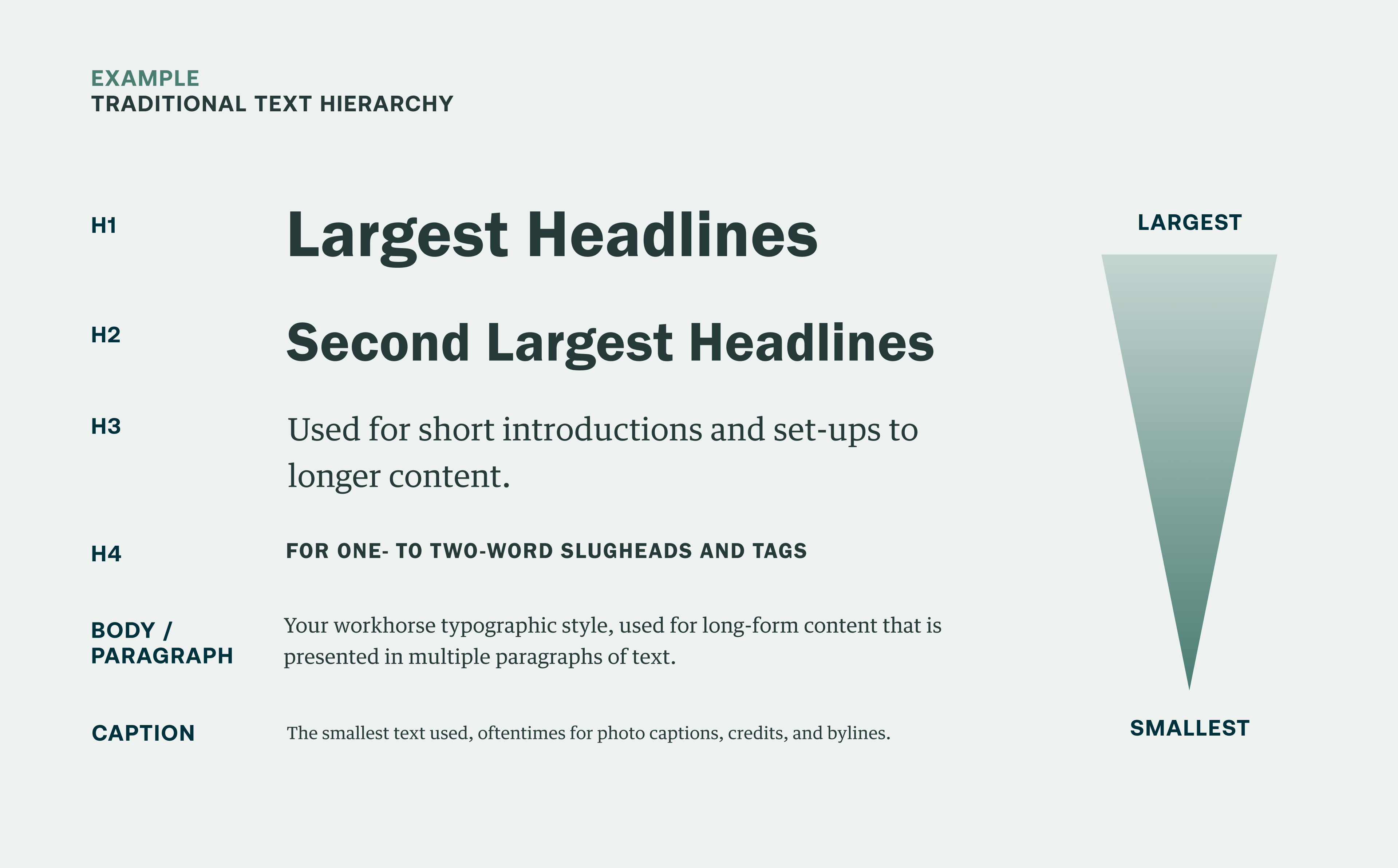
3. Give text a real hierarchy and stop under‑sizing everything
Most “accessibility” complaints in SaaS screenshots are typography problems, not algorithm problems.
- Body copy: at least 15–16px with solid contrast.
- Microcopy and helper text: used sparingly, never ultra‑light gray on white.
- Headlines and section titles: clearly larger and bolder, not just “same size but a different color”.
If someone has to zoom to 150% just to read your pricing page, your issue isn’t accessibility rules; it’s basic information design.
4. Make buttons and targets thumb‑sized, not cursor‑sized
WCAG 2.2’s target‑size rules come from a simple reality: people use thumbs, not laser pointers.
- Primary buttons, nav items, and close icons should be in the 40–44px range where possible.
- The icon can stay small; padding makes the hit area big.
- Crowded controls (tiny X next to another tiny X) are a conversion leak, not just an accessibility issue.
If you wouldn’t trust someone to tap it on a moving tram, it’s probably too small.
5. Focus on flows, not just pages
Accessibility is not “does this single screen pass a checklist,” it is “can someone finish a task”.
For your SaaS product, that usually means:
- A user can discover the primary CTA on each page (no “Where do I click?” moments).
- State changes are clear: when a modal opens, focus moves into it; when it closes, focus returns; when a route changes, the new page announces itself.
- Errors in forms are obvious, explained next to the field, and announced—not hidden in a tiny red message somewhere else.
If sign‑up, onboarding, and “give us money” flows feel obvious and forgiving, you’re winning both on accessibility and conversion.
Now for the full version -- the rest of this guide is the “long read” for engineers and designers who want to see the math, patterns, and code behind those five rules.
I. The mathematics of contrast: luminance vs perception
For the last decade, we’ve used a simple luminance formula to judge contrast: (L1+0.05)/(L2+0.05)(L1+0.05)/(L2+0.05). This is the WCAG 2.x “4.5:1” ratio everyone quotes.
L1= relative luminance of the lighter color (0–1).
L2= luminance of the darker color.
0.05= fudge factor for ambient glare and very dark colors.
The result ranges from 1:1 (no contrast) to 21:1 (pure black on pure white).
a) The legacy standard: WCAG 2.1 / 2.2
WCAG 2.1/2.2 set these thresholds for text:
- Normal text (<18pt regular, <14pt bold): 4.5:1 minimum.
- Large text (≥18pt regular or ≥14pt bold): 3:1 minimum.
This math is baked into:
- Legal frameworks (ADA, EAA, Section 508 guidance).
- Audit tools (Lighthouse, Axe, browser devtools contrast pickers).
That makes it the rule of law: if you want safe harbor, you must pass these ratios even when they aren’t perfect.
b) The luminance trap
The WCAG formula uses raw luminance, but our vision is non‑linear and context‑dependent.
We perceive:
- Light text on dark backgrounds differently than dark on light.
- Edges differently depending on font weight, size, and surrounding clutter.
Yet the formula treats both directions and all fonts as equivalent. That’s the luminance trap.
- Example: mid‑gray
#777on white and the same#777on black can both compute to similar ratios, but the light‑on‑dark version often blooms and feels harder to read because of halation (light bleed) and glare, especially on cheap displays.
c) False positives and false negatives
Because the formula is crude, you get:
- False positives – color pairs that “pass” at 4.5:1 but feel bad.
- False negatives – color pairs that “fail” by the numbers but are actually crisp.
False positive example: very light text on a saturated light background can meet 4.5:1 in certain ranges but still shimmer and feel unstable to the eye, especially in motion.
False negative example: white text on strong blues in dark mode can land at ~4.4:1 and technically “fail”, even though legibility is excellent in practice on most screens.
The outcome: you sometimes darken your brand colors just to appease the formula, making the interface muddier without actually helping users.

d) The rule of law vs reality
So how do we reconcile this? Think of WCAG contrast as the speed limit and APCA as your suspension tuning. You obey the law, but you tune for the actual road.
- Legal & tooling reality: Ship WCAG 2.1/2.2 AA contrast for text and important UI; that’s what courts, auditors, and scanners understand.
- Human reality: Use better models (APCA) and real‑world testing to make sure “compliant” designs also feel readable in context.
II. The future standard: APCA
APCA (Advanced Perceptual Contrast Algorithm) is the proposed contrast method for WCAG 3.0. Instead of a simple ratio, it outputs an Lc value (Lightness contrast, roughly −108 to +108) that maps more closely to perceived readability.
Key differences:
- Direction matters (light on dark vs dark on light are not symmetric).
- Font size and weight matter (16px thin text requires more contrast than 16px bold).
- Thresholds are tied to task type: body text, UI chrome, large display text, etc.
APCA in practice
A simple mapping you can adopt:
- Body copy (16px regular): aim for Lc 60–75 (“Silver” level).
- Microcopy (12–14px regular): aim for Lc 75–90 (“Gold”).
- Large headings (24px+ bold): Lc 45–60 is usually enough.
- UI chrome (borders, icons): lower Lc is acceptable, but avoid ultra‑low contrast on critical indicators.
Rule of thumb: Use WCAG 2.2 AA to pass audits, use APCA to design what actually feels good. If APCA says your compliant orange is weak, adjust the orange.
III. Typography & readability engineering
Accessibility is mostly typography discipline plus some guardrails. If your type system is fragile, no color algorithm will save you.
a) The environmental factor
The 4.5:1 ratio is tested in a lab environment. In real life:
- Phone in direct sun.
- Laptop at 50% brightness.
- Cheap monitors with crushed shadows.
Glare can effectively cut contrast in half.
Rule: Design for the sun, not the studio.
Example: If your body text is a soft gray like #9CA3AF on white, it may pass but will wash out on mobile outdoors. Bump it to something like #6B7280 or darker, and test it at 50% brightness.
b) The size–weight matrix
WCAG defines when you can relax contrast for “large” text.
- Normal text: <18pt (~24px) regular or <14pt bold → needs 4.5:1.
- Large text: ≥18pt regular or ≥14pt bold → can drop to 3:1.
You can combine that with APCA to build a quick decision table:
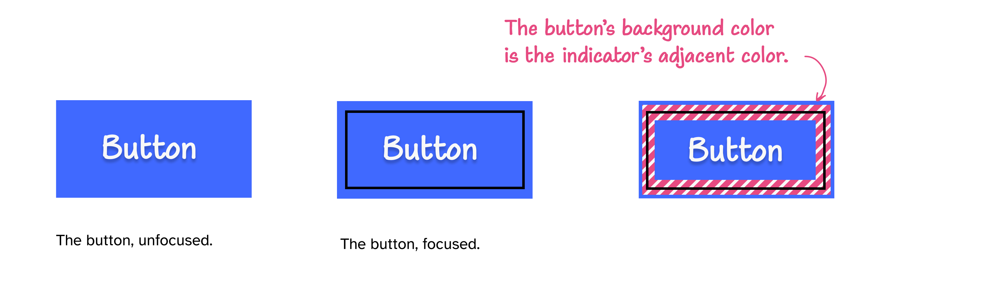
IV. Focus state architecture
The most common accessibility regression in modern apps: removing the default focus ring via outline: none without a replacement. WCAG 2.2 doubles down with Focus Appearance and Focus Not Obscured.
Rule: Every interactive element must have a visible, high‑contrast focus state that isn’t hidden behind sticky UI.
The double‑ring technique
A single colored outline can vanish if it matches the background.
<style>
/* The 2026 standard focus ring */

:focus-visible {

	outline: 2px solid transparent;

/* 2px white gap, 2px brand blue ring */

	box-shadow:    0 0 0 2px #FFFFFF,    0 0 0 4px #3B82F6;

}
</style>- Inner ring = white (or surface color) to separate the element.
- Outer ring = brand color with strong contrast to the surrounding
V. The invisible architecture: DOM vs AOM
Screen readers and many assistive tools don’t care how your UI looks; they care about the Accessibility Tree (AOM). When the visual DOM and AOM drift apart, weird bugs show up.
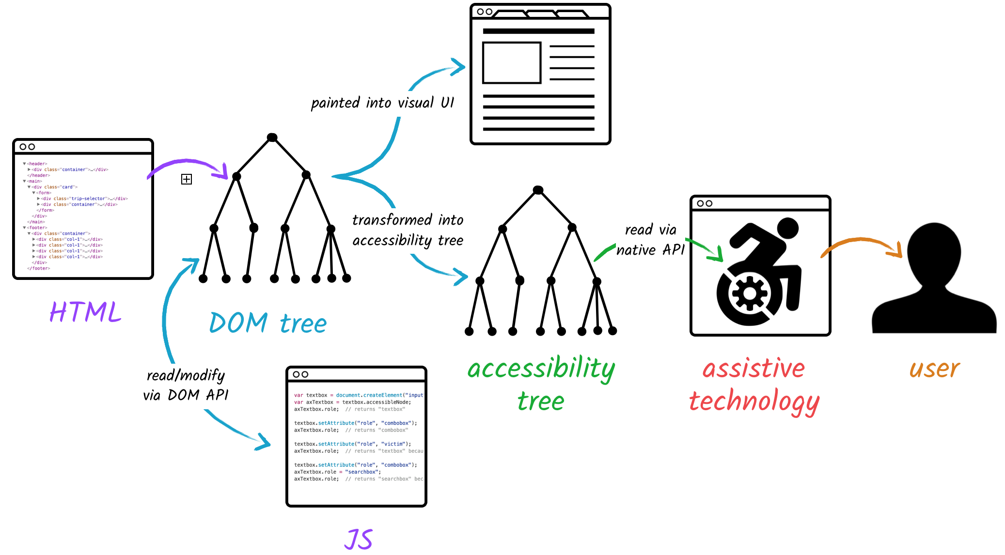
a) The “ghost button” problem
Using opacity: 0 or visibility: hidden to hide an element often keeps it in the AOM.
- The user can tab into an “invisible” button.
- The screen reader may still announce it.
- Your UI now has phantom interactions.
Fix:
- Use
display: nonewhen things are truly gone.
- Or use
aria-hidden="true"on non‑focusable decorative elements.
- Never combine
aria-hidden="true"withtabindex="0"or clickable handlers; that’s how you create a black hole in your focus order.
b) SPA routing & focus management
In SPAs (React, Next.js, Vue), route changes don’t trigger a full page load, so focus tends to fall back to <body> or stay where it was.
Pattern:
- Give your route’s main
<h1>atabindex="-1".
- On route change, programmatically call
.focus()on it.
- Optionally announce the new title in a
role="status"oraria-live="polite"region.
<main>
<h1 id="page-title" tabindex="-1">Dashboard</h1>

…

</main>
function focusMainHeading() {
const h1 = document.getElementById("page-title");
if (h1) h1.focus();
}This keeps keyboard and screen‑reader users in sync with what your SPA is doing.
c) Motion physics
Complex parallax, big zooms, and auto‑playing animations can cause nausea for users with vestibular disorders, which is why platforms expose a Reduce Motion setting and browsers provide prefers-reduced-motion.
@media (prefers-reduced-motion: reduce) {
*, *::before, *::after
{
	animation-duration: 0.01ms !important;
    animation-iteration-count: 1 !important;
    transition-duration: 0.01ms !important;

}
}Use this guardrail on global styles or on specific high‑energy components so users who opt out get calm versions of your UI.
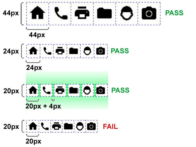
VI. Touch target physics
Fitts’s Law: the time to hit a target depends on its size and distance. WCAG 2.2 formalizes this with Target Size (Minimum).
a) The 24px floor
- Rule: Targets for pointer input must be at least 24×24 CSS pixels or have 24px spacing from neighbors.
- Exemptions: inline links in text and a few special cases, but your primary controls are not exempt.
The icon itself can be 16px; padding expands the hit box:
.icon-button {
  display: inline-flex;
  align-items: center;
  justify-content: center;
  width: 24px;
  height: 24px;
  padding: 4px; /* 16px icon + padding = 24px target */
}
b) The 44px professional standard
Research and platform guidelines recommend 44×44px or 48×48dp targets for comfortable touch.
- Average fingertip covers ~16–20mm; on many devices that’s near 44px.
- Larger targets reduce mis‑taps for everyone, not only disabled users.
For primary actions, navigation, and mobile controls, design for 44×44 as your default.
VII. Semantic DOM, ARIA, and focus traps
The fastest way to break accessibility is “div soup”: using <div> for every interactive thing. Semantic HTML and light‑touch ARIA give you a clean structure that assistive tech can actually understand.
a) The “div button” anti‑pattern
Bad:
<div class="btn" onclick="submitForm()">Submit</div>Problems:
- Screen readers don’t know it is a button.
- No built‑in keyboard:
Enter/Spacewon’t activate it.
- It doesn’t appear in the accessibility tree as an actionable control.
Good:
<button type="button" class="btn">Submit</button>You get keyboard behavior, focus, and correct semantics for free.
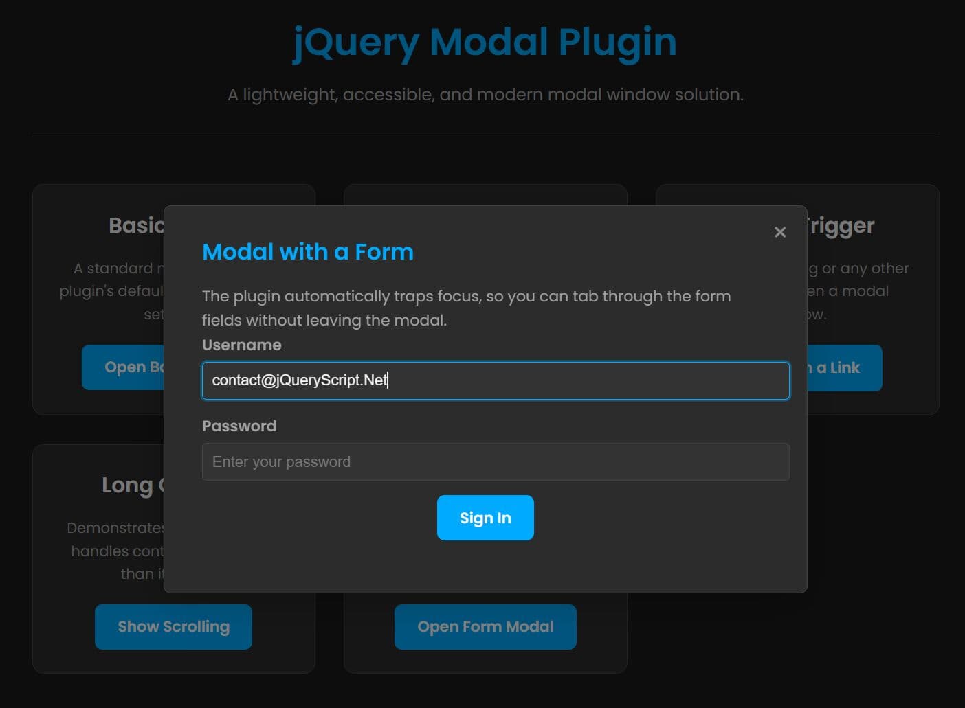
b) The focus trap (modals)
Modals fail when:
- Focus moves behind the backdrop.
Tabfalls into content underneath.
- On close, focus is dumped at the top of the page.
Rule: When a modal opens:
- Move focus into the modal (usually the close button or first input).
- Trap
Tabso focus cycles within the modal.
- On close, return focus to the control that opened it.
Tie it together with:
<div role="dialog"
     aria-modal="true"
     aria-labelledby="settings-title">
  <h2 id="settings-title">Settings</h2>
  …
</div>
This tells assistive tech: this is a dialog; treat it as a temporary, self‑contained context.
c) From “div soup” to a semantic layout
The same problem appears at the page level: everything wrapped in anonymous <div> and <span> elements.
Non‑semantic layout:
<div class="page">
  <div class="top-bar"></div>
  <div class="menu"></div>
  <div class="content"></div>
  <div class="footer"></div>
</div><header class="top-bar"></header>
<nav class="menu"></nav>
<main class="content"></main>
<aside class="sidebar"></aside>
<footer class="footer"></footer>Why this matters:
- Screen readers can jump straight to
<main>or<nav>instead of tabbing through everything.
- Landmarks make large apps feel structured, not like one giant blob.
- Future engineers can understand the layout by scanning the tags, not reverse‑engineering class names.
If you use the “non‑semantic vs semantic” diagram here, you can caption it with something like: “Left: one big <div>. Right: the same layout expressed with real landmarks.”
d) Semantic patterns for components
You can apply the same idea inside components:
- Use
<ul>/<li>for menus and nav lists.
- Use
<fieldset>/<legend>to group related form controls.
- Use
<section>witharia-labelledbywhen you have titled content blocks.
Example navigation:
<nav aria-label="Primary navigation">
  <ul>
    <li><a href="/dashboard">Dashboard</a></li>
    <li><a href="/billing">Billing</a></li>
    <li><a href="/settings">Settings</a></li>
  </ul>
</nav>
Example form grouping:
<form>
  <fieldset>
    <legend>Billing details</legend>

    <label for="card-number">Card number</label>
    <input
      id="card-number"
      name="card-number"
      type="text"
      inputmode="numeric"
      autocomplete="cc-number"
      pattern="[0-9\\s]{13,19}"
      maxlength="19"
    />

    <label for="expiry">Expiry date</label>
    <input
      id="expiry"
      name="expiry"
      type="text"
      inputmode="numeric"
      autocomplete="cc-exp"
      placeholder="MM / YY"
    />
  </fieldset>
</form>
e) ARIA as a thin layer on top of semantic HTML
ARIA should be a layer, not a replacement:
- Start with the correct native element (
<button>,<a>,<header>,<main>,<nav>,<section>,<form>).
- Add ARIA only when native semantics are not enough, or when you’re building a custom widget.
Good uses in this context:
role="dialog"andaria-modal="true"on the modal container.
aria-labelledby="settings-title"connecting the dialog to its title.
aria-haspopup="dialog"andaria-controls="settings-dialog"on the button that opens a modal.
Putting it together:
<button type="button"
        class="btn"
        aria-haspopup="dialog"
        aria-controls="settings-dialog">
  Open settings
</button>

<div id="settings-dialog"
     role="dialog"
     aria-modal="true"
     aria-labelledby="settings-title">
  <h2 id="settings-title">Settings</h2>
  …
</div>
The native elements give you keyboard and structural behavior; ARIA clarifies the relationships and roles. This combination is how you move from “div soup” to a layout and component system that both browsers and assistive tech actually understand.

VIII. The “squint test” & QA protocols
Automated tools (Axe, Lighthouse, Wave) catch roughly a third of issues. The rest require human judgment.
a) The squint test
Protocol:
- Zoom out slightly, sit back, and literally squint until text blurs.
Check:
- Can you still tell what the primary action is?
- Does the layout reduce to a clear hierarchy or a gray soup?
If everything collapses into uniform gray, your hierarchy is too weak for low‑vision users and probably too weak for busy founders.
b) The zoom reflow test
Protocol:
- Set browser zoom to 400%.
Check:
- Does the layout reflow into a single column without horizontal scrolling for main content?
- Can you still complete a core flow?
WCAG 1.4.10 requires content to reflow without loss at 400% zoom.
c) The keyboard run
Protocol:
- Unplug your mouse or trackpad.
- Try to sign up, sign in, use navigation, and finish checkout using only
Tab,Shift+Tab,Enter, andSpace.
If you get stuck or lose focus in a modal, that’s a P0 bug in the same category as “cannot click the Buy button.”
How worried should you be?
Looking at this, it’s easy to think, “We’re doomed; we have to rebuild everything before we ship.” You don’t.
Here’s the practical view:
- Conversion > compliance checklists for most startups. A product that converts and solves problems is more valuable than a pixel‑perfect-but-unused site.
- Accessibility work is multiplicative: keyboard‑friendly flows, clear hierarchy, and sensible forms help everyone, not just users with assistive tech.
- You can phase it: ship with the Tier‑1 basics (keyboard usable, clear focus, readable text, no ghost elements), then layer in contrast tuning, touch target polish, APCA tokens, and motion preferences as you iterate.
The real failure mode isn’t “we don’t implement every nuanced rule.” It’s “we ignore this entirely and ship flows that some users literally cannot complete.” As long as you avoid that and keep improving, you’re doing the right thing—for users, for the business, and for future you who doesn’t want to untangle a giant accessibility mess later.
Any statistics cited in this post come from third‑party studies and industry reports conducted under their own methodologies. They are intended to be directional, not guarantees of performance. Real outcomes will depend on your specific market and execution.
Is APCA legally required in 2026?
Not yet. As of early 2026, WCAG 2.1 AA remains the primary legal standard for ADA and EAA compliance. However, APCA is the superior design standard for readability. We recommend passing WCAG 2.1 for the lawyers, but tuning your system to APCA Silver for your users.
Why does my orange button fail contrast checks?
Orange is notoriously difficult in the RGB color space. To pass 4.5:1 on white, orange must be very dark/brown. On a dark background, it must be very light/pale. To fix this, consider using a dark text label on the orange button, or switching to a high-contrast "Burnt Orange" (#C2410C) for text.
Do I really need to check for color blindness?
Yes. Approximately 8% of men (1 in 12) and 0.5% of women (1 in 200) have some form of Color Vision Deficiency (CVD). If you design an error state that relies solely on a red border, you are effectively excluding a significant portion of your user base from understanding the interface.
What is a "Focus Trap"?
A focus trap occurs when a keyboard user Tabs into a component (like a Modal) but cannot Tab out of it. The focus cycle gets stuck. To fix this, you must engineer the modal to capture focus when opened, and release it back to the trigger button when closed.
Can I use pure black (#000000) in my UI?
Generally, no. Pure black can cause "smearing" (ghosting) on OLED screens when pixels turn off and on rapidly. It also creates extremely high contrast that can cause eye strain. Use a very dark grey like #121212 or #0F0F0F instead.